- New to JMP? Let the Data Analysis Director guide you through selecting an analysis task, an analysis goal, and a data type. Available now in the JMP Marketplace!
- See how to install JMP Marketplace extensions to customize and enhance JMP.
- Subscribe to RSS Feed
- Mark Topic as New
- Mark Topic as Read
- Float this Topic for Current User
- Bookmark
- Subscribe
- Mute
- Printer Friendly Page
Discussions
Solve problems, and share tips and tricks with other JMP users.- JMP User Community
- :
- Discussions
- :
- How to color continuous data histogram based on category data?
- Mark as New
- Bookmark
- Subscribe
- Mute
- Subscribe to RSS Feed
- Get Direct Link
- Report Inappropriate Content
How to color continuous data histogram based on category data?
Hello,
I have two(2) columns:
1. First column contains continuous data on turn around times.
2. Second column contains categorical data (types of departments) eg: microbiology, histology, chemistry etc.
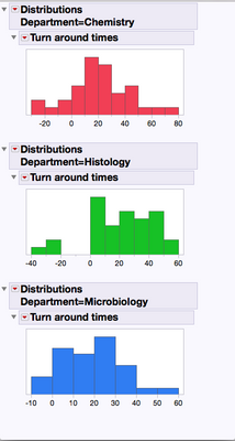
when I create a histogram distribution of turn around time data and use local data filter to filter out departments: I would like to see a different color histogram for different color department.
Right now all departments show the default histogram color. I tried using "color or mark by column" feature but apparently this feature does not work for histograms
Accepted Solutions
- Mark as New
- Bookmark
- Subscribe
- Mute
- Subscribe to RSS Feed
- Get Direct Link
- Report Inappropriate Content
Re: How to color continuous data histogram based on category data?
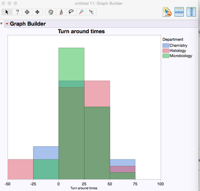
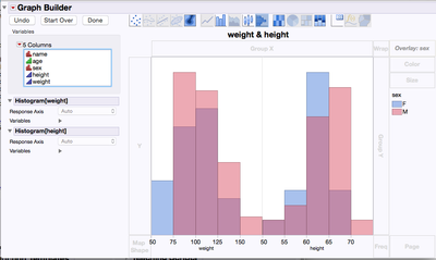
One color for each sex (Blue=F, Pink=M, and Purple=Both M&F). The third color to show the overlap.
The histograms are presented separately below
- Mark as New
- Bookmark
- Subscribe
- Mute
- Subscribe to RSS Feed
- Get Direct Link
- Report Inappropriate Content
Re: How to color continuous data histogram based on category data?
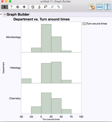
Would this Graph Builder output work?
- Mark as New
- Bookmark
- Subscribe
- Mute
- Subscribe to RSS Feed
- Get Direct Link
- Report Inappropriate Content
Re: How to color continuous data histogram based on category data?
LouV,
I think we are half way there. I do need to present these histograms separately for each category. In your case there will be a separate chart for male and female.
BTW: why do you have three(3) different colors for two(2) levels of sex?
Thanks for your help!
- Mark as New
- Bookmark
- Subscribe
- Mute
- Subscribe to RSS Feed
- Get Direct Link
- Report Inappropriate Content
Re: How to color continuous data histogram based on category data?
One color for each sex (Blue=F, Pink=M, and Purple=Both M&F). The third color to show the overlap.
The histograms are presented separately below
- Mark as New
- Bookmark
- Subscribe
- Mute
- Subscribe to RSS Feed
- Get Direct Link
- Report Inappropriate Content
Re: How to color continuous data histogram based on category data?
Perfect Thanks!!
- Mark as New
- Bookmark
- Subscribe
- Mute
- Subscribe to RSS Feed
- Get Direct Link
- Report Inappropriate Content
Re: How to color continuous data histogram based on category data?
Recommended Articles
- © 2026 JMP Statistical Discovery LLC. All Rights Reserved.
- Terms of Use
- Privacy Statement
- Contact Us


