- New to JMP? Let the Data Analysis Director guide you through selecting an analysis task, an analysis goal, and a data type. Available now in the JMP Marketplace!
- See how to install JMP Marketplace extensions to customize and enhance JMP.
- Subscribe to RSS Feed
- Mark Topic as New
- Mark Topic as Read
- Float this Topic for Current User
- Bookmark
- Subscribe
- Mute
- Printer Friendly Page
Discussions
Solve problems, and share tips and tricks with other JMP users.- JMP User Community
- :
- Discussions
- :
- How to add reference lines automatically to variability charts?
- Mark as New
- Bookmark
- Subscribe
- Mute
- Subscribe to RSS Feed
- Get Direct Link
- Report Inappropriate Content
How to add reference lines automatically to variability charts?
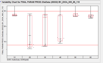
I need to make many graphs such as the one below and add limits using the reference limits in the axis settings. The limits are different for each graph. Is there a way to automate this so I do not have to manually add to each graph? The upper and lower limits could be included in the data set in extra columns.
- Mark as New
- Bookmark
- Subscribe
- Mute
- Subscribe to RSS Feed
- Get Direct Link
- Report Inappropriate Content
Re: How to add reference lines automatically to variability charts?
Hi Kevin,
First of all, I am not familiar with running scripts in JMP. I am willing to learn though but will require some other training.
For these graphs, the limits for each particular dataset will not change. I will do this fairly frequently and there will be multiple columns of data with each column having different limits. The dataset has at least a few hundred columns of data but I only need to graph maybe 20 of the columns. Only these 20 columns would therefore need spec limits (reference lines) added to the graphs.
Thanks,
Rick
- Mark as New
- Bookmark
- Subscribe
- Mute
- Subscribe to RSS Feed
- Get Direct Link
- Report Inappropriate Content
Re: How to add reference lines automatically to variability charts?
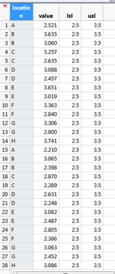
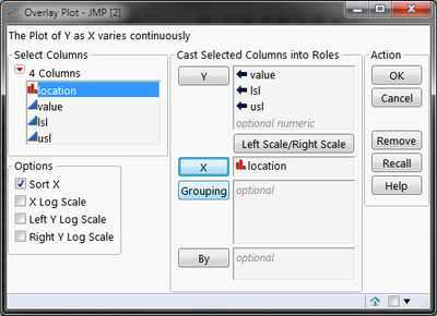
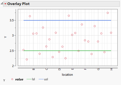
If you have the spec limit in the table as columns, then you can use overlay plot. But it doesn't provide any statistics.
- « Previous
-
- 1
- 2
- Next »
Recommended Articles
- © 2026 JMP Statistical Discovery LLC. All Rights Reserved.
- Terms of Use
- Privacy Statement
- Contact Us


