- New to JMP? Let the Data Analysis Director guide you through selecting an analysis task, an analysis goal, and a data type. Available now in the JMP Marketplace!
- See how to install JMP Marketplace extensions to customize and enhance JMP.
- Subscribe to RSS Feed
- Mark Topic as New
- Mark Topic as Read
- Float this Topic for Current User
- Bookmark
- Subscribe
- Mute
- Printer Friendly Page
Discussions
Solve problems, and share tips and tricks with other JMP users.- JMP User Community
- :
- Discussions
- :
- How do you display Data Labels on Bars in Graph Builder?
- Mark as New
- Bookmark
- Subscribe
- Mute
- Subscribe to RSS Feed
- Get Direct Link
- Report Inappropriate Content
How do you display Data Labels on Bars in Graph Builder?
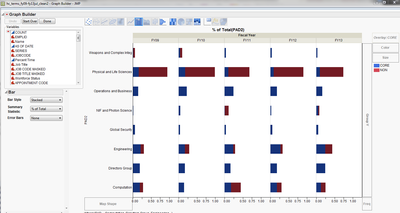
My questions are: 1) How do you display data labels on bars in Graph Builder? 2) Or if it's obvious to you why, for a specific panel/fiscal year does the total of all the bars seem to be going over 100%
I'm a JMP novice. I am using Graph Builder and while I can figure out how to create various trellis charts, contour charts,etc I can't for the life of me figure out how to put data labels on some bars. I tried Rows>Row Labels and looking on Google and in JMP Help. I came up with dead ends.
Specifically I have some data charted as the image below. Stacked bar percent to total to display two categories of employees by Organization (Y axis; categorical) for each Fiscal Year(Group X; Categorical). I'm trying to figure out what percent each bar segement is because when I look at the x-axis and add each of the bars I seem to be going over 100% and this is confusing to me. Your help will be greatly appreciated.
Accepted Solutions
- Mark as New
- Bookmark
- Subscribe
- Mute
- Subscribe to RSS Feed
- Get Direct Link
- Report Inappropriate Content
Re: How do you display Data Labels on Bars in Graph Builder?
I don't think it's possible in Graph Builder in JMP 10 or earlier (it will be in JMP 11 though). But labelled bars is possible with the Chart platform.
- Mark as New
- Bookmark
- Subscribe
- Mute
- Subscribe to RSS Feed
- Get Direct Link
- Report Inappropriate Content
Re: How do you display Data Labels on Bars in Graph Builder?
Too bad you can't do it in JMP 10. We won't betting getting an upgrade for another year or two. Thanks for your reply.
- Mark as New
- Bookmark
- Subscribe
- Mute
- Subscribe to RSS Feed
- Get Direct Link
- Report Inappropriate Content
Re: How do you display Data Labels on Bars in Graph Builder?
A work-around may be to add a Points element behind the Bar since the points do handle labeling in JMP 10. However, for a stacked bar it can get tricky because you have to make a column that represents the sum and use the right-click>Bar>Y submenu to remove it from the stacking.
Recommended Articles
- © 2026 JMP Statistical Discovery LLC. All Rights Reserved.
- Terms of Use
- Privacy Statement
- Contact Us

