- New to JMP? Let the Data Analysis Director guide you through selecting an analysis task, an analysis goal, and a data type. Available now in the JMP Marketplace!
- See how to install JMP Marketplace extensions to customize and enhance JMP.
- Subscribe to RSS Feed
- Mark Topic as New
- Mark Topic as Read
- Float this Topic for Current User
- Bookmark
- Subscribe
- Mute
- Printer Friendly Page
Discussions
Solve problems, and share tips and tricks with other JMP users.- JMP User Community
- :
- Discussions
- :
- How do I visualize individual relationships in multiple regression
- Mark as New
- Bookmark
- Subscribe
- Mute
- Subscribe to RSS Feed
- Get Direct Link
- Report Inappropriate Content
How do I visualize individual relationships in multiple regression
Dear all
I have put together a multiple regression model in JMP from fit model.
I already visualized the relationships with fit y by x before beginning.
My question is, how can I visualize the relationships between the response and the variables after the model has been output?
I have tried prediction profiler, but I would like to see the relationships with all data points, so that I can fit lines etc similar to the y by x function, except this time with the output from the model?
Any help would be greatly appreciated.
Thank you
- Mark as New
- Bookmark
- Subscribe
- Mute
- Subscribe to RSS Feed
- Get Direct Link
- Report Inappropriate Content
Re: How do I visualize individual relationships in multiple regression
Hi @FISH1,
The Prediction Profiler in Fit Model is exactly what you want -- it is showing the relationship between Y and each predictor that your model fit, and is showing it in a way that lets you see how that relationship changes with respect to the levels of your other variables. Looking at marginal plots (what you will get from Fit Y by X) does not show the same thing -- a bivariate fit is providing the unconditional regression coefficients, whereas multiple regression is providing the conditional, partial regression coefficients (the effect of each variable holding constant the other variables in the model).
Take for instance this example from the Cars 1993 sample data:
Open("$SAMPLE_DATA/Cars 1993.jmp");
Fit Model(
	Y( :Name( "City Mileage (MPG)" ) ),
	Effects(
		:Name( "Engine Size (liters)" ),
		:Name( "Weight (pounds)" ),
		:Name( "Engine Size (liters)" ) * :Name( "Weight (pounds)" )
	),
	Personality( "Standard Least Squares" ),
	Emphasis( "Minimal Report" ),Run())
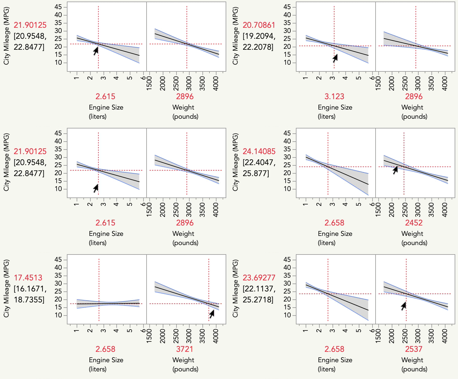
The profiler allows you to see how the Y (MPG) changes with respect to each variable, as well as how the relationship between Y and each predictor changes at different levels of the other variable:
So, there is no additional line fitting that is necessary after the model has been run -- the line (or curve etc) that is generated by the model *is* what is shown in the prediction profiler.
Adding points to the prediction profiler isn't standard, so there is no single click way to do it in JMP. However, there is a way using Copy Frame Contents, and Paste Frame Contents. Simply make your bivariate plots with Fit Y by X, right click each plot > Edit > Copy Frame Contents. Then, right click the associated plot in the Profiler > Edit > Paste Frame Contents.
I hope this helps!
- Mark as New
- Bookmark
- Subscribe
- Mute
- Subscribe to RSS Feed
- Get Direct Link
- Report Inappropriate Content
Re: How do I visualize individual relationships in multiple regression
However when moving the red line on one variable, the other axes only move up and down and do not change? Is there a way to recify this?
- Mark as New
- Bookmark
- Subscribe
- Mute
- Subscribe to RSS Feed
- Get Direct Link
- Report Inappropriate Content
Re: How do I visualize individual relationships in multiple regression
As for why the slope is not changing, I suspect that either you have fit a model without interaction terms between your predictors (which means the model is not estimating the terms necessary for the level of one variable to affect the relationship between Y and another variable), or, that you have fit those interactions but the estimates for those terms are close to 0.
Recommended Articles
- © 2026 JMP Statistical Discovery LLC. All Rights Reserved.
- Terms of Use
- Privacy Statement
- Contact Us

