- Subscribe to RSS Feed
- Mark Topic as New
- Mark Topic as Read
- Float this Topic for Current User
- Bookmark
- Subscribe
- Mute
- Printer Friendly Page
Discussions
Solve problems, and share tips and tricks with other JMP users.- JMP User Community
- :
- Discussions
- :
- Re: How can I make this polar plot in JMP?
- Mark as New
- Bookmark
- Subscribe
- Mute
- Subscribe to RSS Feed
- Get Direct Link
- Report Inappropriate Content
How can I make this polar plot in JMP?
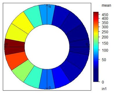
I have a dataset including wind speed and direction. I would like to show the average wind speed in different wind direction with equal intervals (see attached). I have already binned the wind direction data into equal intervals. I also converted the wind speed and wind direction to components 'u' and 'v' using u = ws * cos(θ) and v = ws * sin(θ). I only need help in making a plot similar to the attached.
Accepted Solutions
- Mark as New
- Bookmark
- Subscribe
- Mute
- Subscribe to RSS Feed
- Get Direct Link
- Report Inappropriate Content
Re: How can I make this polar plot in JMP?
This combines three of my least favorite things in dataviz (circular encoding, rainbow coloring, and means out of context), so of course I have to try it out!
The simplest thing to do is probably to use the computed x/y points and make a scatter plot of colored dots around a circle.
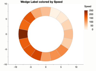
A fancy solution is to make a custom shape file where each shape is a wedge of the circle. Sometimes people do that for wafer maps so that each component can have a color.
For the circle, you have to know how many wedges you want in advance and refer to each by name. Here's what that can look like (I couldn't bring myself to use the rainbow):
Attached is a script that makes three data tables for this chart. Two data tables comprise the shape descriptions and the third one has the data, most random in this case. As long as you're happy with the wedges, you can use those files for different data tables. The trick is to set a column property called Shape Use in your data table to point to the shape tables.
Having gone wild and making a polar chart, I must at least point out this paper, Graphical Inference for Infovis, by Hadley Wickham et al, which has an incidental result where Cartesian coordinates were more effect than polar coordinates for wind data. Admittedly, they were unwilling to simplify down to a mean and were trying to show all the data.
- Mark as New
- Bookmark
- Subscribe
- Mute
- Subscribe to RSS Feed
- Get Direct Link
- Report Inappropriate Content
Re: How can I make this polar plot in JMP?
Open up the control panel and change the Summary Statistic within the Map Shapes option. (You can also get to it by right-clicking in the graph.) Not sure why the color stat is out of sync with it.
- Mark as New
- Bookmark
- Subscribe
- Mute
- Subscribe to RSS Feed
- Get Direct Link
- Report Inappropriate Content
Re: How can I make this polar plot in JMP?
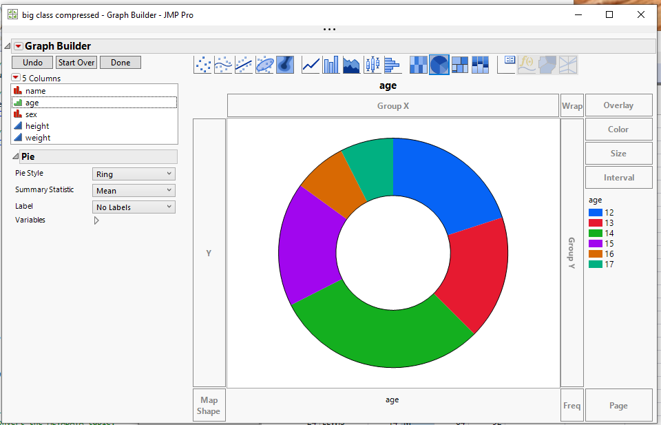
It appears that you can use Graph Builder Pie chart with the Ring style selection
- Mark as New
- Bookmark
- Subscribe
- Mute
- Subscribe to RSS Feed
- Get Direct Link
- Report Inappropriate Content
Re: How can I make this polar plot in JMP?
Thanks @txnelson . But I want equal sizes (because they are equal wind direction intervals) colored by average wind speed. Using pie chart, I get different sizes since the average wind speed in each wind interval is different.
- Mark as New
- Bookmark
- Subscribe
- Mute
- Subscribe to RSS Feed
- Get Direct Link
- Report Inappropriate Content
Re: How can I make this polar plot in JMP?
I was hoping I could make it by pre-summarizing the table using Tables->Summary and calculating the average wind speed by direction. Then I could use that wind speed column in the Color role in Graph Builder.
However, it doesn't look like pie charts support the color role. Maybe @XanGregg knows a tricky way. Else, add a wish for Color role support for pie charts to the Wish List.
- Mark as New
- Bookmark
- Subscribe
- Mute
- Subscribe to RSS Feed
- Get Direct Link
- Report Inappropriate Content
Re: How can I make this polar plot in JMP?
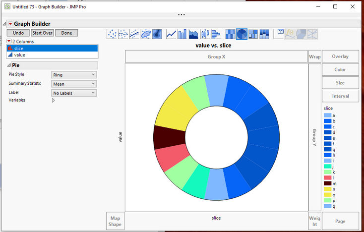
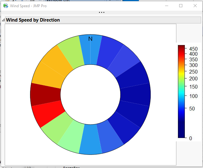
I thing I can get closer than I demonstrated to the Wind chart you want. All I have done is to define 17 categories, and use the Value Colors column property to set the colors.
I didn't work too hard on getting the blues as dark as your chart, but all of those colors can be referenced. Attached is the data table with the Value Colors set, and below is the script I used to produce the chart.
Graph Builder(
	Variables( X( :slice ), Y( :value ) ),
	Elements( Pie( X, Y, Legend( 3 ), Pie Style( "Ring" ) ) )
);- Mark as New
- Bookmark
- Subscribe
- Mute
- Subscribe to RSS Feed
- Get Direct Link
- Report Inappropriate Content
Re: How can I make this polar plot in JMP?
This combines three of my least favorite things in dataviz (circular encoding, rainbow coloring, and means out of context), so of course I have to try it out!
The simplest thing to do is probably to use the computed x/y points and make a scatter plot of colored dots around a circle.
A fancy solution is to make a custom shape file where each shape is a wedge of the circle. Sometimes people do that for wafer maps so that each component can have a color.
For the circle, you have to know how many wedges you want in advance and refer to each by name. Here's what that can look like (I couldn't bring myself to use the rainbow):
Attached is a script that makes three data tables for this chart. Two data tables comprise the shape descriptions and the third one has the data, most random in this case. As long as you're happy with the wedges, you can use those files for different data tables. The trick is to set a column property called Shape Use in your data table to point to the shape tables.
Having gone wild and making a polar chart, I must at least point out this paper, Graphical Inference for Infovis, by Hadley Wickham et al, which has an incidental result where Cartesian coordinates were more effect than polar coordinates for wind data. Admittedly, they were unwilling to simplify down to a mean and were trying to show all the data.
- Mark as New
- Bookmark
- Subscribe
- Mute
- Subscribe to RSS Feed
- Get Direct Link
- Report Inappropriate Content
Re: How can I make this polar plot in JMP?
@XanGregg Thanks so much!! this is great. The article was also very helpful. thanks for sharing.
Just a quick followup question: the summary statistics under Color does not seem to be responsive and it only shows the mean of data regardless of what I choose (e.g., min, max, etc.) Any suggestions on how to fix it?
- Mark as New
- Bookmark
- Subscribe
- Mute
- Subscribe to RSS Feed
- Get Direct Link
- Report Inappropriate Content
Re: How can I make this polar plot in JMP?
Open up the control panel and change the Summary Statistic within the Map Shapes option. (You can also get to it by right-clicking in the graph.) Not sure why the color stat is out of sync with it.
- Mark as New
- Bookmark
- Subscribe
- Mute
- Subscribe to RSS Feed
- Get Direct Link
- Report Inappropriate Content
Re: How can I make this polar plot in JMP?
Thanks @XanGregg !
- Mark as New
- Bookmark
- Subscribe
- Mute
- Subscribe to RSS Feed
- Get Direct Link
- Report Inappropriate Content
Re: How can I make this polar plot in JMP?
OK, so @XanGregg solution may be the best.......but there is a Pandemic going on, and I have too much time on my hands. So I have revisited my initial proposed solution, and formalized it into a script that takes the 16 directional wind speeds, and takes it all the way though the final graph. It uses the 0 to 450 color gradient, and has the same legend as the sample graph. Yup, this is my silliness, but it does work using Graph Builder's pie chart, plus some enhancements. Attached is the data table and the script.
Recommended Articles
- © 2026 JMP Statistical Discovery LLC. All Rights Reserved.
- Terms of Use
- Privacy Statement
- Contact Us
