cancel
Showing results for 
Show  only  | Search instead for 
Did you mean: 
  • DownloadSemiconductor Toolkit: Tools to create wafer maps, add wafer geometry to graphics, explore die defects & compare wafers.
  • Discovery Summit 2026: Early User Edition - September 23-24.Register. It's free.
  • See how to use JMP Pro to analyze and predict using entire data set rather than selected points in a curve. Register for Nov. 6 Mastering JMP.

Discussions

Solve problems, and share tips and tricks with other JMP users.
Choose Language Hide Translation Bar
hogi
Level XIII

Highlighting Axis labels corresponding to selected data points.

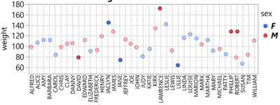
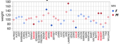
In Graph Builder, is there a functionality to highlight axis labels which correspond to selected data points?


Instead of a plot like this:

hogi_2-1682599527832.pnghogi_2-1682599527832.png


to get a plot like this:

hogi_1-1682599442909.pnghogi_1-1682599442909.png


1 REPLY 1
hogi
Level XIII

Re: Highlighting Axis labels corresponding to selected data points.

Not the same, but related - very elegant highlighting of close-by x labels in Plotly:

(view in My Videos)


Recommended Articles