- New to JMP? Let the Data Analysis Director guide you through selecting an analysis task, an analysis goal, and a data type. Available now in the JMP Marketplace!
- See how to install JMP Marketplace extensions to customize and enhance JMP.
- Subscribe to RSS Feed
- Mark Topic as New
- Mark Topic as Read
- Float this Topic for Current User
- Bookmark
- Subscribe
- Mute
- Printer Friendly Page
Discussions
Solve problems, and share tips and tricks with other JMP users.- JMP User Community
- :
- Discussions
- :
- Re: Help in plotting the RSM contour plot similar to the output in MINITAB (jmp...
- Mark as New
- Bookmark
- Subscribe
- Mute
- Subscribe to RSS Feed
- Get Direct Link
- Report Inappropriate Content
Help in plotting the RSM contour plot similar to the output in MINITAB (jmp 17 pro)
Hi there!
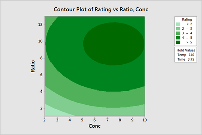
I'm trying to plot a contour graph in JMP similar to the example below, plotted via minitab:
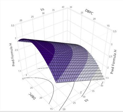
To make the response surface below on JMP, I saved the formula for the predicted response H in a column and plotted the following surface:
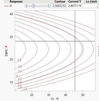
I would like to plot the projection of this response surface similar to the minitab example given, but I can only get the curves in the JMP surface predictor (which doesn't interest me, in this case: I want to plot it similar to the minitab example):
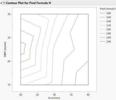
Plotting the contour via JMP's contour profile using the H saved prediction formula, I only get this not-at-all-satisfactory surface:
Any ideas on how to plot this contour similar to the one in mintab? with the curves not being polygonal and broken, with gradient filling and color legend?
Thanks for the time!
- Tags:
- windows
- Mark as New
- Bookmark
- Subscribe
- Mute
- Subscribe to RSS Feed
- Get Direct Link
- Report Inappropriate Content
Re: Help in plotting the RSM contour plot similar to the output in MINITAB (jmp 17 pro)
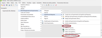
I would like to ask one more question: in Minitab, I have the response optimization tool to predict the best responses according to the constraints of various responses (maximize/minimize or target, for example).
I couldn't find any option in JMP for it to tell me the best results for such conditions, nor did I find where I can predict responses by typing the parameters I want in the model within the designated sample space.
- Mark as New
- Bookmark
- Subscribe
- Mute
- Subscribe to RSS Feed
- Get Direct Link
- Report Inappropriate Content
Re: Help in plotting the RSM contour plot similar to the output in MINITAB (jmp 17 pro)
You need to look at the Prediction Profiler. Optimization is under the red popup of the Profiler. From there look at Desirability. The Profiler also allows you to generate predictions for any combination of the factors. You can drag the red vertical lines to set the factors or click on the numbers in the axis area of the factors to type in the values that you want.
You really should look at the features of the Prediction Profiler. That is a fantastic tool for understanding a model.
- Mark as New
- Bookmark
- Subscribe
- Mute
- Subscribe to RSS Feed
- Get Direct Link
- Report Inappropriate Content
Re: Help in plotting the RSM contour plot similar to the output in MINITAB (jmp 17 pro)
I tested here and saw that I can maximize/minimize/target for each isolated response. Would it be possible to select the maximum height considering the other two answers? For example, in order of weight and importance of the answers: smallest variation in width for the smallest width and largest height, at the same time?
In the image posted, I only see the prediction of the variables for the isolated H response, correct?
- Mark as New
- Bookmark
- Subscribe
- Mute
- Subscribe to RSS Feed
- Get Direct Link
- Report Inappropriate Content
Re: Help in plotting the RSM contour plot similar to the output in MINITAB (jmp 17 pro)
Yes, the Prediction Profiler allows you to do multiple response optimization. When you select Analyze > Fit Model, simply put all of your responses in the response field of the dialog box. You can then check the "Fit Separately" box so that you can create different models for each response. With this setup the Prediction Profiler will have a row for each of the responses. The Desirability Function will allow you to define the objectives for each response and then when you maximize desirability, it will be finding the best balance of all responses.
If you have already fit your models in three separate Fit Model dialog boxes, save the prediction formulas to the data table. You can then use Graph > Prediction Profiler, specify all of the prediction formulas, and then perform the optimization as outlined above.
Again, I encourage you to read the online manuals for the Prediction Profiler to see the capabilities.
- Mark as New
- Bookmark
- Subscribe
- Mute
- Subscribe to RSS Feed
- Get Direct Link
- Report Inappropriate Content
Re: Help in plotting the RSM contour plot similar to the output in MINITAB (jmp 17 pro)
I am also curious to know why contour lines are smooth in contour profiler but not in contour plot (under graph menu). Are both using the predicted values?
- Mark as New
- Bookmark
- Subscribe
- Mute
- Subscribe to RSS Feed
- Get Direct Link
- Report Inappropriate Content
Re: Help in plotting the RSM contour plot similar to the output in MINITAB (jmp 17 pro)
Hi @OrdinaryShark22,
Contour Profiler uses Prediction formula (so model equation), so it enables smooth interpolation (depending on the model smoothness and complexity) : Example of the Contour Profiler
Contour plot can use any Y response, actual/measured response or Prediction response, and creates boundaries only based on data (by triangulation, no model behind), which is why you can expect less smooth boundaries. However in Graph Builder, you can improve the smoothness of boundaries by increasing the smoothness setting :
See Example of a Contour Plot in Graph Builder (jmp.com) and previous explanations from @Dan_Obermiller.
Hope this helps a better understanding between the different graphical results,
"It is not unusual for a well-designed experiment to analyze itself" (Box, Hunter and Hunter)
- « Previous
-
- 1
- 2
- Next »
Recommended Articles
- © 2026 JMP Statistical Discovery LLC. All Rights Reserved.
- Terms of Use
- Privacy Statement
- Contact Us
