- New to JMP? Let the Data Analysis Director guide you through selecting an analysis task, an analysis goal, and a data type. Available now in the JMP Marketplace!
- See how to install JMP Marketplace extensions to customize and enhance JMP.
- Subscribe to RSS Feed
- Mark Topic as New
- Mark Topic as Read
- Float this Topic for Current User
- Bookmark
- Subscribe
- Mute
- Printer Friendly Page
Discussions
Solve problems, and share tips and tricks with other JMP users.- JMP User Community
- :
- Discussions
- :
- Re: Heatmap - with borders
- Mark as New
- Bookmark
- Subscribe
- Mute
- Subscribe to RSS Feed
- Get Direct Link
- Report Inappropriate Content
Heatmap - with borders
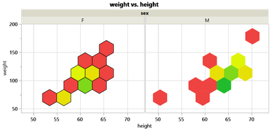
In some session with @jules I leaned how to make Heatmap Plots more attractive by adding some borders around the cells.
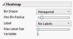
Other options - like the pattern - can be controlled via the Control Panel on the left.
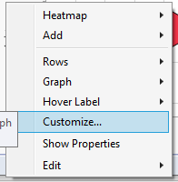
This one unfortunately not - it has to be applied via right Click into the graph/Customize... - and separately for each subplot.
On one hand, this is nice because every subplot can be configures individually - on the other hand: this can take some time.
If there are several open subplots, how can I change all subplots at once - and how can I change the setting, such that (when the data table is updated and new subplots appear the) new subplots start with linewidth=1?
Most of such right Click commands can be broadcasted to all subplots by pressing CTRL.
But for Customize ... this doesn't seem to be possible.
A trick is to remove all subplots by removing columns from Group X/Y, Wrap/Pages, apply the LineWidth and then add the columns again to the respective DropZones. But that takes some time.
Another Trick:
Send the command to all FrameBoxes of the current Graph via JSL.
But then there is still the issue when new Subplots show up (without the borders).
Anybod using Heatmaps with borders around the cells? And recommendations how to facilitate the usage?
Names Default to Here(1);
dt = Open( "$SAMPLE_DATA/Big Class.jmp" );
Graph Builder(
	Size( 454, 256 ),
	Show Control Panel( 0 ),
	Show Legend( 0 ),
	Summary Statistic( "Median" ),
	Graph Spacing( 4 ),
	Variables( X( :height ), Y( :weight ), Group X( :sex ), Overlay( :sex ) ),
	Elements( Heatmap( X, Y, Legend( 3 ), Bin Shape( "Hexagonal" ) ) ),
	SendToReport(
		Dispatch(
			{},
			"Graph Builder",
			FrameBox,
			{DispatchSeg( HexSeg( 1 ), Line Width( 1 ) )}
		)
	)
)
Accepted Solutions
- Mark as New
- Bookmark
- Subscribe
- Mute
- Subscribe to RSS Feed
- Get Direct Link
- Report Inappropriate Content
Re: Heatmap - with borders
Maybe customization copy+paste works in this case? Right click on the graph ->Edit -> Copy Customizations. Then go to other frame and same but Paste Customizations (I think you can also broadcast this with Ctrl).
- Mark as New
- Bookmark
- Subscribe
- Mute
- Subscribe to RSS Feed
- Get Direct Link
- Report Inappropriate Content
Re: Heatmap - with borders
nice trick :)
thanks.
- Mark as New
- Bookmark
- Subscribe
- Mute
- Subscribe to RSS Feed
- Get Direct Link
- Report Inappropriate Content
Re: Heatmap - with borders
Hi @hogi ,
you mention one option is to:
Send the command to all FrameBoxes of the current Graph via JSL.
If I don't know what the Group X values will be, how do I do this?
I presume I can do it by sending a message to the Framebox(es) something like this (where gb1 is a reference to the Graph Builder):
bordercode = "HexSeg( 1 ), {Line Width( 1 )}";
fnDef = Expr(
	(gb1 << xpath( "//FrameBox" )) << DispatchSeg( __aa__ )
);
Substitute Into( fnDef, Expr( __aa__ ),  parse( bordercode )  );
Parse( fnDef );
But I'm getting the following error:
Unexpected ",". Perhaps there is a missing ";" or ",".
Line 1 Column 13: HexSeg( 1 )►, {Line Width( 0.5 )}
The remaining text that was ignored was
,{Line Width(0.5)}
So I presume I'm formatting the message incorrectly. I've tried various combinations, with and without "Parse" etc but no luck.
Thank you for any suggestions!
- Mark as New
- Bookmark
- Subscribe
- Mute
- Subscribe to RSS Feed
- Get Direct Link
- Report Inappropriate Content
Re: Heatmap - with borders
fbs =current report() << xpath( "//FrameBox" );
fbs << {DispatchSeg( HexSeg( 1 ), Line Width( 1 ) )}Recommended Articles
- © 2026 JMP Statistical Discovery LLC. All Rights Reserved.
- Terms of Use
- Privacy Statement
- Contact Us


