- New to JMP? Let the Data Analysis Director guide you through selecting an analysis task, an analysis goal, and a data type. Available now in the JMP Marketplace!
- See how to install JMP Marketplace extensions to customize and enhance JMP.
- Subscribe to RSS Feed
- Mark Topic as New
- Mark Topic as Read
- Float this Topic for Current User
- Bookmark
- Subscribe
- Mute
- Printer Friendly Page
Discussions
Solve problems, and share tips and tricks with other JMP users.- JMP User Community
- :
- Discussions
- :
- Graph Builder - parallel Plot - missing entries
- Mark as New
- Bookmark
- Subscribe
- Mute
- Subscribe to RSS Feed
- Get Direct Link
- Report Inappropriate Content
Graph Builder - parallel Plot - missing entries
It is great that Graph Builder allows you to display multiple nominal values in parallel along an axis, either with points or via the parallel plot.
Please try Enhanced Sankey Plot (ESP) , provided by @jthi .
This type of plot is useful to visualize correlations and root causes in the data.
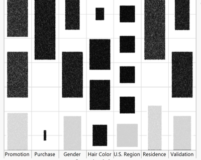
Unfortunately, if some of the entries have missing data, it's hard to distinguish between real "splits" - and accidental splits (missing vs. available data). This problem could be solved by increasing the transparency for missing data. Unfortunately, the only way I know how to selectively add transparency is: via the color dropzone. But due to the way the data is displayed in parallel, this is a dead end:
How can I generate a plot like this:
... or is there another, better way to mark missing data?
dt = Open( "$SAMPLE_DATA/Hair Care Product.jmp" );
for each({i},{1,3,6,8},
rows=associative array(J(1,50000,Random Integer(120000))) << get keys;
dt [rows,i] =J(n items(rows),1,.);
);

rows = dt << get rows where(contains(:Residence,"Rural"));

dt [rows,"Residence"] =J(n items(rows),1,.);

Graph Builder(
	Summary Statistic( "Median" ),
	Graph Spacing( 4 ),
	Variables(
		X( :Promotion ),
		X( :Purchase, Position( 1 ) ),
		X( :Gender, Position( 1 ) ),
		X( :Hair Color, Position( 1 ) ),
		X( :U.S. Region, Position( 1 ) ),
		X( :Residence, Position( 1 ) ),
		X( :Validation, Position( 1 ) )
	),
	Elements( Points( X( 1 ), X( 2 ), X( 3 ), X( 4 ), X( 5 ), X( 6 ), X( 7 )) )
);
- Mark as New
- Bookmark
- Subscribe
- Mute
- Subscribe to RSS Feed
- Get Direct Link
- Report Inappropriate Content
Re: Graph Builder - parallel Plot - missing entries
Maybe one option is to enable
- Mark as New
- Bookmark
- Subscribe
- Mute
- Subscribe to RSS Feed
- Get Direct Link
- Report Inappropriate Content
Re: Graph Builder - parallel Plot - missing entries
?
- Mark as New
- Bookmark
- Subscribe
- Mute
- Subscribe to RSS Feed
- Get Direct Link
- Report Inappropriate Content
Re: Graph Builder - parallel Plot - missing entries
You mean "disable" - hide completely, instead of adding some transparency?
Agree, better than showing ...
Recommended Articles
- © 2026 JMP Statistical Discovery LLC. All Rights Reserved.
- Terms of Use
- Privacy Statement
- Contact Us


