- JMP User Community
- :
- Discussions
- :
- For Smoother lines, can the volume/density of data be used to adjust the thickne...
- Subscribe to RSS Feed
- Mark Topic as New
- Mark Topic as Read
- Float this Topic for Current User
- Bookmark
- Subscribe
- Printer Friendly Page
- Mark as New
- Bookmark
- Subscribe
- Mute
- Subscribe to RSS Feed
- Get Direct Link
- Report Inappropriate Content
For Smoother lines, can the volume/density of data be used to adjust the thickness of the Smoother line?
I often use Smoother+Overlay to check how independent categorical variables affect dependent continuous variables in a time trend plot. But one issue I often encounter is when different categories have different volumes of data, the smoother lines are equally as big even if one category has 200 data points and another category has 4 data points. This can create busy plots where it's hard to distinguish the important signals. (And if I'm checking a large number of different independent variables in the Overlay role, it is tedious to exclude small-data-volume groups for each variable.)
Is there any way to do something similar to: make the Smoother line thicker if there's a high data volume, and thinner if there's less data? (Even BETTER would be if the line dynamically changed thickness depending on the deltaX between two points: e.g., if one category has two points 1 day apart and another category has two point 2 days apart, the smoother line for the first category would be ~twice as thick.)
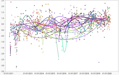
Here's the type of "busy graph" I'm dealing with: variable thickness lines would help me determine at a glance which signals are important and which ones aren't.
- Mark as New
- Bookmark
- Subscribe
- Mute
- Subscribe to RSS Feed
- Get Direct Link
- Report Inappropriate Content
Re: For Smoother lines, can the volume/density of data be used to adjust the thickness of the Smoother line?
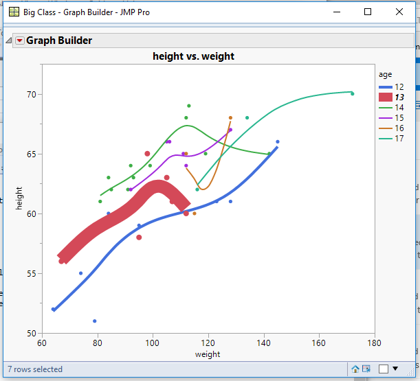
Other than manually changing the line thickness, once the graph is displayed, one would have to write a script to do this. If you are a script writer, it should not be a major task to do this. Below is an example hardwired script that will give you an idea of how to approach the task. It uses the Big Class sample data table as it's data source
Graph Builder(
	Variables( X( :weight ), Y( :height ), Overlay( :age ) ),
	Elements( Points( X, Y, Legend( 9 ) ), Smoother( X, Y, Legend( 10 ) ) ),
	SendToReport(
		Dispatch(
			{},
			"400",
			ScaleBox,
			{Legend Model(
				10,
				Properties( 0, {Line Width( 4 )}, Item ID( "12", 1 ) ),
				Properties( 1, {Line Width( 12 )}, Item ID( "13", 1 ) )
			)}
		)
	)
);
- Mark as New
- Bookmark
- Subscribe
- Mute
- Subscribe to RSS Feed
- Get Direct Link
- Report Inappropriate Content
Re: For Smoother lines, can the volume/density of data be used to adjust the thickness of the Smoother line?
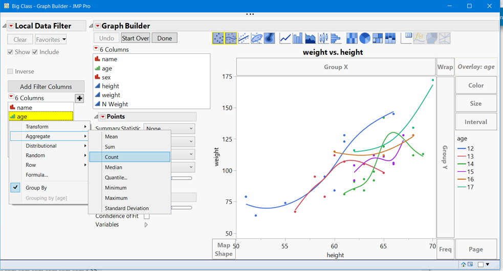
Local Data Filters, especially with Column transforms are quite useful for your task. Look at the screenshot below. You can do this by hand
- Create your GraphBuilder plot
- Add a Local Data Filter
- Select your category/Overlay/GroupBy column, in this example age. Right click and select Group By
- Right click again and select Aggregate > Count. If you have missing data, select your Y variable and select Aggregate>Count
- Hit the plus sign, to add this filter.
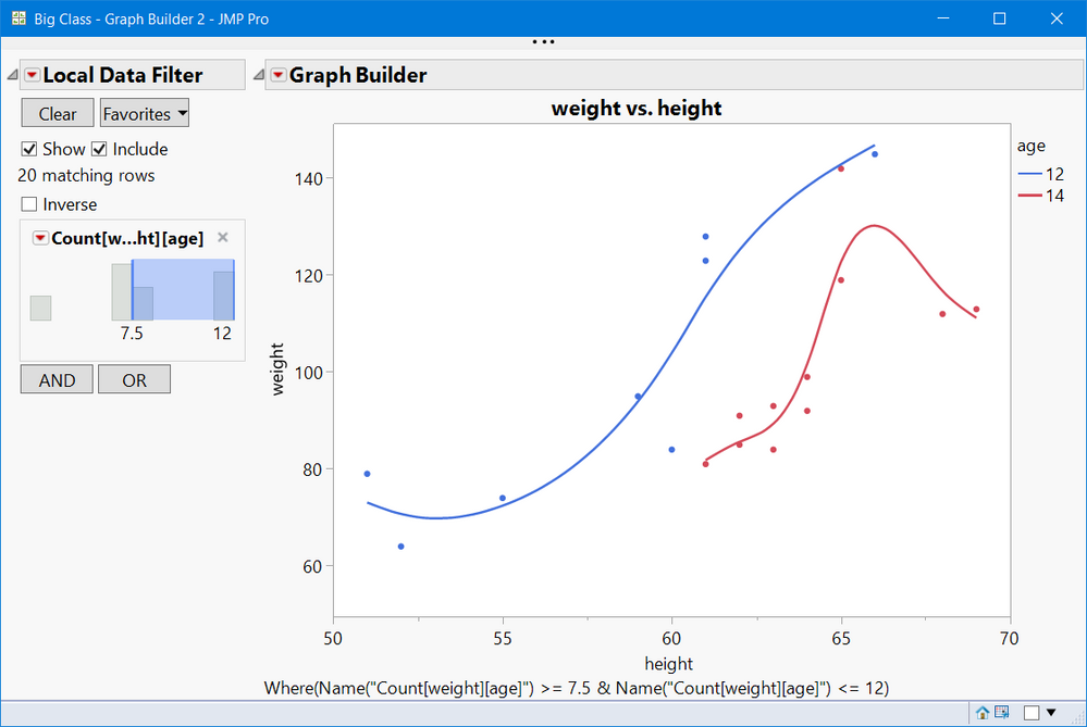
See the second screenshot picture. You can slide the bars for the relative size you want. Or even look at the low density data alone.
As @txnelson, Jim, mentioned this is fairly easy to script. See below. That said, "N", or count is not the best filter. Your data could have 200 values of weight vs. height for 12 year olds, and 180 value are all for 50< height < 53. In other words, no representation for tall kids.
This is not exactly what you want, but a data filter such as this can be quite useful when looking for nuggets of information on "messy" graphs. Note you can also make a context filter, where the filter applies to multiple graphs. Good luck with your search for something you can use now.
Graph Builder(
	Size( 615, 481 ),
	Show Control Panel( 0 ),
	Variables( X( :height ), Y( :weight ), Overlay( :age ) ),
	Elements( Points( X, Y, Legend( 50 ) ), Smoother( X, Y, Legend( 51 ) ) ),
	Local Data Filter(
		Add Filter(
			columns(
				Transform Column(
					"Count[weight][age]",
					Formula( Col Number( :weight, :age ) )
				)
			),
		)
	)
);
- Mark as New
- Bookmark
- Subscribe
- Mute
- Subscribe to RSS Feed
- Get Direct Link
- Report Inappropriate Content
Re: For Smoother lines, can the volume/density of data be used to adjust the thickness of the Smoother line?
Thanks for the method, that's very cool! Is there any way to get it to work when the column is of Data Type = Character? I've gotten your method to work when the data type is numeric, but when I right click on a column whose data type is Character I don't see an option for Aggregate.
- Mark as New
- Bookmark
- Subscribe
- Mute
- Subscribe to RSS Feed
- Get Direct Link
- Report Inappropriate Content
Re: For Smoother lines, can the volume/density of data be used to adjust the thickness of the Smoother line?
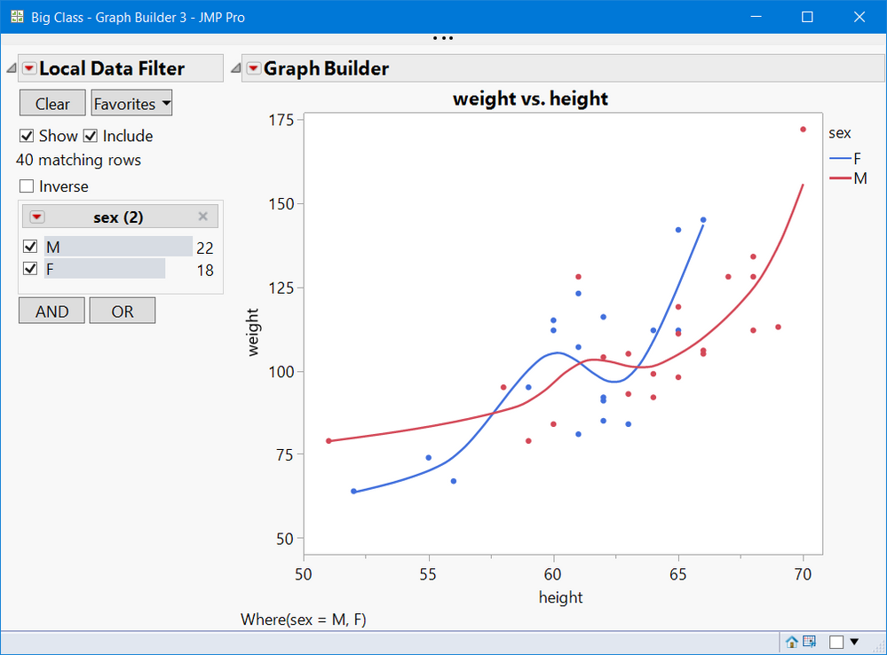
I suggest you just use, the categorical variable and select the Display Options: Check Box and Order by Count
Note you will get N and you can easily select multiple groups. The
Graph Builder(
	Size( 526, 474 ),
	Show Control Panel( 0 ),
	Variables( X( :height ), Y( :weight ), Overlay( :sex ) ),
	Elements( Points( X, Y, Legend( 22 ) ), Smoother( X, Y, Legend( 23 ) ) ),
	Local Data Filter(
		Add Filter(
			columns( :sex ),
			Display( :sex, "Check Box Display" ),
			Order By Count( :sex )
		)
	)
);
Hope that helps.
- © 2025 JMP Statistical Discovery LLC. All Rights Reserved.
- Terms of Use
- Privacy Statement
- Contact Us
