- Instantly extract effect sizes, F-ratios, and FDR-adjusted p-values from your models with the Calculate Effects Sizes extension, available now in the JMP Marketplace!
- New to JMP? Join us Sept. 23-24 for the Early User Edition of Discovery Summit, tailor-made for new users. Register now for free!
- See how to use the JMP Marketplace – Free tools to expand JMP capabilities. Register. July 10, 2 pm US Eastern Time.
- Subscribe to RSS Feed
- Mark Topic as New
- Mark Topic as Read
- Float this Topic for Current User
- Bookmark
- Subscribe
- Mute
- Printer Friendly Page
Discussions
Solve problems, and share tips and tricks with other JMP users.- JMP User Community
- :
- Discussions
- :
- Re: Fit Y by X - plot centered by block

- Mark as New
- Bookmark
- Subscribe
- Mute
- Subscribe to RSS Feed
- Get Direct Link
- Report Inappropriate Content
Fit Y by X - plot centered by block
Hi,
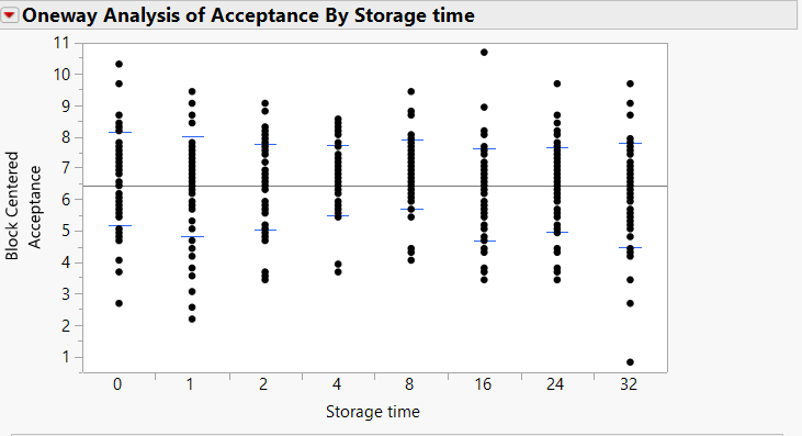
I am analyzing the data of a sensory test, in which participants had to indicate how acceptable they deem a sample for consumption. In this data, the acceptability scores they can give range from 1 to 9. In total 8 samples need to be evaluated. I have 50 different consumers who each evaluated the 8 samples. So I have 400 scores in total, and I want to take the variability between consumers into account by using consumer as a block variable in the Fit Y by X platform. I have also carried out this analysis with the Fit Model tool, by specifying consumer as a random effect. The results from both analyses provide me with the same p-value, but there is one thing that still puzzles me. In the Fit Y by X platform, a plot is produced of the response variable. Because I specified consumer as a block variable, the plot indicates that the Y-variable is centered by block (consumer). I assumed that centering meant mean-centering around the block mean per consumer, but I saw that there are now acceptability scores higher than 9, which is impossible, considering that all scores lie between 1 and 9. See the figure attached to see what I mean.
My question is, how does this block centering then work? How come there are block centered acceptability scores higher than the raw acceptability score? Thank you for your help!
Kind regards,
Accepted Solutions

- Mark as New
- Bookmark
- Subscribe
- Mute
- Subscribe to RSS Feed
- Get Direct Link
- Report Inappropriate Content
Re: Fit Y by X - plot centered by block
By group, I do mean the storage time for your situation.
In your case you are interested in seeing if there are differences between the storage times. You have this extra source of variability, consumer. If you were to just use Fit Y by X without the block, the picture would be misleading because of the consumer variability. You would have a hard time seeing the effect of the storage times because of the variability the consumer added. So what to do? Let's remove the effect of the consumer from the plot by centering for each block.
I think it may be easiest to see what is going on with a simple example. Let's use this data with two blocks and two groups (you can use consumer and storage time respectively if you like those names better):

Notice that the highest data point is on row 4, block 1, Group B. It has a value of 14. Now using Fit Y by X with Group as the X and Block going into the blocking role will give this plot:

The highest value looks to be around 11. What happened to the 14? From the red popup choose Means/Anova/Pooled t. Now look at the block means report:

The mean for block 1 is 12. The mean for block 2 is 6. The overall average is 9. So every observation in block 1 is 3 units higher than average. Everything in block 2 is 3 units lower than average. In order to remove the block effect, I can add or subtract 3 (depending on which block I am in) to remove the block effect. That is block centering.
Now look at the observations again. For Group B the original observations were 12, 14, 6, and 8. The 12 and 14 were in block 1, so we need to subtract 3 giving us 9 and 11. The 6 and 8 were in block 2, so we add 3. That gives 9 and 11. Those are the two points shown on the graph. If we were to add jitter to the graph, you would see there are two observations at 9 and two at 11. And, of course, a similar calculation is done for Group A.
The block centering is only removing the effect of the blocking variable so that you can more accurately see the differences between the treatments (levels of the X variable) in the picture. I hope this helps. I'm including the file for my simple example for convenience.
- Mark as New
- Bookmark
- Subscribe
- Mute
- Subscribe to RSS Feed
- Get Direct Link
- Report Inappropriate Content
Re: Fit Y by X - plot centered by block
Suppose the overall average for all of the data is 6. You happen to have one of the groups that has a low average, suppose it is 3. But you have quite a bit of data in that group so there is a value that is 9.
The centering says that items in that group must be raised (since the group average is low). What happens to the 9? It must go larger.
- Mark as New
- Bookmark
- Subscribe
- Mute
- Subscribe to RSS Feed
- Get Direct Link
- Report Inappropriate Content
Re: Fit Y by X - plot centered by block
- Mark as New
- Bookmark
- Subscribe
- Mute
- Subscribe to RSS Feed
- Get Direct Link
- Report Inappropriate Content
Re: Fit Y by X - plot centered by block
By group, I do mean the storage time for your situation.
In your case you are interested in seeing if there are differences between the storage times. You have this extra source of variability, consumer. If you were to just use Fit Y by X without the block, the picture would be misleading because of the consumer variability. You would have a hard time seeing the effect of the storage times because of the variability the consumer added. So what to do? Let's remove the effect of the consumer from the plot by centering for each block.
I think it may be easiest to see what is going on with a simple example. Let's use this data with two blocks and two groups (you can use consumer and storage time respectively if you like those names better):
Notice that the highest data point is on row 4, block 1, Group B. It has a value of 14. Now using Fit Y by X with Group as the X and Block going into the blocking role will give this plot:
The highest value looks to be around 11. What happened to the 14? From the red popup choose Means/Anova/Pooled t. Now look at the block means report:
The mean for block 1 is 12. The mean for block 2 is 6. The overall average is 9. So every observation in block 1 is 3 units higher than average. Everything in block 2 is 3 units lower than average. In order to remove the block effect, I can add or subtract 3 (depending on which block I am in) to remove the block effect. That is block centering.
Now look at the observations again. For Group B the original observations were 12, 14, 6, and 8. The 12 and 14 were in block 1, so we need to subtract 3 giving us 9 and 11. The 6 and 8 were in block 2, so we add 3. That gives 9 and 11. Those are the two points shown on the graph. If we were to add jitter to the graph, you would see there are two observations at 9 and two at 11. And, of course, a similar calculation is done for Group A.
The block centering is only removing the effect of the blocking variable so that you can more accurately see the differences between the treatments (levels of the X variable) in the picture. I hope this helps. I'm including the file for my simple example for convenience.
Recommended Articles
- © 2026 JMP Statistical Discovery LLC. All Rights Reserved.
- Terms of Use
- Privacy Statement
- Contact Us