- JMP User Community
- :
- Discussions
- :
- Fit Y by X -> plot -> Matching colum. Question: how highlight (differently) matc...
- Subscribe to RSS Feed
- Mark Topic as New
- Mark Topic as Read
- Float this Topic for Current User
- Bookmark
- Subscribe
- Printer Friendly Page
- Mark as New
- Bookmark
- Subscribe
- Mute
- Subscribe to RSS Feed
- Get Direct Link
- Report Inappropriate Content
Fit Y by X -> plot -> Matching colum. Question: how highlight (differently) matching points (eg, with White circle and Black circle)?
Fit Y (temperature) by X (two groups) -> got plot -> then I make “Matching colum” (I have colum: 0-survival patients, 1- dead)-> now I want highlight the survival patients with White Circle marker and died with Black circle. How to do it on plot? (I can do it in the data table, but do not know how to do it on graph.) Thanks!
Accepted Solutions
- Mark as New
- Bookmark
- Subscribe
- Mute
- Subscribe to RSS Feed
- Get Direct Link
- Report Inappropriate Content
Re: Fit Y by X -> plot -> Matching colum. Question: how highlight (differently) matching points (eg, with White circle and Black circle)?
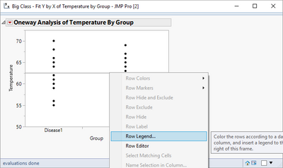
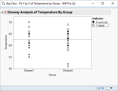
So now all you have to do is to create the graph. Rt mouse click on the graph and select Row Legend
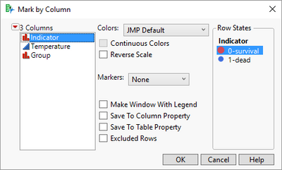
Select the Indicator column.
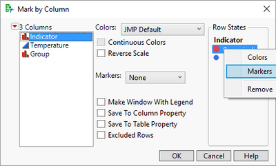
Right Mouse Click on the value in the Row State box, and change the colors and the markers to what you want, and then repeat the process for the second value of Indicator.
- Mark as New
- Bookmark
- Subscribe
- Mute
- Subscribe to RSS Feed
- Get Direct Link
- Report Inappropriate Content
Re: Fit Y by X -> plot -> Matching colum. Question: how highlight (differently) matching points (eg, with White circle and Black circle)?
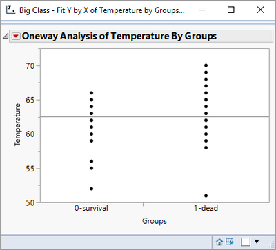
If I am understanding your question, you have a plot like the following:
And you want to color all of the 0-survival points one color and all of the 1-dead points a different color.
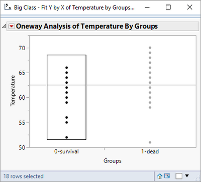
All you have to do, is to click on your mouse and drag it across all of the points you want to be grouped together for coloring, and then rt mouse click on one of the selected points and select Row Colors, and then select the color you want. If you want a different marker, repeat the rt mouse click and choose Row Markers.
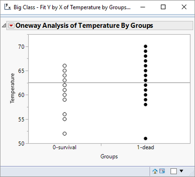
Repeat the operation for the 1-dead grouping and you will get the following chart
- Mark as New
- Bookmark
- Subscribe
- Mute
- Subscribe to RSS Feed
- Get Direct Link
- Report Inappropriate Content
Re: Fit Y by X -> plot -> Matching colum. Question: how highlight (differently) matching points (eg, with White circle and Black circle)?
Jim, thank you for the really useful information for me and I'm sorry that not clear written! I mean something other:
There are three columns:
1) Temperature
2) Group (disease1 and disease2) and
3) Indicator (alive -0, dead-1), so alive and dead can be in both groups!!!
Fit Y (temperature) by X (two groups: disease1 and disease2) -> got plot -> then I make “Matching colum” (I have indicator colum: 0-alive patients, 1- dead patients)-> now I want highlight the survival patients with White Circle marker and died with Black circle. How to do it on plot? (I can do it in the data table, but do not know how to do it on graph.) Thanks!
- Mark as New
- Bookmark
- Subscribe
- Mute
- Subscribe to RSS Feed
- Get Direct Link
- Report Inappropriate Content
Re: Fit Y by X -> plot -> Matching colum. Question: how highlight (differently) matching points (eg, with White circle and Black circle)?
So now all you have to do is to create the graph. Rt mouse click on the graph and select Row Legend
Select the Indicator column.
Right Mouse Click on the value in the Row State box, and change the colors and the markers to what you want, and then repeat the process for the second value of Indicator.
- Mark as New
- Bookmark
- Subscribe
- Mute
- Subscribe to RSS Feed
- Get Direct Link
- Report Inappropriate Content
Re: Fit Y by X -> plot -> Matching colum. Question: how highlight (differently) matching points (eg, with White circle and Black circle)?
Dear Jim, Thank You for your kindness and so clear explanation!
- © 2025 JMP Statistical Discovery LLC. All Rights Reserved.
- Terms of Use
- Privacy Statement
- Contact Us
