- Subscribe to RSS Feed
- Mark Topic as New
- Mark Topic as Read
- Float this Topic for Current User
- Bookmark
- Subscribe
- Mute
- Printer Friendly Page
Discussions
Solve problems, and share tips and tricks with other JMP users.- JMP User Community
- :
- Discussions
- :
- Filtering and plotting data
- Mark as New
- Bookmark
- Subscribe
- Mute
- Subscribe to RSS Feed
- Get Direct Link
- Report Inappropriate Content
Filtering and plotting data
Hello,
I would like to plot and identify outliers within say three different batches. Each batch contains about 80 values. What would be a good way to plot and highlight the outliers between these 3 batches?
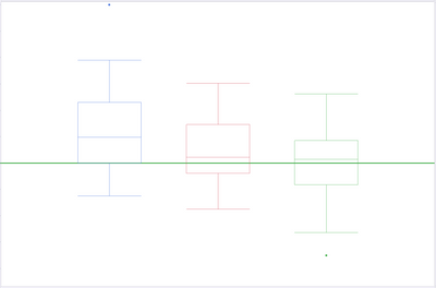
I thought maybe using the Animation feature in the local data filter to walk through the comparison would work, but I have a feeling that there's a better way. Here is an image that I was attempting to use. Those box plots will move up or down around the threshold. The idea was that as the Animation runs I could stop it to check which batch had a high or low outlier. But I wonder if there's a simpler way to show more data at once to capture the outliers between the batches.
Thanks so much for your help!
- Mark as New
- Bookmark
- Subscribe
- Mute
- Subscribe to RSS Feed
- Get Direct Link
- Report Inappropriate Content
Re: Filtering and plotting data
I would first take a look at the Outlier Analysis in
Analysis=>Screening=>Explore Outliers
- Mark as New
- Bookmark
- Subscribe
- Mute
- Subscribe to RSS Feed
- Get Direct Link
- Report Inappropriate Content
Re: Filtering and plotting data
Thank you so much! I've never used that function! I'm looking into that now. Will need to educate m'self a bit more about K Sigma, PCA outliers...etc. But I'm excited to learn if this would help.
- Mark as New
- Bookmark
- Subscribe
- Mute
- Subscribe to RSS Feed
- Get Direct Link
- Report Inappropriate Content
Re: Filtering and plotting data
Also checkout Understanding Outliers blog series by @JerryFish . In some of the episodes (2 and 3) he does the use Explore Outliers which @txnelson already mentioned
Recommended Articles
- © 2026 JMP Statistical Discovery LLC. All Rights Reserved.
- Terms of Use
- Privacy Statement
- Contact Us


