- New to JMP? Let the Data Analysis Director guide you through selecting an analysis task, an analysis goal, and a data type. Available now in the JMP Marketplace!
- See how to install JMP Marketplace extensions to customize and enhance JMP.
- Subscribe to RSS Feed
- Mark Topic as New
- Mark Topic as Read
- Float this Topic for Current User
- Bookmark
- Subscribe
- Mute
- Printer Friendly Page
Discussions
Solve problems, and share tips and tricks with other JMP users.- JMP User Community
- :
- Discussions
- :
- Creating plots with error bars with "Fit Yby X", "Graph Builder" or other option...
- Mark as New
- Bookmark
- Subscribe
- Mute
- Subscribe to RSS Feed
- Get Direct Link
- Report Inappropriate Content
Creating plots with error bars with "Fit Yby X", "Graph Builder" or other options
Hi,
How do I create plots with error bars based on "Fit y by x", Graph builder, other?
The question may refer to two ways to achieve the plots:
1. The error bars can be derived from explicitly from the data by creating columns of means, upper/lower errors, from which the plots are created, for e.g. time dependent data.
2. From the raw data by grouping several variables (columns) from which the means and STD/SDE are calculated (per row) and subsequently are used to create the Y by X plot ()means with the error bars (STD/SDE).
I have seen some examples using the Graph Builder using Bar format as intermediate stage, however, it seem not to work for me.
Thanks,
- Dean
- Mark as New
- Bookmark
- Subscribe
- Mute
- Subscribe to RSS Feed
- Get Direct Link
- Report Inappropriate Content
Re: Creating plots with error bars with "Fit Yby X", "Graph Builder" or other options
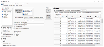
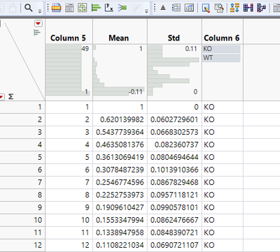
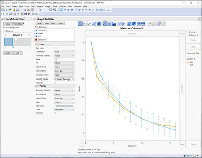
You could stack your data, rename columns, create category column. Then you can use Mean as Y, Std as Interval and the category column as Overlay
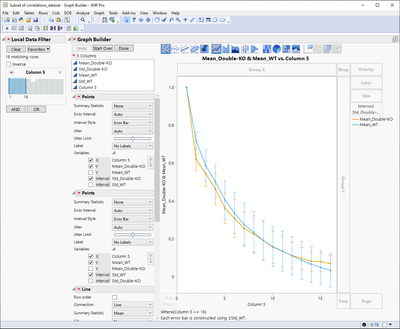
You can also do it from your data table but I think you will have to add multiple plots into your graph and disable variables correctly
Here is a script for that option, so you can maybe a bit easier get an idea how variables could be disabled
Graph Builder(
	Transform Column("Row", Formula(Row())),
	Size(545, 741),
	Show Control Panel(1),
	Variables(
		X(:Row),
		Y(:"Mean_Double-KO"n),
		Y(:Mean_WT, Position(1)),
		Interval(:"Std_Double-KO"n),
		Interval(:Std_WT)
	),
	Elements(
		Points(X, Y(1), Interval(1), Legend(4)),
		Points(X, Y(2), Interval(2), Legend(5)),
		Line(X, Y(1), Interval(0), Legend(6), Error Interval("None")),
		Line(X, Y(2), Interval(0), Legend(7), Error Interval("None"))
	),
	Local Data Filter(Add Filter(columns(Row), Where(:Row <= 16))),
	SendToReport(Dispatch({}, "Graph Builder", FrameBox, {Reference Line Order(6)}))
);- Mark as New
- Bookmark
- Subscribe
- Mute
- Subscribe to RSS Feed
- Get Direct Link
- Report Inappropriate Content
Re: Creating plots with error bars with "Fit Yby X", "Graph Builder" or other options
It's clear how to do this in Graph Builder. But any ways to accomplish the same in Fit Y by X? I'm kinda stuck with this platform for now. And with version 17.2
- « Previous
-
- 1
- 2
- Next »
Recommended Articles
- © 2026 JMP Statistical Discovery LLC. All Rights Reserved.
- Terms of Use
- Privacy Statement
- Contact Us


