Hi,
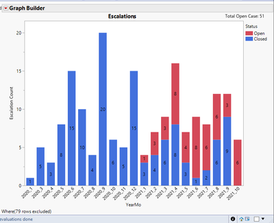
I have this bar graph below, which indicates total escalation cases for each month (YearMo).
I would like to create two similar bar graph, but with a line graph representing a trend. How can I add a line graph on top of this to show:
Line Graph 1. A mean line graph representing time to close trend (in days) for each YearMo?
Line Graph 2. A line graph representing total cases closed for each YearMo?
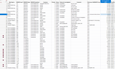
Here are the raw data:
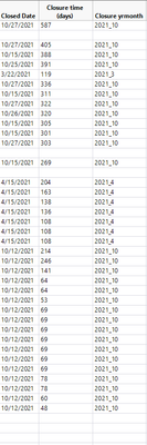
Hopefully, I provide enough information.
Thank you!