- Subscribe to RSS Feed
- Mark Topic as New
- Mark Topic as Read
- Float this Topic for Current User
- Bookmark
- Subscribe
- Mute
- Printer Friendly Page
Discussions
Solve problems, and share tips and tricks with other JMP users.- JMP User Community
- :
- Discussions
- :
- Create this type of graph
- Mark as New
- Bookmark
- Subscribe
- Mute
- Subscribe to RSS Feed
- Get Direct Link
- Report Inappropriate Content
Create this type of graph
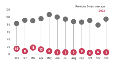
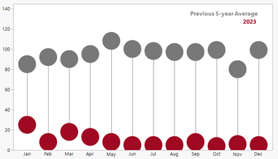
I have been asked to make a graph like the one below, comparing one year to another. But I have no idea how to do this in JMP (or anything else honestly). Can anyone help point me in the right direction?
- Tags:
- windows
- Mark as New
- Bookmark
- Subscribe
- Mute
- Subscribe to RSS Feed
- Get Direct Link
- Report Inappropriate Content
Re: Create this type of graph
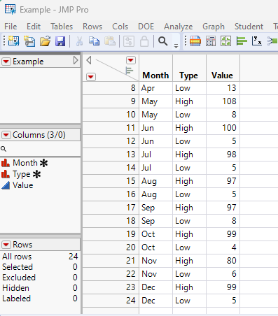
Here is one way to accomplish this. Given a data table
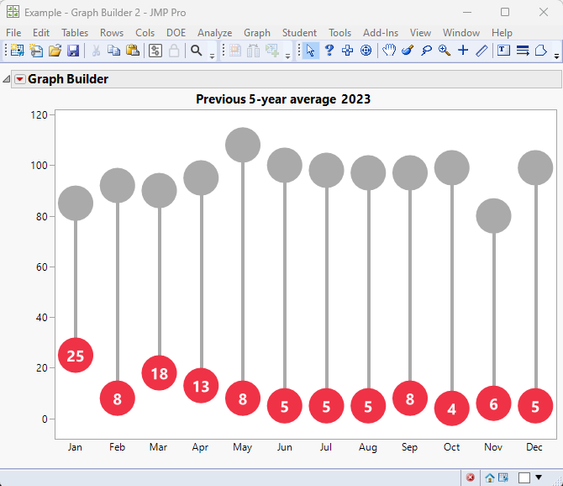
I produced the below chart, using Graph Builder, with Added graphics
Below is the JSL that produced the above graph
Names Default To Here( 1 );

dt = Data Table( "Example" );

gb = dt << Graph Builder(
	Size( 648, 450 ),
	Show Control Panel( 0 ),
	Variables( X( :Month ), Y( :Value ) ),
	Elements( Points( X, Y, Legend( 3 ), Error Interval( "Range" ) ) ),
	SendToReport(
		Dispatch(
			{},
			"Value",
			ScaleBox,
			{Min( -8.0923781757601 ), Max( 122.008163265306 ), Inc( 20 ),
			Minor Ticks( 0 )}
		),
		Dispatch(
			{},
			"400",
			ScaleBox,
			{Legend Model(
				3,
				Properties( 0, {Line Color( 16 )}, Item ID( "Value", 1 ) ),
				Properties( -1, {Line Color( 16 )}, Item ID( "Jan", 1 ) ),
				Properties( -1, {Line Color( 16 )}, Item ID( "Mean", 1 ) )
			)}
		),
		Dispatch(
			{},
			"graph title",
			TextEditBox,
			{Set Text( "Previous 5-year average  2023" )}
		),
		Dispatch( {}, "X title", TextEditBox, {Set Text( "" )} ),
		Dispatch( {}, "Y title", TextEditBox, {Set Text( "" )} ),
		Dispatch( {}, "400", LegendBox, {Legend Position( {3, [-1, -3]} )} )
	)
);

// Add the Circles and Lines
Report( gb )[FrameBox( 1 )] <<
Add Graphics Script(
	For Each Row(
		If( :Type == "High",
			Fill Color( "Gray" );
			theHigh = :Value;
			theLow = :Value[Row() + 1];
			Pen Color( "Gray" );
			Pen Size( 4 );
			X = Matrix( Floor( Row() / 2 ) ) || Matrix( Floor( Row() / 2 ) );
			y = Matrix( theHigh ) || Matrix( theLow );
			Line( X, Y );
			theList = {};
			Insert Into( theList, X[1] );
			Insert Into( theList, Y[1] );
			Circle( theList, 7, "Fill" );
		,
			Fill Color( "Red" );
			theList = {};
			Show( Floor( Row() - 1 ) );
			Insert Into( theList, Floor( (Row() - 1) / 2 ) );
			Insert Into( theList, :value );
			Circle( theList, 7, "Fill" );
			// Add the numerical value in the circle
			Text Color( "White" );
			// Subtract a fudge factor to better center the text
			theList[2] = :Value - 3;
			Text Font( "Segoe UI", 14, "Bold" );
			Text( Center Justified, theList, Char( :Value ) );
		)
	)
);- Mark as New
- Bookmark
- Subscribe
- Mute
- Subscribe to RSS Feed
- Get Direct Link
- Report Inappropriate Content
Re: Create this type of graph
This is helping a LOT. What if (instead of high and low) I wanted to do the year?
- Mark as New
- Bookmark
- Subscribe
- Mute
- Subscribe to RSS Feed
- Get Direct Link
- Report Inappropriate Content
Re: Create this type of graph
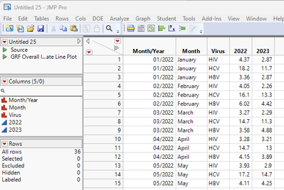
Here is the data file I am using. I really want to compare it month by (one for each virus) for 2022 and 2023.
- Mark as New
- Bookmark
- Subscribe
- Mute
- Subscribe to RSS Feed
- Get Direct Link
- Report Inappropriate Content
Re: Create this type of graph
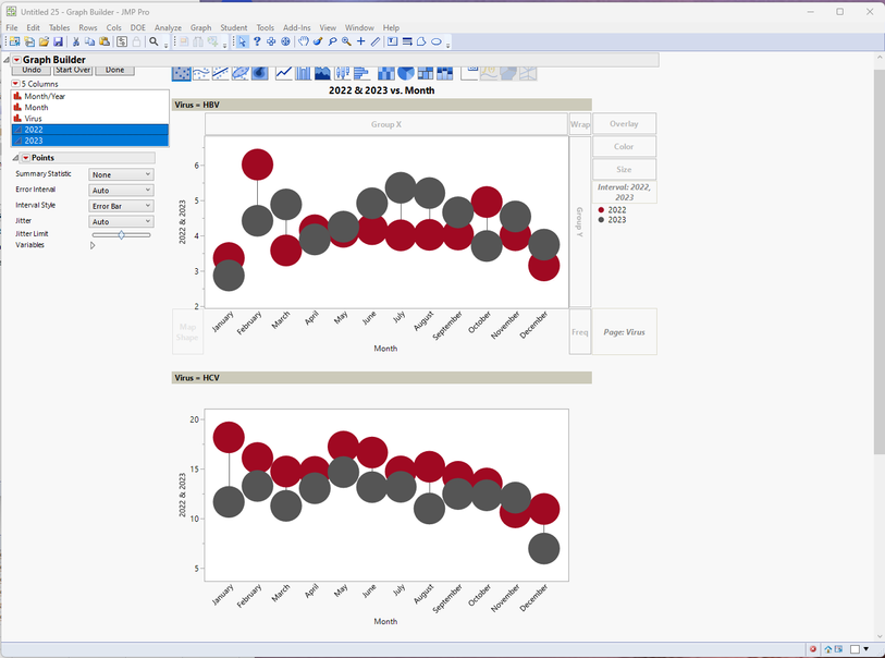
Using @scott_allen method(much better than mine), and your data I created these graphs interactively using Graph Builder.
The only things I had to do to your data was to
- subset the data keeping only the data for years 2022 and 2023.
- Split the subsetted data table using Tables=>Split,
- Split By: Year
- Split Columns: Rate
- Select "Keep All"
Using the new split data table
- Opened Graph Builder
- To make separate graphs for each virus, I selected Virus and dragged it to the Page drop sone.
- Selected the Month column and dragged it to the X axis drop zone
- Select both columns 2022 and 2023 and dragged them to the Y axis drop zone
- To relate the 2 year columns, select 2022 and 2023 and drag them to the Interval drop zone
- In the legend, right click on the blue dot and select Marker Size
- Select "Other"
- The type in 40
- Repeat step 6 for the red dot
- You can right click on the dots and change the colors to your liking
The most important thing to do is to read the documentation available under the Help Pull Down menu.
- Discovering JMP
- Using JMP
- Essential Graphing (in particular the section on Graph Builder)
- Mark as New
- Bookmark
- Subscribe
- Mute
- Subscribe to RSS Feed
- Get Direct Link
- Report Inappropriate Content
Re: Create this type of graph
Here is another way that gets you pretty close and does not require any scripting.
One way to get this style of graph is to re-shape your data table by splitting the data into two columns, then use those columns in the Interval Dropzone. I learned this trick from @scwise from one of his Pictures from the Gallery series. Everything else is changing colors, adding annotation boxes, and hiding various chart elements.
Hope this helps!
Recommended Articles
- © 2026 JMP Statistical Discovery LLC. All Rights Reserved.
- Terms of Use
- Privacy Statement
- Contact Us
