- New to JMP? Let the Data Analysis Director guide you through selecting an analysis task, an analysis goal, and a data type. Available now in the JMP Marketplace!
- See how to install JMP Marketplace extensions to customize and enhance JMP.
- Subscribe to RSS Feed
- Mark Topic as New
- Mark Topic as Read
- Float this Topic for Current User
- Bookmark
- Subscribe
- Mute
- Printer Friendly Page
Discussions
Solve problems, and share tips and tricks with other JMP users.- JMP User Community
- :
- Discussions
- :
- Create my own color map on correlation and correlation matrix
- Mark as New
- Bookmark
- Subscribe
- Mute
- Subscribe to RSS Feed
- Get Direct Link
- Report Inappropriate Content
Create my own color map on correlation and correlation matrix
reposting, I must have accidentally deleted the original post:
I am writing a teaching and demonstration script that will:
- Create a random covariance matrix of a specified size, and calculate the corresponding correlation matrix (C)
- Create random multivariate normal data with a specified number of rows and mean vector, based on the covariance matrix
- output the simulated data to a data table and run the multivariate platform analysis on that data
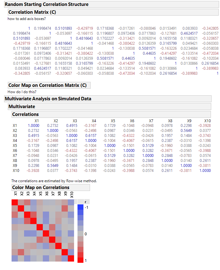
what I also want to include in the output of the script, in the report window, is a display of the starting correlation matrix (C) that I had created, and the corresponding color map, similar to what is shown in the multivariate platform for the estimated correlation matrix. I cannot figure out how to create the axis boxes for the correlation (C) matrix, nor how to create the color map on correlations of the C matrix.
Here is my script:
Names Default To Here( 1 );

//simulate multivariate normal data with random correlation
//number of rows of data
n = 10;
// number of variables
k = 20;
//create list of variable names
varlist = {};
For( ii = 1, ii <= k, ii++,
	Insert Into( varlist, "X" || Char( ii ) )
);
//create mean vector
meanvec = J( k, 1, 0 );
//create random M matrix
M = Diag( J( k, 1, 10 + Random Normal() ) );
//make empty E matrix
E = [];
//fill the E matrix
For( ii = 1, ii <= k, ii++,
	// create random eigenvector
	vec = J( k, 1, Random Uniform() - (0.5) );
	// normalize it
	vec = vec / Sqrt( vec` * vec );
	//append to E matrix
	E = E || vec;
);

// create covariance matrix from eigenvector (E) matrix and eigenvalue (M) matrix
covariance = E * M * E`;
// create correlation matrix by scaling covariance by the diagonal elements
correlation = J( k, k, . );
For( ii = 1, ii <= k, ii++,
	For( jj = 1, jj <= k, jj++,
		correlation[ii, jj] = covariance[ii, jj] / (Sqrt( covariance[ii, ii] * covariance[jj, jj] ))
	)
);

// simulate multivariate normal data
data = J( n, k, Random Normal() );

data = data * Sqrt( Diag( M ) ) * E`;

// make into data table
_dt_out = As Table( data, <<column names( varlist ) );
_dt_out << Set Name( "Simulated Multivariate Normal Data" );

// make an expression to create the run the multivariate platform on the simulated data table
createMultivariateExpr = Expr(
	xvarstring = "";
	For( ii = 1, ii <= k - 1, ii++,
		xvarstring = xvarstring || ":" || varlist[ii] || ", "
	);
	xvarstring = xvarstring || ":" || varlist[ii];
	multivarstring = "
Multivariate(
	Y(" || xvarstring ||
	" ),
	Estimation Method( \!"Row-wise\!" ),
	Matrix Format( \!"Square\!" ),
	Scatterplot Matrix(
		Density Ellipses( 1 ),
		Shaded Ellipses( 0 ),
		Ellipse Color( 3 )
	),
	Color Map on Correlations( 1 ),
	SendToReport( Dispatch( {}, \!"Scatterplot Matrix\!", OutlineBox, {Close( 1 )} ) )
)
";
	Eval( Parse( multivarstring ) );
);

New Window( "correlations",
	V List Box(
		Outline Box( "Random Starting Correlation Structure",
			V List Box(
				Outline Box( "Correlation Matrix (C)",
					Text Box( "how to add axis boxes?" ),
					_mb = Matrix Box( correlation )
					//how do I get axis boxes alongside and above the matrix box?
				),
				Outline Box( "Color Map on Correlation Matrix (C)",
			// how to do this???
					Text Box( "How do I do this?" )
				)

			)
		),
		Outline Box( "Multivariate Analysis on Simulated Data", createMultivariateExpr )

	)

);

_mb << Set Conditional Format( "Correlation" );
Here is an example output:
Accepted Solutions
- Mark as New
- Bookmark
- Subscribe
- Mute
- Subscribe to RSS Feed
- Get Direct Link
- Report Inappropriate Content
Re: Create my own color map on correlation and correlation matrix
Thanks, Mark, for the suggestion. I knew I could do it if I made the matrix into a stacked table and used graph builder or cell plot. I was just hoping that I could use the Cell Plot Box() display object, but I think that display element is only available to internal JMP functions, not through JSL. At least the Matrix Box() display element can be used via JSL.
I did come up with a work around, just using a graph box, that at least gets the color map (without axes labels). See below.
// start matrix color map script
names default to here(1);

corr_mat = [1 0 -1,
                0 1 .5,
                -1 .5 1];

_nw = New Window("Color Map",
     _gb=graph box(
           SuppressAxes,
           xscale(0,1),
           yscale(0,1),
           frame size(300,300),
           nr=nrows(corr_mat);
           nc=ncols(corr_mat);
           xinc=1/nc; yinc=1/nr;
           for(ii=1, ii<=nr, ii++,
                for(jj=1, jj<=nc, jj++,
                     fill color(heat color((corr_mat[ii,jj]+1)/2, <<"Blue to Gray to Red"));
                     Rect((jj-1)*xinc,
                           1-(ii-1)*yinc,
                           jj*xinc,
                           1-(ii*yinc),
                           1
                     )
                )
           );
     )
);
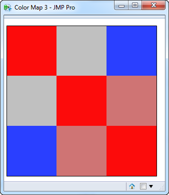
which gives this result for the 3x3 matrix
- Mark as New
- Bookmark
- Subscribe
- Mute
- Subscribe to RSS Feed
- Get Direct Link
- Report Inappropriate Content
Re: Create my own color map on correlation and correlation matrix
Why not use the color map of correlations in the Multivariate report?
We generally recommend using the built-in objects (entire platforms or specific display boxes in the report) as much as possible, rather than creating such objects from scratch.
It is easy to include such objects in your custom window. Just include data table reference << Multivariate( ... ) if you want the object to be 'live,' that is, respond with the usual interactivity or create the platform separately, clone the desired object, close the platform, and include or append the cloned object if interactivity is not required. (Note that you can deleted undesirable objects from the platform if you want to simplify the report for your purpose.)
- Mark as New
- Bookmark
- Subscribe
- Mute
- Subscribe to RSS Feed
- Get Direct Link
- Report Inappropriate Content
Re: Create my own color map on correlation and correlation matrix
I understand now that you have the correlations in a matrix, not in a platform. The following approach might work. If so, then it can be added to your script.
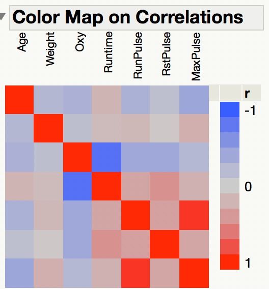
I used the Fitness data table from the JMP Sample Data folder. I selected Analyze > Multivariate Methods > Multivariate. I entered Oxy through MaxPulse in the Y role. Here is the result:
You want to make this map with your matrix of correlations.
- Right-click on this table and select Make Into Data Table. (Note that you would first save your matrix as a data table, add the corresponding Row column, and name the data columns appropriately.)
- Select Tables > Stack.
- Select Age through MaxPulse and click Stack.
- Enter Correlation for the data column name.
- Enter Column for the label column name.
- Click OK.
- Select Graph > Graph Builder.
- Drag Row to X.
- Drag Column to Y.
- Drag Correlation to Color.
- Click the Heat Map element at the top.
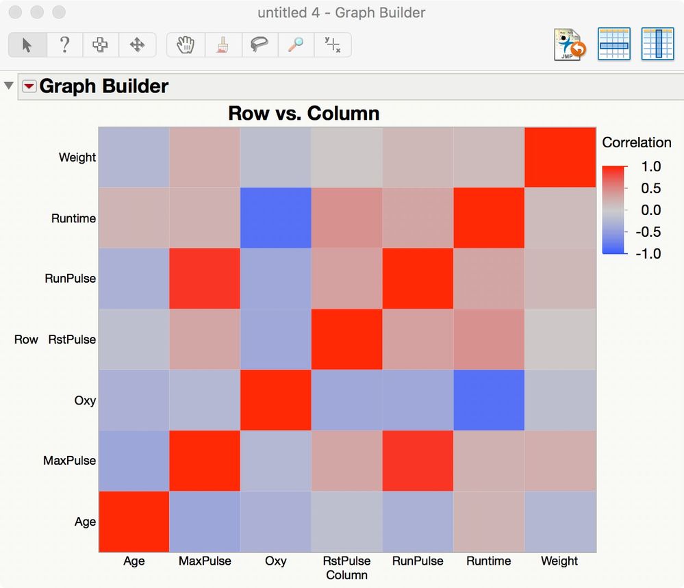
Here is the result:
So I think that you can use a few high level JMP objects to obtain the heat map that you want.
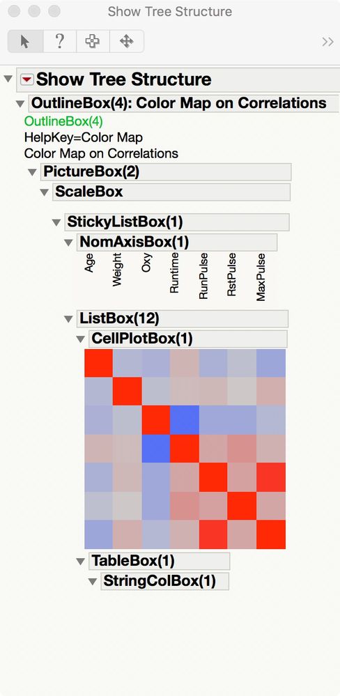
I don't think it would be possible to script the heat map from scratch given its structure in Multivariate platform but others might know a way. Here is the portion of the display tree for the correlations map shown above:
- Mark as New
- Bookmark
- Subscribe
- Mute
- Subscribe to RSS Feed
- Get Direct Link
- Report Inappropriate Content
Re: Create my own color map on correlation and correlation matrix
Thanks, Mark, for the suggestion. I knew I could do it if I made the matrix into a stacked table and used graph builder or cell plot. I was just hoping that I could use the Cell Plot Box() display object, but I think that display element is only available to internal JMP functions, not through JSL. At least the Matrix Box() display element can be used via JSL.
I did come up with a work around, just using a graph box, that at least gets the color map (without axes labels). See below.
// start matrix color map script
names default to here(1);

corr_mat = [1 0 -1,
                0 1 .5,
                -1 .5 1];

_nw = New Window("Color Map",
     _gb=graph box(
           SuppressAxes,
           xscale(0,1),
           yscale(0,1),
           frame size(300,300),
           nr=nrows(corr_mat);
           nc=ncols(corr_mat);
           xinc=1/nc; yinc=1/nr;
           for(ii=1, ii<=nr, ii++,
                for(jj=1, jj<=nc, jj++,
                     fill color(heat color((corr_mat[ii,jj]+1)/2, <<"Blue to Gray to Red"));
                     Rect((jj-1)*xinc,
                           1-(ii-1)*yinc,
                           jj*xinc,
                           1-(ii*yinc),
                           1
                     )
                )
           );
     )
);
which gives this result for the 3x3 matrix
- Mark as New
- Bookmark
- Subscribe
- Mute
- Subscribe to RSS Feed
- Get Direct Link
- Report Inappropriate Content
Re: Create my own color map on correlation and correlation matrix
You can do the same thing in Graph Builder, using a Shape Map. You can create a Shape map of 50x50 or larger, and then use it with any correlation matrix up to that dimention. The map will only display the elements it has data for, so you will only see the actual XxX matrix
Recommended Articles
- © 2026 JMP Statistical Discovery LLC. All Rights Reserved.
- Terms of Use
- Privacy Statement
- Contact Us

