- JMP User Community
- :
- Discussions
- :
- Create multiple overlay plots and link the x-axes for zooming?
- Subscribe to RSS Feed
- Mark Topic as New
- Mark Topic as Read
- Float this Topic for Current User
- Bookmark
- Subscribe
- Printer Friendly Page
- Mark as New
- Bookmark
- Subscribe
- Mute
- Subscribe to RSS Feed
- Get Direct Link
- Report Inappropriate Content
Create multiple overlay plots and link the x-axes for zooming?
Hi,
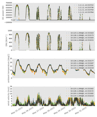
I'm working at a solar energy company and we often need to browse and inspect time-series of meteorological and electrical power data (see example plot below).
It would be useful if I could have several overlay plots (e.g. one with irradiance over time, one with temperature over time, one with electrical power over time) on one page and have the x-axes (always time in this case) linked, so if I zoom into e.g. one hour in one overlay plot, the others are automatically zoomed to the same time window.
Here you can see how typical plots look like - I would like to establish the same plot within JMP.
Thanks for any hint!
Tobias
Accepted Solutions
- Mark as New
- Bookmark
- Subscribe
- Mute
- Subscribe to RSS Feed
- Get Direct Link
- Report Inappropriate Content
Re: Create multiple overlay plots and link the x-axes for zooming?
Can be done in Graph Builder. Your data needs to be "stacked", with one column for date (x axis), one column identifying the Y variable (e.g. wind velocity, ambient temperature, etc.), and one column with Y values.
Here's an example done in JSL, that starts with unstacked data, stacks it, and then plots it.
dt1 = New Table( "Unstacked", Add Rows( 5 ),
New Column( "Date", Numeric, Continuous, Format( "m/d/y", 10 ),
Input Format( "m/d/y" ),
Set Values( [3502915200, 3505593600, 3508012800, 3510691200, 3513283200] ) ),
New Column( "Wind", Numeric, Continuous, Format( "Best", 12 ),
Set Values( [10, 20, 30, 20, 10] ) ),
New Column( "Temperature", Numeric, Continuous, Format( "Best", 12 ),
Set Values( [100, 20, 150, 175, 180] ) ),
New Column( "Power", Numeric, Continuous, Format( "Best", 12 ),
Set Values( [50, 51, 52, 53, 54] ) )
);
dt2 = Data Table( "Unstacked" ) << Stack(
columns( :Wind, :Temperature, :Power ),
Source Label Column( "Group" ),
Stacked Data Column( "Y Values" ),
Output Table( "Stacked" )
);
dt2 << Graph Builder(
Show Control Panel( 0 ),
Variables( X( :Date ), Y( :Y Values ), Group Y( :Group ), Color( :Group ) ),
Elements(
Line( X, Y, Legend( 3 ), Row order( 0 ), Summary Statistic( "Mean" ) )
)
);
- Mark as New
- Bookmark
- Subscribe
- Mute
- Subscribe to RSS Feed
- Get Direct Link
- Report Inappropriate Content
Re: Create multiple overlay plots and link the x-axes for zooming?
I hadn't thought about scripting this. Another approach does not require the stacking. I built the graph interactively with Graph Builder by just dragging the various Y columns to the Y-axis, one below the other. I then switched to the lines rather than data points. Here is the resulting script using Peter's unstacked data table:
Graph Builder(
Size( 534, 452 ),
Show Control Panel( 0 ),
Variables( X( :Date ), Y( :Wind ), Y( :Temperature ), Y( :Power ) ),
Elements( Position( 1, 1 ), Line( X, Y, Legend( 39 ) ) ),
Elements( Position( 1, 2 ), Line( X, Y, Legend( 40 ) ) ),
Elements( Position( 1, 3 ), Line( X, Y, Legend( 41 ) ) )
);
- Mark as New
- Bookmark
- Subscribe
- Mute
- Subscribe to RSS Feed
- Get Direct Link
- Report Inappropriate Content
Re: Create multiple overlay plots and link the x-axes for zooming?
Thanks DanO. I figured there was a way to do it using unstacked data but couldn't find the right "drop zone"!
- Mark as New
- Bookmark
- Subscribe
- Mute
- Subscribe to RSS Feed
- Get Direct Link
- Report Inappropriate Content
Re: Create multiple overlay plots and link the x-axes for zooming?
Thanks to both of you for showing me two ways how to get there! (I had not noticed yet that one can drag multiple columns to the y axis, one below the other).
- © 2025 JMP Statistical Discovery LLC. All Rights Reserved.
- Terms of Use
- Privacy Statement
- Contact Us


