cancel
Showing results for 
Show  only  | Search instead for 
Did you mean: 
  • DownloadSemiconductor Toolkit: Tools to create wafer maps, add wafer geometry to graphics, explore die defects & compare wafers.
  • Discovery Summit 2026: Early User Edition - September 23-24.Register. It's free.
  • Use JMP Clinical with CDISC-compliant data. Review studies, ID safety and efficacy signals & communicate findings with interactive graphics. Register to see how. Aug. 27, 2 pm US ET.

Discussions

Solve problems, and share tips and tricks with other JMP users.
Choose Language Hide Translation Bar
Marco2024
Level III

Could JMP show in a single graph a sensitivity analysis and the probability of occurrence of a result?

Hello Community!

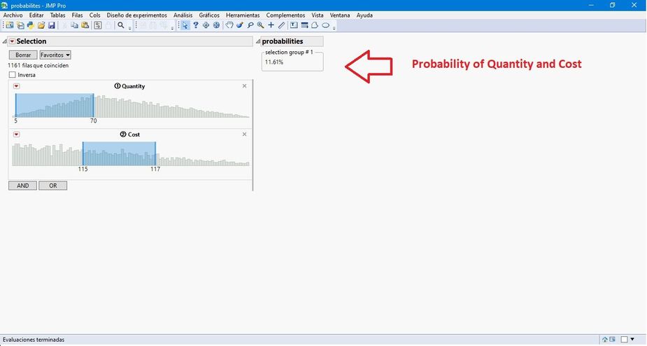
Attached is the script "Hogi chart calculates risk and probability", an excellent work by HOGI ... which calculates the risks and probabilities of occurrence of an input or multiple inputs (x), of an output or multiple outputs (Y) or their combination in a table. For example:

Marco2024_0-1727914143523.jpeg

Marco2024_1-1727914203306.jpeg

Would it be possible to expand the capacity of the script to make a sensitivity analysis of the inputs (x) of the table and show a graph with the most important and least important inputs (x), the Mean, Standard Deviation, Asymmetry, Kurtosis ... etc? ... for example:

Marco2024_2-1727914336848.jpeg

Greetings,

Marco


0 REPLIES 0

Recommended Articles