- New to JMP? Let the Data Analysis Director guide you through selecting an analysis task, an analysis goal, and a data type. Available now in the JMP Marketplace!
- See how to install JMP Marketplace extensions to customize and enhance JMP.
- Subscribe to RSS Feed
- Mark Topic as New
- Mark Topic as Read
- Float this Topic for Current User
- Bookmark
- Subscribe
- Mute
- Printer Friendly Page
Discussions
Solve problems, and share tips and tricks with other JMP users.- JMP User Community
- :
- Discussions
- :
- Re: Correlate Y by X with Multiple Items
- Mark as New
- Bookmark
- Subscribe
- Mute
- Subscribe to RSS Feed
- Get Direct Link
- Report Inappropriate Content
Correlate Y by X with Multiple Items
Hi,
I have a table which consist of few parametrics item that I want to check for correlation with respect to few X items at one time. Can I know what is the best way to do it as per attached file. I would like to have param1 vs param2 and param3 at the same time for correlation check and compare against 2 different Eval, T_Type and No_ID. I think in Graph Builder, I can do that but how about in Analyze section.
Thanks.
Accepted Solutions
- Mark as New
- Bookmark
- Subscribe
- Mute
- Subscribe to RSS Feed
- Get Direct Link
- Report Inappropriate Content
Re: Correlate Y by X with Multiple Items
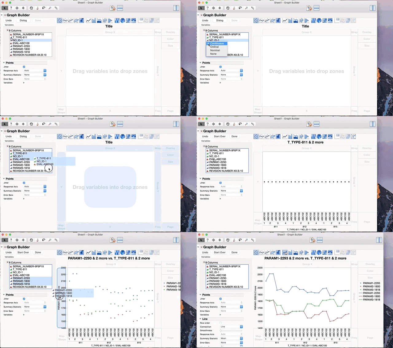
After importing your data into JMP change the modeling type of T-Type and No_ID to Ordinal or Nominal and then drag all three of your columns (Eval, No_ID and T-Type) to the X axis in Graph Builder. Then drag your three parameters to the Y axis. You can shift-click on the Line element to add the line.
- Mark as New
- Bookmark
- Subscribe
- Mute
- Subscribe to RSS Feed
- Get Direct Link
- Report Inappropriate Content
Re: Correlate Y by X with Multiple Items
Have you looked at 'Analyze > Multivariate Methods > Multivariate'? The script below runs this platform, using 'T_TYPE' (defined with Modeling Type Nominal) as a 'By' variable. Yyou can have more than one such variable.
Multivariate(Y( :PARAM1, :PARAM2, :PARAM3 ), By( :T_TYPE ));- Mark as New
- Bookmark
- Subscribe
- Mute
- Subscribe to RSS Feed
- Get Direct Link
- Report Inappropriate Content
Re: Correlate Y by X with Multiple Items
Thanks. Yes, I have tried that. Is it possible to have the By in this case the Eval,No_ID, T_Type appearing together(similar to MS Excel pivot chart.
Thanks.
- Mark as New
- Bookmark
- Subscribe
- Mute
- Subscribe to RSS Feed
- Get Direct Link
- Report Inappropriate Content
Re: Correlate Y by X with Multiple Items
If I assign all three of those variable to the 'By' role, there is one point in each scatterplot matrix (but maybe this is just sample data).
Anyway, given your comment about piovot chart, I'm now not sure if you are looking for a table. or a graph, or both. There are lots of good reasons why the last choice would be the best.
So, can you describe further or give an example of what you want?
- Mark as New
- Bookmark
- Subscribe
- Mute
- Subscribe to RSS Feed
- Get Direct Link
- Report Inappropriate Content
Re: Correlate Y by X with Multiple Items
Hi Ian,
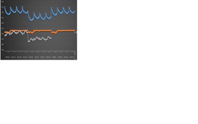
I'm looking into something like pareto chart whereby my Y-axis will gives me param1/param2/param3 while my X-axis will show me the Eval, No_ID and T-Type. Please refer to example as per attached.
Thanks.
- Mark as New
- Bookmark
- Subscribe
- Mute
- Subscribe to RSS Feed
- Get Direct Link
- Report Inappropriate Content
Re: Correlate Y by X with Multiple Items
After importing your data into JMP change the modeling type of T-Type and No_ID to Ordinal or Nominal and then drag all three of your columns (Eval, No_ID and T-Type) to the X axis in Graph Builder. Then drag your three parameters to the Y axis. You can shift-click on the Line element to add the line.
- Mark as New
- Bookmark
- Subscribe
- Mute
- Subscribe to RSS Feed
- Get Direct Link
- Report Inappropriate Content
Re: Correlate Y by X with Multiple Items
Thanks Jeff and Ian. I guess this is what I'm looking for :)
Recommended Articles
- © 2026 JMP Statistical Discovery LLC. All Rights Reserved.
- Terms of Use
- Privacy Statement
- Contact Us


