- New to JMP? Let the Data Analysis Director guide you through selecting an analysis task, an analysis goal, and a data type. Available now in the JMP Marketplace!
- See how to install JMP Marketplace extensions to customize and enhance JMP.
- Subscribe to RSS Feed
- Mark Topic as New
- Mark Topic as Read
- Float this Topic for Current User
- Bookmark
- Subscribe
- Mute
- Printer Friendly Page
Discussions
Solve problems, and share tips and tricks with other JMP users.- JMP User Community
- :
- Discussions
- :
- Re: Control chart spec limits bug
- Mark as New
- Bookmark
- Subscribe
- Mute
- Subscribe to RSS Feed
- Get Direct Link
- Report Inappropriate Content
Control chart spec limits bug
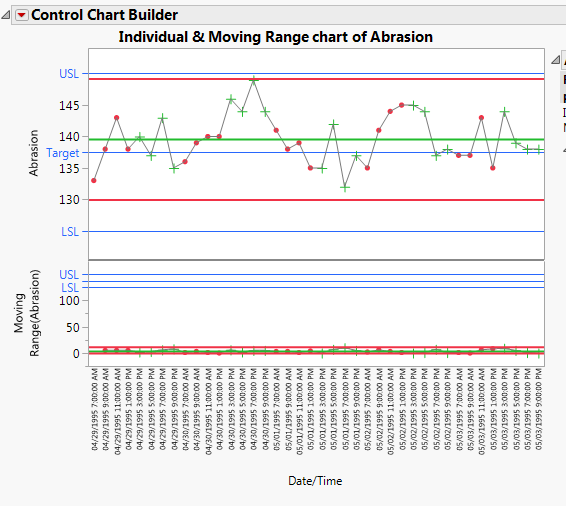
When you use the "control chart builder" on a column which has spec limits, those limits are plotted on both the Individual and Moving Range charts. It's useful to have the limits shown on the Individual chart, but they make no sense on the Moving Range chart and make the axis range useless.
Here's an example using data from the "Abrasion" sample data set (adding spec limits to the column before running control chart builder):
It's sometimes possible to remove the limits after the chart is created, but sometimes they reappear.
Also, I need to do this from a script--it's been difficult to determine how to access them.
Here's a script which starts with the sample data "Abrasion" already open (and spec limits added to the column "Abrasion"):
dt = Data Table("Abrasion");

dt << Control Chart Builder(
	Show Control Panel(0),
	Variables(X(Column("Date/Time")), Y(:Abrasion)
	)
);
Does anyone know what to add to this script to remove the undesired LSL/Target/USL lines from the Moving Range chart?
Accepted Solutions
- Mark as New
- Bookmark
- Subscribe
- Mute
- Subscribe to RSS Feed
- Get Direct Link
- Report Inappropriate Content
Re: Control chart spec limits bug
This is a known issue detailed in the following note. http://www.jmp.com/support/notes/59/378.html
This happens when you have Show as Graph Reference Lines checked in the column property. You can uncheck that in the column property either through the GUI or through JSL. To see the JSL syntax, use the Scripting Index.
If you wish to still have this checked, you can use the Remove Ref Line command to remove the reference lines from the graph. You can do this through the GUI or through JSL. To see the syntax, use the Scripting Index.
- Mark as New
- Bookmark
- Subscribe
- Mute
- Subscribe to RSS Feed
- Get Direct Link
- Report Inappropriate Content
Re: Control chart spec limits bug
Thanks!
Here's what the script looks like (note that you can use text names of ref lines instead of their values--not sure if this is documented anywhere):
dt = Data Table("Abrasion");

mycc = dt << Control Chart Builder(
	Show Control Panel(0),
	Variables(X(Column("Date/Time")), Y(:Abrasion)
	)
);

rmycc = mycc << report;
axisbox = rmycc[axis box(3)];
axisbox<<Remove Ref Line("LSL");
axisbox<<Remove Ref Line("Target");
axisbox<<Remove Ref Line("USL");
Recommended Articles
- © 2026 JMP Statistical Discovery LLC. All Rights Reserved.
- Terms of Use
- Privacy Statement
- Contact Us

