- New to JMP? Let the Data Analysis Director guide you through selecting an analysis task, an analysis goal, and a data type. Available now in the JMP Marketplace!
- See how to install JMP Marketplace extensions to customize and enhance JMP.
- Subscribe to RSS Feed
- Mark Topic as New
- Mark Topic as Read
- Float this Topic for Current User
- Bookmark
- Subscribe
- Mute
- Printer Friendly Page
Discussions
Solve problems, and share tips and tricks with other JMP users.- JMP User Community
- :
- Discussions
- :
- Color Map on Correlations
- Mark as New
- Bookmark
- Subscribe
- Mute
- Subscribe to RSS Feed
- Get Direct Link
- Report Inappropriate Content
Color Map on Correlations
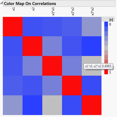
All, I am trying to come up with a nice qualitative explanation for the color map on correlations plot in the DOE Design Evaluation. My best explanation so far is that it is a measure of how distinguishable two effects are. For instance for the correlation plot below we can say that that main effects x1 and x2 are uncorrelated but the effects x1*x1 and x2*X2 have a correlation value near 0.5.
How close to reality would it be if I said that this meant that 50% of the energy in the x2*x2 effect (or fit coefficient) could potentially bleed into the x1*x1 effect and vice versa? This increases the variance and of course the confidence interval of any predictions made.
How would you explain it?
Thanks in advance,
Orthogonal
Accepted Solutions
- Mark as New
- Bookmark
- Subscribe
- Mute
- Subscribe to RSS Feed
- Get Direct Link
- Report Inappropriate Content
Re: Color Map on Correlations
I checked with a DOE expert whose response is below. My interpretation: The bottom line is that the numbers in the correlation matrix are not quantitatively interpretable. They only suggest where you're likely to find issues in the "real" measures (alias matrix and variance inflation factors). That's because the correlation matrix is based on the design matrix multiplied by it transpose, but the estimation is based on the inverse of that. Only when the matrix is very sparse do the numbers have direct correspondences in the estimation, because the inverse is simple in that case.
The Color Map on Correlations are the correlations arising from the Design Matrix (a Table Property if you select Save X Matrix before making the data table), and is useful to check how non-orthogonal a design may be. To quantify how this correlation manifests itself depends on how the effects are treated - we can take a look in the Design Evaluation.
If the terms are both in the model, the variance of those effect estimates and prediction variance will be increased - to see the difference in effect estimates compared to a perfectly orthogonal design (which may not exist), look under Design Evaluation and examine the Variance Inflation Factors (JMP 10) or Estimation Efficiencies (JMP 11).
If an effect is not estimated, it induces bias on the estimated effects. How the effects are biased can be seen through the Alias Matrix under Design Evaluation.
There is a very nice discussion on this in Chapter 2 of Goos and Jones (2011).
The Color Map on Correlations is great for a visual on the orthogonality of a design (one could even use the correlations as a metric), but both aliasing and estimation efficiency involve the inverse of (transpose(X) * X), which is why one should look to the other diagnostics if trying to quantify it in such a way.
Recommended Articles
- © 2026 JMP Statistical Discovery LLC. All Rights Reserved.
- Terms of Use
- Privacy Statement
- Contact Us

