- New to JMP? Let the Data Analysis Director guide you through selecting an analysis task, an analysis goal, and a data type. Available now in the JMP Marketplace!
- See how to install JMP Marketplace extensions to customize and enhance JMP.
- Subscribe to RSS Feed
- Mark Topic as New
- Mark Topic as Read
- Float this Topic for Current User
- Bookmark
- Subscribe
- Mute
- Printer Friendly Page
Discussions
Solve problems, and share tips and tricks with other JMP users.- JMP User Community
- :
- Discussions
- :
- Clustering X-Y graphs
- Mark as New
- Bookmark
- Subscribe
- Mute
- Subscribe to RSS Feed
- Get Direct Link
- Report Inappropriate Content
Clustering X-Y graphs
I've got some trending data for different identifiers and I want to identify similar trends using clustering. I'm not sure how to do this to cluster similar X-Y graphs together, or even if this is the correct way to analyze the data. Here's some sample data:
| Time Period | PT | RP |
| 1 | A |
.1 |
| 2 | A | .2 |
| 3 | A | .3 |
| 4 | A | .38 |
| 1 | B | .7 |
| 2 | B | .6 |
| 3 | B | .5 |
| 4 | B | .4 |
| 1 | C | .11 |
| 2 | C | .22 |
| 3 | C | .33 |
| 4 | C | .48 |
| 1 | D | .77 |
| 2 | D | .66 |
| 3 | D | .55 |
| 4 | D | .44 |
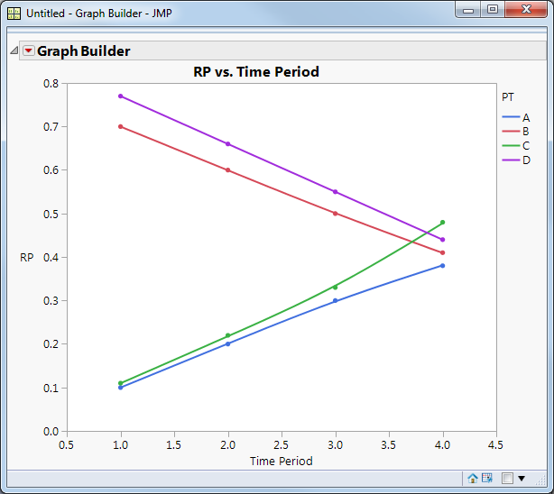
Graphing the data shows two similar groups, A+C and B+D:
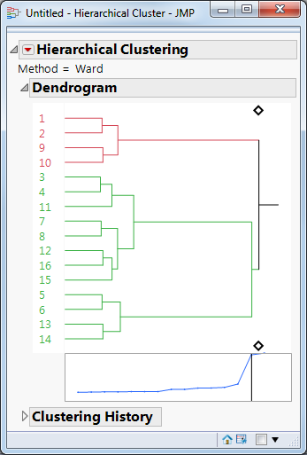
When I try cluster analysis I put Time Period, PT and RP in as Y variables, but the clustering isn't what I expected. If I set the clusters to two I get this:
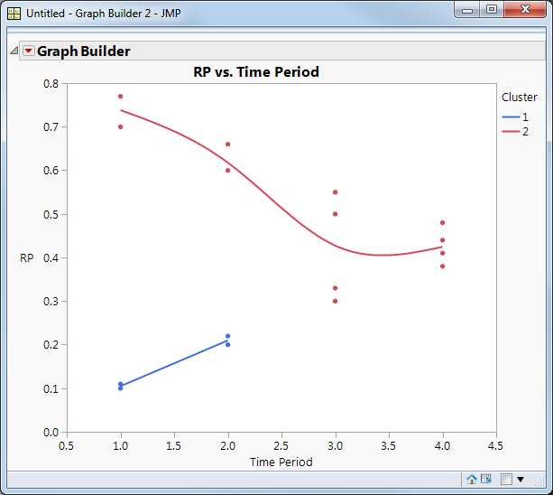
When I save the clusters and graph them it's got them grouped spatially; not seeming to take the PT identifier into account:
Any ideas? Thanks!
Accepted Solutions
- Mark as New
- Bookmark
- Subscribe
- Mute
- Subscribe to RSS Feed
- Get Direct Link
- Report Inappropriate Content
Re: Clustering X-Y graphs
I've done something very similar to what you're looking for using home price index data.
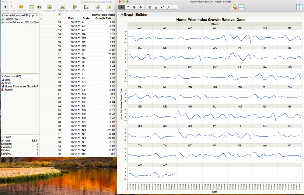
It starts off looking like this. One row for each Month/State combination. If I put that in Graph Builder I can see traces that look similar between States (e.g. NV and FL).
So, I want to find clusters of States where the Growth Rate is similar over the years.
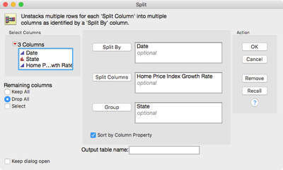
To do that, I'll need to reshape the data to get one row for each State (that's what I want to cluster) and one column for each Month (the variables I want to use to determine the clusters). To do that, I use Tables->Split.
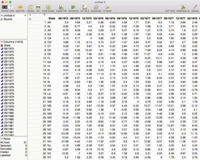
Which gives me a table like this. (NB: There are 51 rows because DC is in this data.)
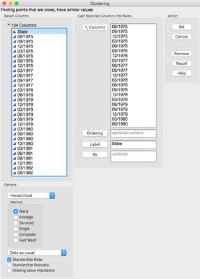
Now I can use Analyze->Clustering->Heirarchical Clustering to group the states.
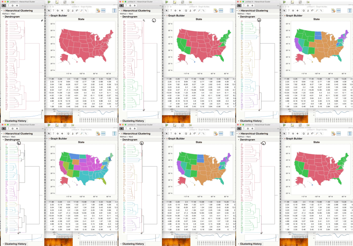
I usually turn on the Color Clusters options from the red triangle, and for this data, since it represents the States I bring up a map in Graph Builder alongside. Now, as I drag the thumb to choose how many clusters, I can see the map color as well.
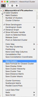
Once I've decided on the number of clusters, I save the cluster number to the table using the hotspot.
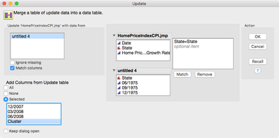
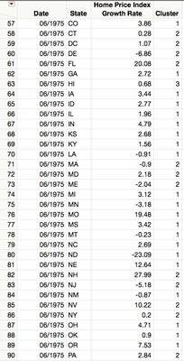
But that saves the number back to the table after the split and I want that cluster number in the original table. So, I use Tables->Update to get it there.
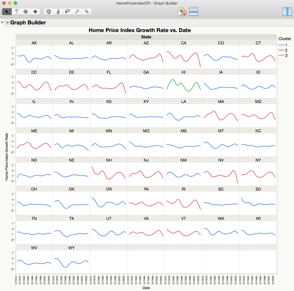
Now I can use the cluster number to color the traces from my original Graph Builder trellis to see how good it did matching the patterns. I do this by using Cluster in the Overlay role.
I only used three clusters here, there are probably more but I think it does a pretty good job of getting the wiggly States together and the flat states together. Hawaii is a statistical (as well as geographic!) outlier.
Hope that helps.
- Mark as New
- Bookmark
- Subscribe
- Mute
- Subscribe to RSS Feed
- Get Direct Link
- Report Inappropriate Content
Re: Clustering X-Y graphs
- Mark as New
- Bookmark
- Subscribe
- Mute
- Subscribe to RSS Feed
- Get Direct Link
- Report Inappropriate Content
Re: Clustering X-Y graphs
It looks like instead of clustering points you want to cluster PTs. You could:
- Fit lines or curves to each group
- Save the parameters in a combined data table
- Pivot/unpivot the table to have one row per PT and one column per parameter
- Cluster the parameter columns in the new table
Then you should see the two groups you point out.
- Mark as New
- Bookmark
- Subscribe
- Mute
- Subscribe to RSS Feed
- Get Direct Link
- Report Inappropriate Content
Re: Clustering X-Y graphs
Try spliting out on PT so each PT is a column with values for each time point. Then clustering Time Period using PT. Time Period would be on Y axis of Cluster and PT would be X axis (See attached JMP table)
The problem you will find is that Hiearchical Clustering in JMP uses Euclidean Distance to define the distance matrix. For your case, you would nee to use correlation since you are looking for correlated PTs over time.
After Spliting, you can using Multivariate to Cluster on Correlations.
Data Scientist, Life Sciences - Global Technical Enablement
JMP Statistical Discovery, LLC. - Denver, CO
Tel: +1-919-531-9927 ▪ Mobile: +1-303-378-7419 ▪ E-mail: chris.kirchberg@jmp.com
www.jmp.com
- Mark as New
- Bookmark
- Subscribe
- Mute
- Subscribe to RSS Feed
- Get Direct Link
- Report Inappropriate Content
Re: Clustering X-Y graphs
An added note. If you want to cluster on the correlations using Hierarchical Clustering, then you would need to save the correlation matrix from Multivariate as a data table, then create 4 more columns where a formula is created for each to subtract the correlation value from 1 so that you now have a "distance matrix" that can be used in Hierarchical Clustering (there is an option at the bottom left of the dialog to choose data is a distrance matrix).
If you choose this option, be aware that the new columns you make have to have the same lable and the "Row" Column which is used as a label in Hierchical Clustering. There you will see that AC and BD are clustered together (almost "perfectly" so).
Hope that helps.
Data Scientist, Life Sciences - Global Technical Enablement
JMP Statistical Discovery, LLC. - Denver, CO
Tel: +1-919-531-9927 ▪ Mobile: +1-303-378-7419 ▪ E-mail: chris.kirchberg@jmp.com
www.jmp.com
- Mark as New
- Bookmark
- Subscribe
- Mute
- Subscribe to RSS Feed
- Get Direct Link
- Report Inappropriate Content
Re: Clustering X-Y graphs
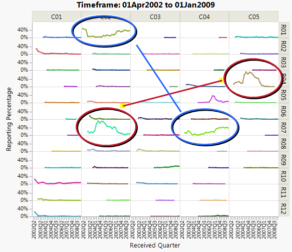
Thanks to both of you for your suggestions. Modeling the data is probably not a good option; this is what the data typically looks like:
As you can see this is time trending data. I would like to automatically detect that the red-circled trends are similar, and the blue-circled trends are similar.
- Mark as New
- Bookmark
- Subscribe
- Mute
- Subscribe to RSS Feed
- Get Direct Link
- Report Inappropriate Content
Re: Clustering X-Y graphs
Ya, I think you can get away with using Euclidean distances in that case given the nature and shape of the data. Spliting out the data, then clustering will help a lot. You can save the cluster numbers to the data table then stack it again to use teh cluster numbers to color.
I attached an example journal with data set and scripted buttons.
Data Scientist, Life Sciences - Global Technical Enablement
JMP Statistical Discovery, LLC. - Denver, CO
Tel: +1-919-531-9927 ▪ Mobile: +1-303-378-7419 ▪ E-mail: chris.kirchberg@jmp.com
www.jmp.com
- Mark as New
- Bookmark
- Subscribe
- Mute
- Subscribe to RSS Feed
- Get Direct Link
- Report Inappropriate Content
Re: Clustering X-Y graphs
Jeff Perkinson used to do a demonstration of exactly this problem based on profiles of house prices over time across states. The cluster analysis was performed on split data. Perhaps there is a video somewhere . . .
- Mark as New
- Bookmark
- Subscribe
- Mute
- Subscribe to RSS Feed
- Get Direct Link
- Report Inappropriate Content
Re: Clustering X-Y graphs
Couldn't find a video so I made one ...
- Mark as New
- Bookmark
- Subscribe
- Mute
- Subscribe to RSS Feed
- Get Direct Link
- Report Inappropriate Content
Re: Clustering X-Y graphs
I've done something very similar to what you're looking for using home price index data.
It starts off looking like this. One row for each Month/State combination. If I put that in Graph Builder I can see traces that look similar between States (e.g. NV and FL).
So, I want to find clusters of States where the Growth Rate is similar over the years.
To do that, I'll need to reshape the data to get one row for each State (that's what I want to cluster) and one column for each Month (the variables I want to use to determine the clusters). To do that, I use Tables->Split.
Which gives me a table like this. (NB: There are 51 rows because DC is in this data.)
Now I can use Analyze->Clustering->Heirarchical Clustering to group the states.
I usually turn on the Color Clusters options from the red triangle, and for this data, since it represents the States I bring up a map in Graph Builder alongside. Now, as I drag the thumb to choose how many clusters, I can see the map color as well.
Once I've decided on the number of clusters, I save the cluster number to the table using the hotspot.
But that saves the number back to the table after the split and I want that cluster number in the original table. So, I use Tables->Update to get it there.
Now I can use the cluster number to color the traces from my original Graph Builder trellis to see how good it did matching the patterns. I do this by using Cluster in the Overlay role.
I only used three clusters here, there are probably more but I think it does a pretty good job of getting the wiggly States together and the flat states together. Hawaii is a statistical (as well as geographic!) outlier.
Hope that helps.
- Mark as New
- Bookmark
- Subscribe
- Mute
- Subscribe to RSS Feed
- Get Direct Link
- Report Inappropriate Content
Re: Clustering X-Y graphs
Thank you Jeff and Dave for your very clear examples! This is exactly what I need.
Recommended Articles
- © 2026 JMP Statistical Discovery LLC. All Rights Reserved.
- Terms of Use
- Privacy Statement
- Contact Us

