Hi all,
This might sound like a simple question but I haven't figured out a way to make this work.
I ran a test on multiple samples and for each sample, the test outputs the percentages of the three different components that make up the sample.
I set up a data table with 4 columns: 1 for sample name and the other 3 for the percentages of the 3 components.
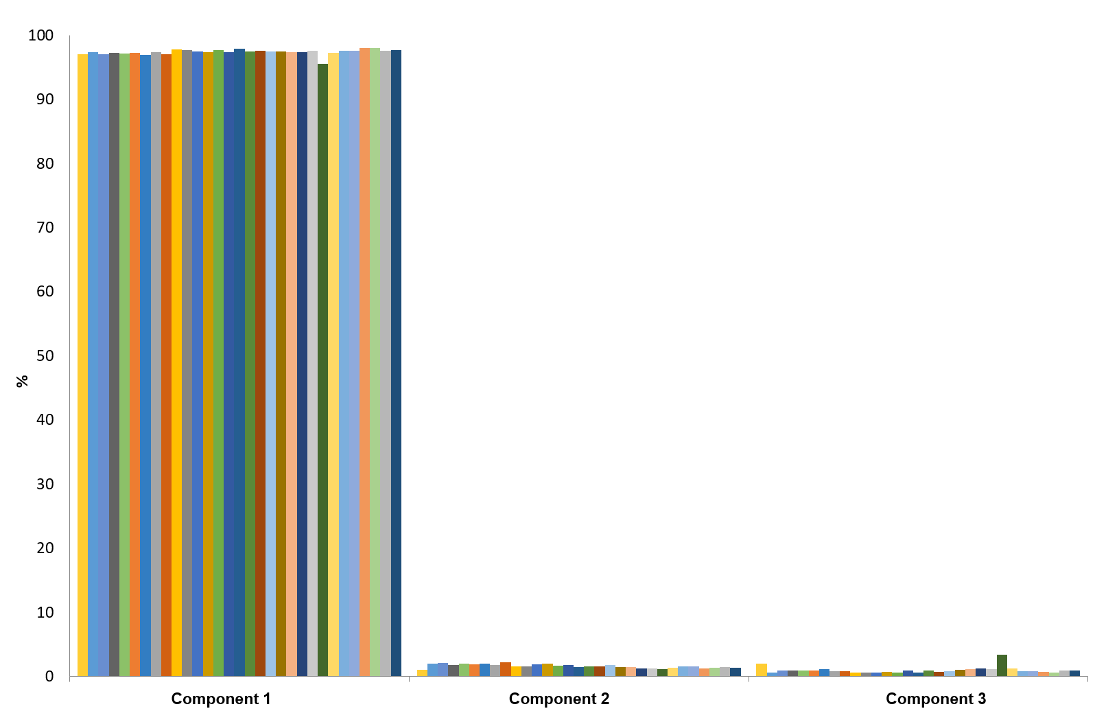
I'm trying to create a clustered bar chart as shown in the attached picture (done in Excel), where the data are grouped into 3 different clusters, corresponding to the 3 components.
I know that I could try stacking all the component columns first ("Clustering by Variable" described here); however that would make it into a super long table and hard to navigate (I have multiple types of tests, each outputting different components). Also, I would need to have 2 separate tables, one for the original data format which is easier to navigate and another for the clustered bar charts.
I'm thinking of two different methods to get around this.
1) For each test, plot the results for each component side by side. Is there a way to have them all share the same y-axis?
2) Using the column stacking method, is there any way I can combine the two tables into one so that I could have a saved script in the original table that would generate the clustered bar charts automatically as I click it? I'm aware that I could save the script that generates the stacked table but then I would still need to re-make the clustered bar charts.
Thank you!
