- New to JMP? Let the Data Analysis Director guide you through selecting an analysis task, an analysis goal, and a data type. Available now in the JMP Marketplace!
- See how to install JMP Marketplace extensions to customize and enhance JMP.
- Subscribe to RSS Feed
- Mark Topic as New
- Mark Topic as Read
- Float this Topic for Current User
- Bookmark
- Subscribe
- Mute
- Printer Friendly Page
Discussions
Solve problems, and share tips and tricks with other JMP users.- JMP User Community
- :
- Discussions
- :
- Chart is showing data I've excluded and not using data that should be included.
- Mark as New
- Bookmark
- Subscribe
- Mute
- Subscribe to RSS Feed
- Get Direct Link
- Report Inappropriate Content
Chart is showing data I've excluded and not using data that should be included.
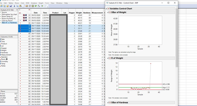
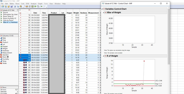
I've excluded data from my table and when I'm making an xbar control chart, JMP is pulling data that's one or two data points off from what I've hidden and excluded. I've highlighted the first and last points so you can see the data JMP is using to create the points.
I dont think the colors have anything to do with it. The charts were displaying the same information before I added the colors.
I'm a basic user, so I'm not into scripting and all that!
Should be running JMP 14.3.0
- Mark as New
- Bookmark
- Subscribe
- Mute
- Subscribe to RSS Feed
- Get Direct Link
- Report Inappropriate Content
Re: Chart is showing data I've excluded and not using data that should be included.
It is difficult to understand the issue with just the images you posted. There does not appear to be any averages plotted at all? It also looks like your subgrouping is questionable. If you attach the JMP table (go ahead and modify it to leave out sensitive columns) we can have a better look. I do see JMP is reporting that 154 samples were excluded.
- Mark as New
- Bookmark
- Subscribe
- Mute
- Subscribe to RSS Feed
- Get Direct Link
- Report Inappropriate Content
Re: Chart is showing data I've excluded and not using data that should be included.
You are using the legacy control chart. In the documentation, you will find the following: "Hide and Exclude operate only on the row state of the first observation in the sample. For example, if the second observation in the sample is hidden, but the first observation is not hidden, the sample still appears on the chart." Because the first observation in the sample is not hidden or excluded, all observations in that sample are used. I suggest using the more modern Control Chart Builder platform instead.
Recommended Articles
- © 2026 JMP Statistical Discovery LLC. All Rights Reserved.
- Terms of Use
- Privacy Statement
- Contact Us


