- New to JMP? Let the Data Analysis Director guide you through selecting an analysis task, an analysis goal, and a data type. Available now in the JMP Marketplace!
- See how to install JMP Marketplace extensions to customize and enhance JMP.
- Subscribe to RSS Feed
- Mark Topic as New
- Mark Topic as Read
- Float this Topic for Current User
- Bookmark
- Subscribe
- Mute
- Printer Friendly Page
Discussions
Solve problems, and share tips and tricks with other JMP users.- JMP User Community
- :
- Discussions
- :
- Re: Bubble plot, draw bubbles for a list of radius
- Mark as New
- Bookmark
- Subscribe
- Mute
- Subscribe to RSS Feed
- Get Direct Link
- Report Inappropriate Content
Bubble plot, draw bubbles for a list of radius
Hi all, I'm making a bubble plot where X, Y axis are longitudes and latitudes. I want to use bubbles to mark the range my radio can cover. For example, I have a list of radio ranges, 200 miles, 300 miles, etc. I want to use the 200, 300 etc as radius, the center is new york, and draw bubbles. Is this doable and how should I arrange my data tables? Thank you all!
- Tags:
- windows
- Mark as New
- Bookmark
- Subscribe
- Mute
- Subscribe to RSS Feed
- Get Direct Link
- Report Inappropriate Content
Re: Bubble plot, draw bubbles for a list of radius
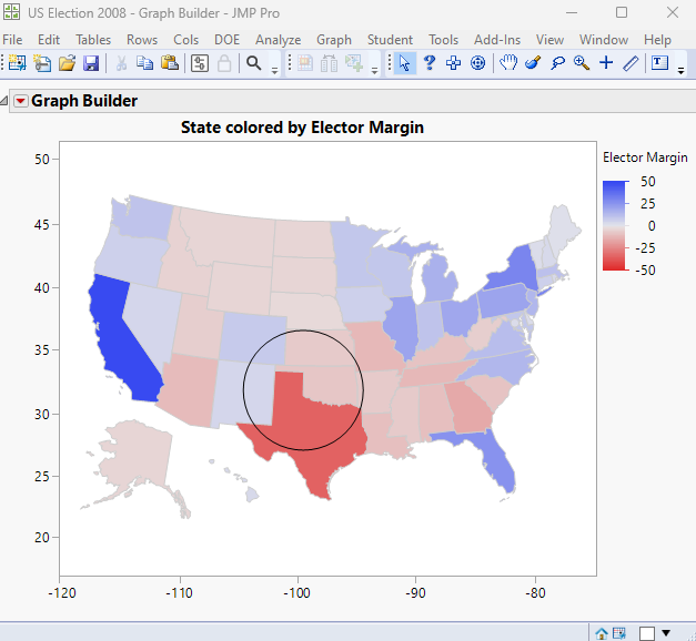
I do not believe that you will have much success in using the Bubble Plot platform for what you described. I believe that you can get what you want by using the Graph Builder platform, with a shape map, and then use JMP's graphic primitives to draw the circles centered exactly at the latitude and longitude you want, with the precise diameter you need. See "Add Graphics Script" for documentation on adding the circles to JMP output.
Here is a simple example
names default to here(1);
dt=// Open Data Table: US Election 2008.jmp
// → Data Table( "US Election 2008" )
Open( "$SAMPLE_DATA/US Election 2008.jmp" );

Graph Builder(
	Size( 528, 456 ),
	Show Control Panel( 0 ),
	Variables( Color( :Elector Margin ), Shape( :State ) ),
	Elements( Map Shapes( Legend( 9 ) ) ),
	SendToReport(
		Dispatch( {}, "", ScaleBox, {Format( "Best", 12 )} ),
		Dispatch( {}, "", ScaleBox( 2 ), {Format( "Best", 12 )} ),
		Dispatch(
			{},
			"Graph Builder",
			FrameBox,
			{Add Graphics Script( 4, Description( "" ), Circle( [-100, 35], 5 ) )}
		)
	)
)
- Mark as New
- Bookmark
- Subscribe
- Mute
- Subscribe to RSS Feed
- Get Direct Link
- Report Inappropriate Content
Re: Bubble plot, draw bubbles for a list of radius
Hello,
Technically, this is doable as a bubble plot--with a few caveats. Maybe someone will chime in with an easier way that I don't know about.
1) You will need to select geodesic scaling on your axes.
2) Because bubble "sizes" reflect areas and not radii, you need to use the squared radius as the size variable.
3) Since bubble plot bubbles do not change size when you drag axes, zoom, etc., you will need to "calibrate" by using the slider.
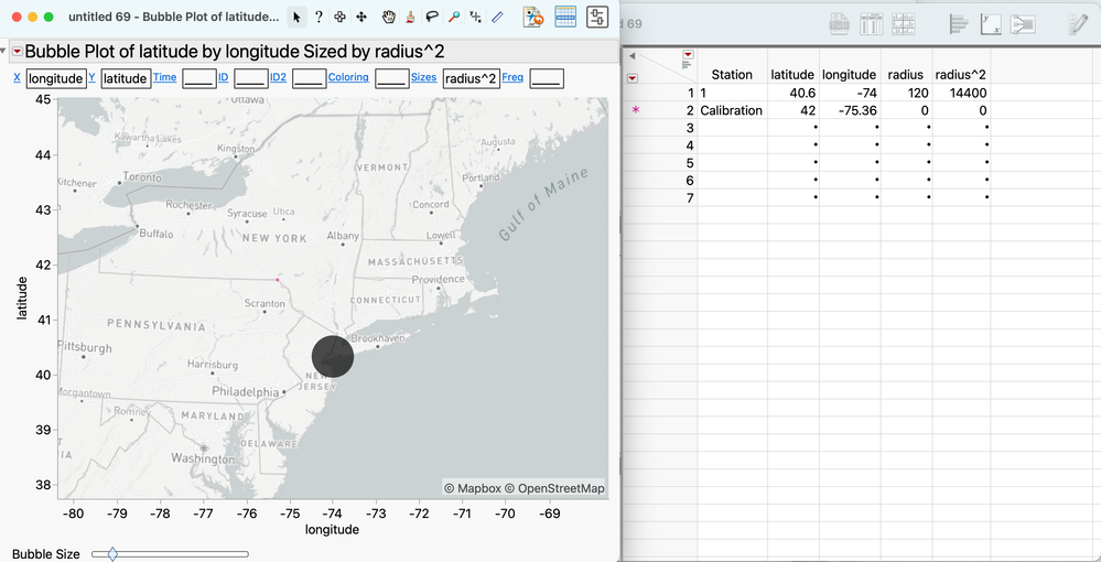
In the first screenshot below, we're all set up, but uncalibrated. I know that it is a distance of 120 miles from the center of the circle to the pink dot on the border of Pennsylvania, a little northeast of Scranton. This dot represents the data in row 2, which is included only for the purpose of calibration. You can place the calibration point anywhere you want on the circumference of one of your stations' signal footprint. If you use a radius of 0 for the calibration point, its bubble will remain a dot, regardless of scaling.
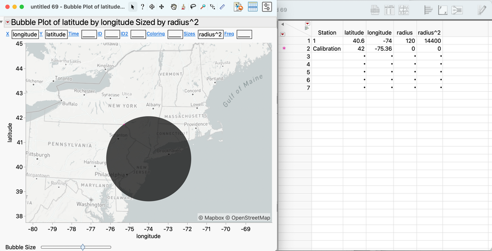
In the second screenshot, I've increased the bubble size until the bubble just touches the calibration point. At this point, all bubbles for the stations in rows 3+ should accurately reflect the range of their signals, provided station 1's bubble touches the calibration point and you've used the square of the radius as the sizing variable.
If you are willing to live with the inconvenience of re-calibrating when you change the graph axes, this approach lets you avoid scripting.
For more flexibility, go the route Jim recommends. You'll have to do some spherical trig to convert degrees to miles in your specific part of the globe, and learn how to work with graphics objects.
- Mark as New
- Bookmark
- Subscribe
- Mute
- Subscribe to RSS Feed
- Get Direct Link
- Report Inappropriate Content
Re: Bubble plot, draw bubbles for a list of radius
Thank you for your reply! This is exactly what I want, do you know how to set the slider bar to reflect specific number? right now it seems it doesn't depend on the radius^2 column...
- Mark as New
- Bookmark
- Subscribe
- Mute
- Subscribe to RSS Feed
- Get Direct Link
- Report Inappropriate Content
Re: Bubble plot, draw bubbles for a list of radius
You must adjust the slider bar manually to get the radius touching the calibration point. Well, you don't HAVE to do it manually, but in my opinion, if you know enough about JSL to do it completely via scripting, then you know enough about JSL to use Jim's approach... and if that's the case, you should use Jim's approach!
Recommended Articles
- © 2026 JMP Statistical Discovery LLC. All Rights Reserved.
- Terms of Use
- Privacy Statement
- Contact Us


