- Subscribe to RSS Feed
- Mark Topic as New
- Mark Topic as Read
- Float this Topic for Current User
- Bookmark
- Subscribe
- Mute
- Printer Friendly Page
Discussions
Solve problems, and share tips and tricks with other JMP users.- JMP User Community
- :
- Discussions
- :
- Re: Automating curve alignment based on a midpoint?
- Mark as New
- Bookmark
- Subscribe
- Mute
- Subscribe to RSS Feed
- Get Direct Link
- Report Inappropriate Content
Automating curve alignment based on a midpoint?
I am trying to figure out the best way to script aligning geometric shape data I am collecting from a sensor. The part we are measuring is 'bottom aligned', and we get 250 equally spaced points starting from a fixed z-height. The problem is that parts are not all exactly the same height, and the goal is to understand the differences in features near the top, relative to a flange that helps secure the part in final application.
On the good side we get measurements of the side of the flange and the dimension of the part below that is always significantly smaller - so we can get the midpoint between the edge of the flange and the lower dimension. That is how I am manually aligning the data now - finding the X that is closest to the midpoint Y value between the two dimensions. (of course, for different fixture types, the absolute and relative values of the two dimensions differ).
Any thoughts on how to do this alignment? I know I can find the Max and Min of the final ~50 data points and the average will be right most of the time ... but is there a way to index backwards to find the matching X value and then set up a column to assign that as the new 'zero'?
Thanks!
(I cannot share the actual data, unfortunately)
- Mark as New
- Bookmark
- Subscribe
- Mute
- Subscribe to RSS Feed
- Get Direct Link
- Report Inappropriate Content
Re: Automating curve alignment based on a midpoint?
I understand about the data confidentiality. But would you be able to share a schematic of how a typical part falls in relation to the fixed measurement locations you mention? I imagine a rigid body in a two-dimensional field of view (with some changes in scale and shape from part to part), but I could be wrong.
Also, what quantity is actually being measured?
- Mark as New
- Bookmark
- Subscribe
- Mute
- Subscribe to RSS Feed
- Get Direct Link
- Report Inappropriate Content
Re: Automating curve alignment based on a midpoint?
Do you use JMP Pro? JMP Pro includes the Functional Data Explorer. You data (curves) can be considered as functions and analyzed as such. The FDE includes data processing features including alignment. The dynamic time warping function might work very well in your case. (Time is often the domain of functions, hence the name, but it doesn't have to be time.)
- Mark as New
- Bookmark
- Subscribe
- Mute
- Subscribe to RSS Feed
- Get Direct Link
- Report Inappropriate Content
Re: Automating curve alignment based on a midpoint?
Thanks for the replies - I am using JMP Pro 15.1, and had looked at FDE but was stuck on the 'align to what' question.
So I am attaching a generic example that illustrates the point. In this example I would like to create a '0' alignment at the midpoint that occurs around point 200 and slide each of the four curves so that they all cross through that point. I know in this example the four graphs are pretty close to aligned, but this isn't always the case. The actual base occurs well below where we start measuring.
- Mark as New
- Bookmark
- Subscribe
- Mute
- Subscribe to RSS Feed
- Get Direct Link
- Report Inappropriate Content
Re: Automating curve alignment based on a midpoint?
I am not sure what you ultimately want to do with these curves, but the FDE did a nice job with them!
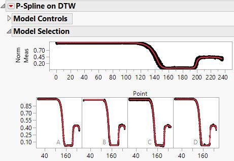
The dynamic time warping aligned all four curves. I aligned them to curve A. A linear P-spline model fits the data well.
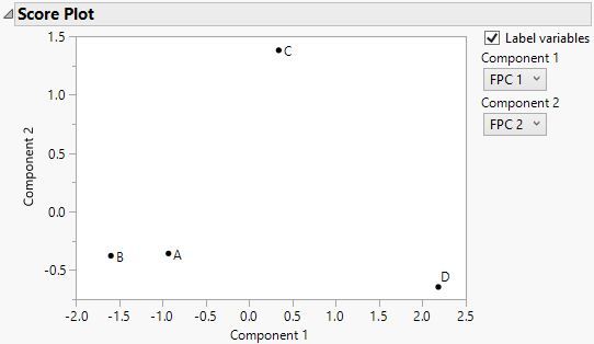
The first two functional principal components are probably sufficient to capture the differences between these four curves.
The plot shows the A and B are most alike and most different from D based on the first FPC. C is neutral in this way. A, B, and D are most alike and most different from C based on the second FPC.
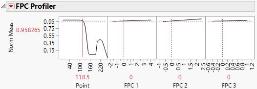
This profiler will let you vary the FPC values to see how they capture the differences in the shape. Remember that their effect decreases in magnitude from FPC1 to FPC 3.
You could add supplementary variables, such as factors in a DOE and then link the factor effects to the curve shapes.
- Mark as New
- Bookmark
- Subscribe
- Mute
- Subscribe to RSS Feed
- Get Direct Link
- Report Inappropriate Content
Re: Automating curve alignment based on a midpoint?
Thanks Mark - the problem with the DTW in this application is that it does align all of the curves at the 'Point 200' area - but in doing so it removes the critical differences in the 'Points 120 - 150' area. Using B-splines and not doing any alignment yields something that makes more sense physically - it highlights the difference in the key area where you can see it in a simple overlay, and E2 & E3 get at the smaller differences that the DTW seems to have smoothed out.
DTW is great for some other applications we are doing, but seems to remove key features in my data in this particular case.
- Mark as New
- Bookmark
- Subscribe
- Mute
- Subscribe to RSS Feed
- Get Direct Link
- Report Inappropriate Content
Re: Automating curve alignment based on a midpoint?
I don't believe we have a direct way to do this currently, but I also need to make sure I understand properly.
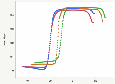
Just to make sure I understand, you're trying to find the X value that is closest to Y = 0.5 — somewhere between say X = 175 and X = 225 — and then you want to align the value for that particular X to be 0?
Here is what that sort of alignment would look like (excluding the early part of the functions):
Is this right, or are you looking to align in a different way? We are always looking to add more useful data processing options, so please let me know if this is right or how you would alter it.
Recommended Articles
- © 2026 JMP Statistical Discovery LLC. All Rights Reserved.
- Terms of Use
- Privacy Statement
- Contact Us


