- JMP User Community
- :
- JMP Discovery Summit Series
- :
- Past Discovery Summits
- :
- Discovery Summit 2017 Presentations
- :
- A Survey of JMP ® Import and Export Support in Narrative Form
- Subscribe to RSS Feed
- Mark as New
- Mark as Read
- Bookmark
- Subscribe
- Printer Friendly Page
- Report Inappropriate Content
Brian Corcoran- Software Development Director, SAS
JMP provides a variety of ways to get a wide range of data formats into the product. It then provides a substantial number of ways to export your results. The reason for the first is obvious enough. There are a lot of tools that were developed over the years to collect and format data. In most cases these tools don’t allow you to convert your data to JMP Data Tables. The reason for the export is that there is a need to share results with a wide audience, many of whom don’t possess JMP.
This paper attempts to give a small sampling of how to use some of the import, query and export capabilities of JMP 13. While the Windows version is used for the desktop screenshots, all the facilities discussed in this paper are also available in the Mac version of JMP. I will use a narrative form because it makes it easier to see the complete end-to-end workflow. I decided on a real-life example that occurred recently.
I have two sons, one about to graduate college and one in his freshman year. The older son changed his course of study during his sophomore year. During that time, we had many discussions about possible careers. What interests you? Where do you feel you would be making a contribution to society? Do you want a desk job or a more active job? Do you want to travel? It went on and on.
The younger son has a plan of study, but is not completely sure that it is the correct choice. This time, I’m thinking, I’d like a little more data to help with the decision-making process. What are the prospects for various jobs? It might help my son confirm his current choice or think about others. In talking with him, he said he wouldn’t mind getting a master’s degree, but probably didn’t want to go the PhD route. He probably wants a technical field, but is open to others. He likes the idea of improving processes and perhaps walking around during his work. Finally, he wants a job on the higher end of the pay scale. OK.
It turns out the U.S. Bureau of Labor Statistics has tools to help with this. The bls.gov website contains large amounts of data on job growth and salaries, required education, and even job descriptions to give visitors an idea what the field entails. The data is available for download to the public, and it presented a great place for me to start exploring.
In searching through the BLS site, the section Employment Projections, Occupational Employment Databases seemed most relevant.[1] The website has a viewer for the data, but I want to get it into JMP. Fortunately, there is a button to download the raw data in Excel XLSX format. Perfect. I downloaded the file, which is a manageable 500K. There are twelve tables in the workbook, but table 1.7 with employment openings for 2014, with projections to 2024, seems the best. I use JMP’s File->Open on the workbook and the Excel Wizard comes up with default settings. I select Table 1.7 under Worksheets to alter the import settings:
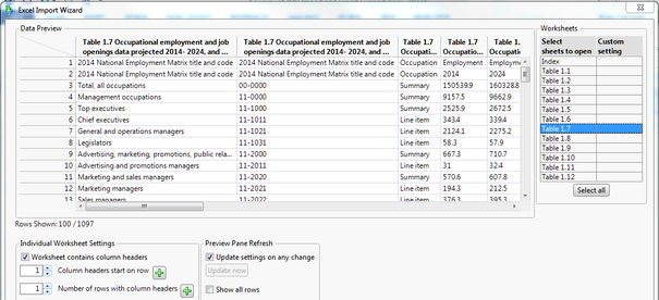
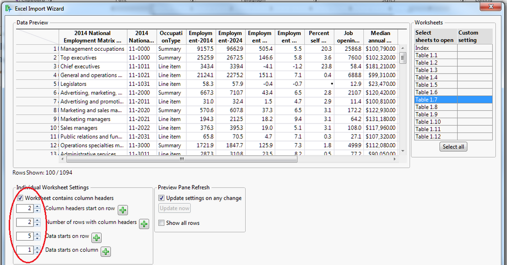
This has a lot of header information. After playing around with the JMP spin buttons for column headers and the start of data, I arrive at settings that look better. Two rows of headers, headers start on row 2, and data starts on row 5.
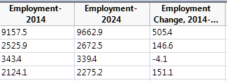
I press the Import button and my 1000+ rows of data come in. BLS provides much more detailed datasets, but this summary dataset seems fine for my needs. The only unfortunate part is that my JMP table seems to have issues where columns are converted to Character format. What went wrong?
Left Justified Text Indicates Character Format
If I scan down the data I can see that there are four lines of footnotes at the end of the table.
By default, JMP scans the first 100 rows of data to determine the type. This makes for an efficient, responsive preview. However, when the actual import was done ALL the rows are scanned and the column was converted to Character to prevent data loss. I can of course change the column type directly, but I can also go back and do the import a different way. Under the “Preview Pane Refresh” panel, there is a checkbox to “Show all rows”. When I select this, it not only shows all the rows in the table in the preview pane, but it uses all the rows for column typing.
Show All Rows
Now, I can go to the end of the table and specify that the data ends above the footnotes. I need to press the “Next” button in the Wizard to get to the second page of options. I click on the last row in the Data Preview that I want to include, and then press the green plus button next to the “Data ends with row” in the second pane of the Wizard. The Wizard will fill in the correct row number and I can press Import again to get the data formatted correctly.
I’ve now got my data cleanly into JMP, with over a thousand occupations to search through. The first two columns have huge, confusing names so I shorten those to Matrix Title and Matrix Code, following the longer names from the BLS. Now, it would be nice to narrow the focus. The table contains a column called OccupationType that really doesn’t seem to be that at all. For this column, each row simply says “Summary” and “Line item”. It turns out that Summary means the row is for all jobs of a certain type, like all engineers. A “Line Item” might be a mechanical engineer. So, the first thing I’d like to do is remove all the summary rows. I could do something like a “Select Where” and then subset the table to remove summary rows. However, there are additional filters I’d like to apply. Query Builder would be ideal for this.
If you aren’t familiar with JMP Query Builder, it is a powerful query tool that provides a GUI to create SQL queries on JMP data tables. There are counterparts with the same interface to query databases through ODBC, and SAS tables through the JMP to SAS connector. You don’t have to know SQL to use Query Builder though. You can create queries through the user interface and save them out for reuse, without ever looking at the underlying SQL.
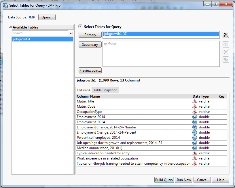
The Query Builder for JMP tables is invoked from the Tables menu. The table selection dialog that comes up first allows you to specify tables to join for the query. In this case, I’m really interested in just filtering my data, so I’ll take the table that we’ve already imported as my Primary table and I’ll move on.
Query Builder Table Selection
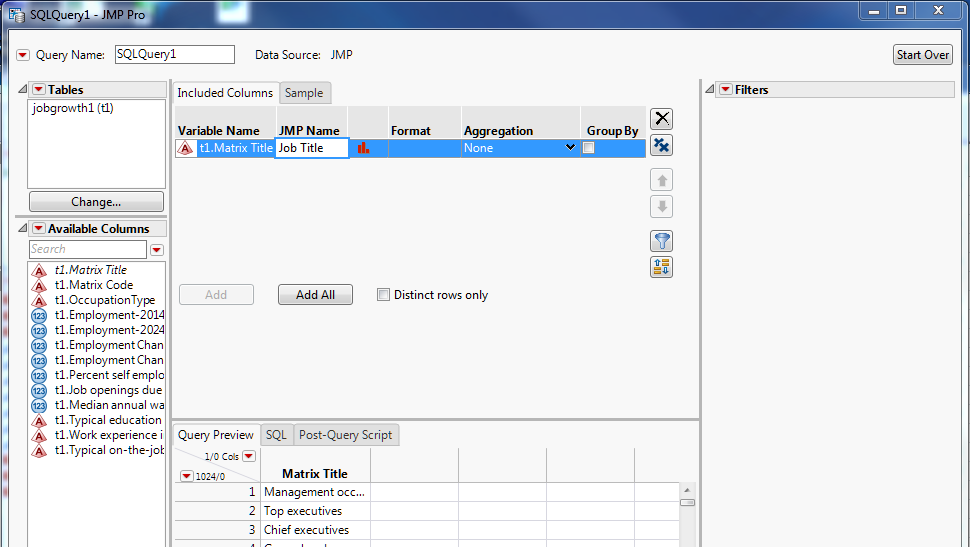
Selecting “Build Query” will bring up my main query construction dialog. The first two columns contain the BLS occupation name and code, still somewhat obscurely named Matrix Title and Matrix Code. I don’t care about the code so I’ll ignore that. I’m still not happy about the name for the occupation column, so after I add the column to the query I’ll click on “JMP Name” to bring up an edit box to change the title for our post-query result to Job Title.
Changin the post-query column name
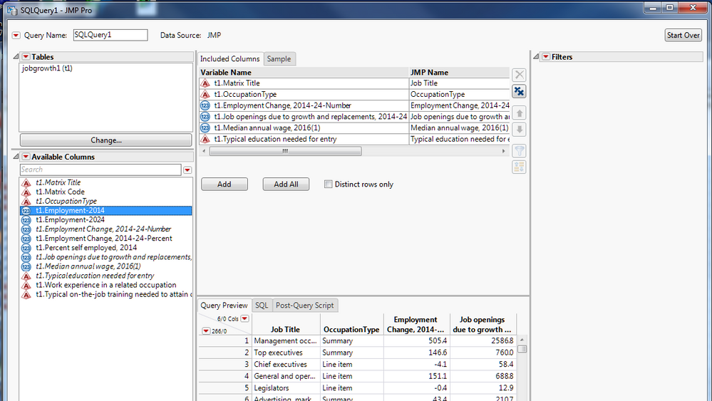
I’ll also add the OccupationType column because I want to exclude summary items. I’ll add Employment Change, 2014-2024 – Number because I am interested in the actual number of jobs being added. The percentage growth column appears to be interesting, but can be misleading. One of the fastest growing occupations is for wind turbine service personnel. However, that is growing from five thousand to ten thousand, so it is still small relative to many fields. So, I’ll go with number of jobs added instead of percentage growth.
I’ll also add Median annual wage because that was one of my son’s criteria, as well as Typical education needed for entry. Finally, I’ll also add what turns out to be perhaps the most important column of all: Job openings due to growth and replacements, 2014-2024. It turns out that many occupations have relatively slow growth, but they need to replace so many retiring workers that there is a huge opportunity for entry level workers. An example is mechanical engineering. There is moderate growth of 14,600 jobs (5%) over the ten-year period. However, the total jobs added when figuring in replacements as well is 102,500 jobs out of the 277,500 jobs in the occupation! This is a typical ratio. Statisticians need to replace 50% of their positions in that timeframe. Here is the Query Builder column selection prior to doing any filtering:
Query Before Filtering
I’d like to include a column that reflects the percentage of job replacement and growth. I can select the red triangle menu by Available Columns and select Add Computed Column. I can select Job openings… as the numerator and Employment-2014 as my divisor and press Ok.
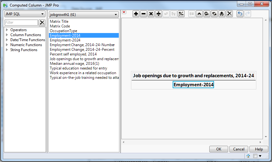
The column is created with the name Calc1. I can use the context menu to change the name to Jobs per Total and then add that to my Included Columns. There, I can change the Format field to Percentage. You may need to stretch out the Included Columns pane to see all the fields because of the long variable names. Now I think I’m ready to start reducing my search with some filters.
First, I can drag OccupationType to the Filters panel. There, I can click on “Line item” to only include the rows that are NOT summary types. Now, I’m going to filter on Median annual wage by including only those jobs that are greater than $75,000 per year. When I drag in annual wage right below my OccupationType filter, it will do an AND operation be default. This is what I want. If you want an OR operation, you need to start that by clicking the OR button. I also put in Typical Education needed and do an extended selection of “Bachelor’s degree”, “Master’s degree” and the dash, which means uncoded. Finally, I notice that a lot of the remaining jobs are management type jobs. It’s very unlikely that an entry level person will get a management job, so I would like to exclude these positions. I can do that with a “Contains” filter, switching it to “Does not contain”. To do this, I drag over my Matrix Title variable. Then, with the red triangle dropdown menu I can select “Filter Type->Contains”. A dropdown list will appear next to Title, and I can select “Does not contain” and then fill in “Manager”. I can now do the same thing for “Executive” to remove Chief Executives (down 3% over 10 years by the way). The filter list upon completion looks like: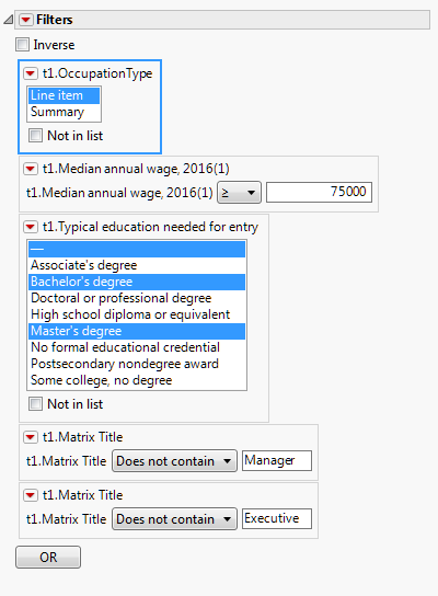
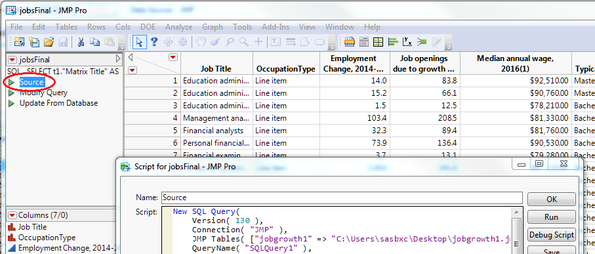
Now I can press “Run Query” and get the table with the data that I want. We’ve reduced more than a thousand rows to fifty-eight. We can save our query to reopen it later for modification. The query that was used to produce the table is also saved as a table script within the data table. It is possible to edit it to see what is being done, to run it to recreate the data, or to even change the query (be careful on that one).
Source Script in Data Table
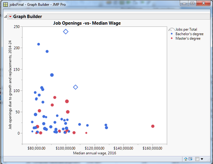
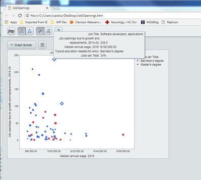
Now that I have my data, I’m going to select Job Title to be a label in my graphs. I’ll start up Graph Builder and put in Median annual wage for my X value, and Job Openings… for Y. To pack in a little more information, I’ll select Typical education needed… for the color and I’ll make the marker size our percentage that shows how many of the jobs are being added relative to the entire pool of workers by dragging Jobs per Total to the Size drop zone. As I’m browsing this graph, I noticed the software jobs have a pretty prominent position. I make applications and systems software jobs into diamond markers. I can send this to my older son, a computer science major, to assure him that he made a good choice. The graph, after a final tweak to the title, ends up looking like this:
Graph Builder Output in JMP
I decide I’ll send my older son this output as an Interactive HTML report. It will be easy for him to hover over the points and explore the data while working or, just as likely, playing a game on his desktop. Interactive HTML sends along the data from the analysis within the HTML report, so be aware of this if you are using sensitive data. I can easily create the report using File->Save As (File->Export on the Mac) and then selecting “Interactive HTML with Data” from the “Save as Type” dropdown. I can mail this standalone report to my son, and he can bring it up in a web browser and hover over the points to look:
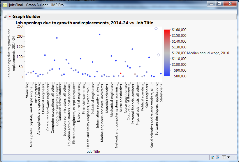
My younger son, the original audience, uses his iPad a lot. I’d like to send him an initial look at this data, but allow him to explore it more on his own. Graph Builder for the iPad will open a JMP data table, and if it finds a Graph Builder script within the table it will automatically open it into Graph Builder. I can prime my data table with an analysis and then allow my son to explore the data himself. I want to emphasize the number of openings more in this graph. I start with Job openings… as Y and Job Title as X, with the salary as color range. However, it just seems busy and a bit cluttered:
Initial Attempt
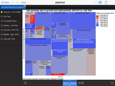
I can reopen the Graph Builder control panel, and with a single click on the Tree Map button I get a graph that I like better. The best part is that it is easy to hover over a square and get more information:
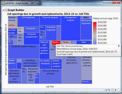
Before I send off my data table, I need to embed the Graph Builder script in it. I do this by using the red triangle dropdown menu next to the Graph Builder outline node, and selecting Save Script->To Data Table. I am prompted to provide a name for the script, which I make as “Job Openings” and I hit OK. This will embed the tree map script in the table.
Now I can put my data table in a cloud storage folder like Dropbox, iCloud or Google Drive. JMP Graph Builder for the iPad knows how to look at those boxes, and I can quickly download my table onto my iPad. Initially there will just be a big JMP icon to select the table.
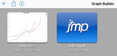
Once I click on this, the Graph Builder app will open the table, look for the first Graph Builder script embedded in the table, and display that analysis.
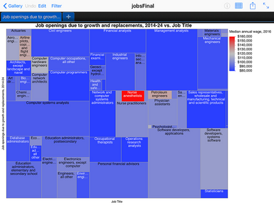
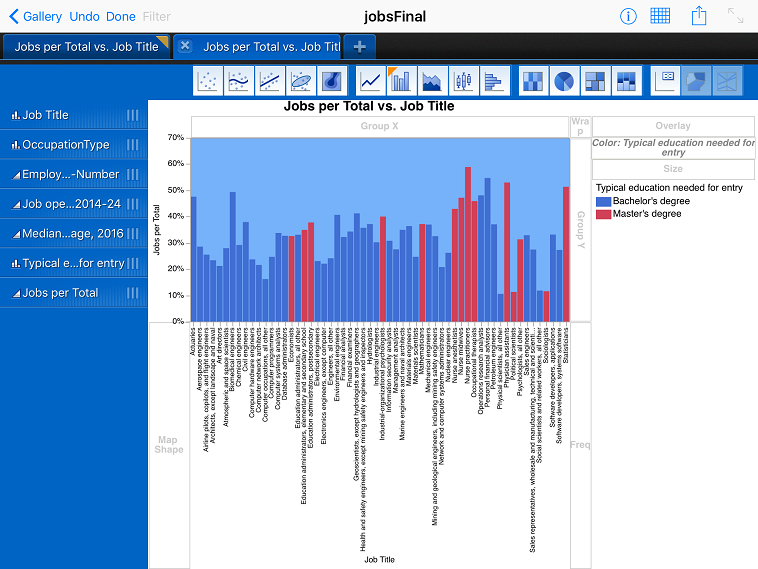
Now that my son has the data and my initial analysis, he can experiment with the data and graphs himself. For instance, he can press “Filter” and select any of the columns to explore. One example might be to filter on “Typical education needed for entry” to see which positions need a bachelor’s degree, and which need a master’s degree:
Filtering by Required Degree
Another really nice feature of the Graph Builder app is that you can try most of the graphs that are provided in the desktop version of Graph Builder. So, if my son wanted to look at different visuals or even drag around different columns to look at the data differently, he can do that. There are “grips” next to the column names to indicate that you can drag them around, and the familiar Graph Builder drop zones will highlight as you drag the variables. There are also customization capabilities for markers, background colors and the axis. He might change the output to something like this:
Creating a New Graph with the iPad App
That completes my work. I’ve sent each son an interactive report for them to consider. For my son who is still exploring, he can create his own reports and hopefully get some insight into his choices.
There are many other ways to get data into JMP, including through connecting to SAS, importing text data, SPSS data you may get from other sources, Triple-S survey data and on and on. Look at the File Open dialog to see your many choices, and know that the reports you generate can be shared with others in interactive ways, even if your recipient doesn’t have JMP.
[1] United States. Bureau of Labor Statistics. Employment Projections. Bureau of Labor Statistics, n.d. Web. 18 Aug. 2017. https://www.bls.gov/emp/ep_data_occupational_data.htm
- © 2025 JMP Statistical Discovery LLC. All Rights Reserved.
- Terms of Use
- Privacy Statement
- Contact Us
