- JMP User Community
- :
- JMP Discovery Summit Series
- :
- Past Discovery Summits
- :
- Discovery Summit 2015 Presentations
- :
- Driving Action Through Analytics: Using JMP® for Effective Communication

- Subscribe to RSS Feed
- Mark as New
- Mark as Read
- Bookmark
- Subscribe
- Printer Friendly Page
- Report Inappropriate Content
Kaylee Linthicum, Applied Mathematician, Boeing
Andrew Parker, Applied Statistician, Boeing
Abstract
In any industry, there are many insights to be gained from data analytics. Unfortunately, many of these insights are never translated into actions or strategy due to lack of adequate communication. Identification of patterns or relationships within data can prove to be a meaningless exercise without an effective way to communicate these findings or results. Additionally, there are often several different audiences that analysts need to consider when communicating results, including peers, customers and management. Fortunately, JMP offers several methods for data visualization that can be tailored to a particular audience and message. This paper will discuss the application and customization of various tools such as JMP journals, HTML5 and Flash integration, Graph Builder and the JMP Scripting Language that can be used to effectively communicate the results of data analysis. Data analytics can be successfully translated into decisions and actions within an organization through the utilization of these tools for intentional communication of analysis results.
Introduction
Data analytics is usually motivated by a specific intent, often a problem to be solved or a question to answer. Analysts rely on the vast amounts of information to make accurate assessments of the outcome and formulate a conclusion. Once the conclusion is made, the final challenge is presenting the analytical process in a manner that is interpretable by the audience, manageable in size, and conveys the correct message. Fortunately, there is the capability of manipulating data and tailoring it to a precise message with the analytical toolbox within JMP®. While there are examples of situations where raw data or simple tables of statistical values are appropriate to present results, this discussion will focus on the visualization tools in JMP® that allow an analyst to move beyond simple tables.
This paper and associated presentation will illustrate the capabilities JMP® provides to customize analytical findings and transform them into the appropriate message for a variety of audiences. There are three specific audience types to be considered: customers/suppliers, peers, and management/leadership. For each audience, there is a brief discussion of important considerations in communication as well as some examples of tools within JMP® that allow the analyst to address these needs when sharing results. Whether presenting a recommendation to management or convincing a supplier they need to revisit a bid, effective communication is essential.
Customers and Suppliers
Communication with external entities requires many different considerations on what and how information and results are presented. When talking to customers, the goal may be to make some type of sale or communicate status. With regards to suppliers, the messages are similar but the focus is reversed. Issues with performance or review of contract terms may need to be discussed. When selecting the medium for communication, several factors should be considered: knowing the audience, limiting the content, and refining the message.
When working with people from a variety of backgrounds, some may be well versed in analytical methods and terminology while others may not have experience in this area. Understanding this is essential in crafting a message because a result can be presented in a way to match the analytics comfort level of the audience.
Simple Graphic Selection and Modification
There is a large volume of statistical information to be reviewed within a standard JMP® model report. In most cases, suppliers and customers do not need to know the underlying details. Controlling the focus of a discussion can be achieved through summarizing the information using a graphic.
The most basic modification of a graphic is the selection of relevant information to be displayed. Figure 1 illustrates the capability to include more or less information by selecting certain layers.
Figure 1: Example of selection layers
The first picture removes focus from dollars and statistics and allows the overall trend and individual points to stand out. The second and third bring in axis, summary statistic, and graph title information, switching focus to numeric values and model quality.
Basic selection capabilities set the stage for more customization. Selectively adding, removing, or changing information provides more context and insight than using more PowerPoint slides.
Figure 2: Increasingly highlighted points
Figure 2 shows how using labels to focus attention on a limited number of points and can provide additional information such as critical values and/or part numbers. Specifically not including information related to any other suppliers or customers limits the conversation to information specific to the current audience or can be done to protect sensitive supplier or internal information. Simply selecting the relevant rows or hiding unrelated rows changes the focus of the graphic.
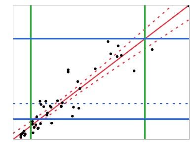
Figure 3 gives an example of how axis settings can be customized with reference lines to draw attention to a specific area within the graphic.
Figure 3: Reference lines from Axis Settings
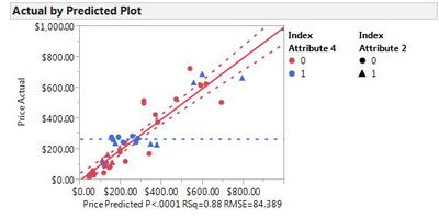
When modifying the appearance of particular points based on attribute values, it is important that the audience be able to quickly identify what different colors or shapes indicate. Figure 4 illustrates the legend capability of graphics in JMP®. This feature allows for layers of information to be added to the default appearance within the graphic.
Figure 4: Two legends for one graphic
These simple graphic controls can be combined to tailor a summary graph to provide a specific message. Once a customer or supplier’s need has been understood, information can be added or modified in a manner best suited for the direction of conversation.
Scripting and Graphics
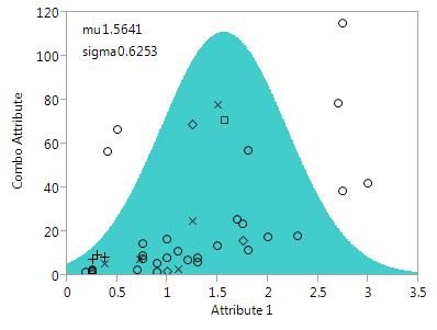
In addition to the quick graphical customizations discussed above, JSL allows for almost an unlimited expansion of graphic customization. While not all JMP® users are familiar with JSL, there are built-in functions that can allow any user to set up simple to advanced enhancements. The scripts for the following figures are located in the Scripting Appendix.
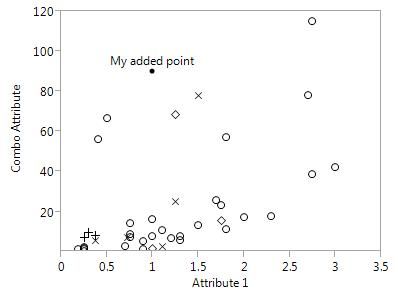
Applying JSL can provide additional information without much effort. Figure 5 illustrates using two built in functions which can add a marker and label anywhere in the graphic.
Figure 5: Simple marker and label output
This marker can also be colored and labeled with text. These features are useful anytime a customer or supplier provides information that adds to the message of the graphic but will not be included in any analysis. Adding features like markers will only overlay information onto the graphic not impacting any underlying or future analysis. Additionally, adding shapes instead of just simple markers and lines can add more detail.
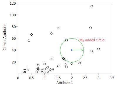
Figure 6: Integrating shapes and data
In Figure 6, the focus is put on a specific area and direction which could show a customer or supplier a sub-section of the graphic needing attention. Any function can be used to draw more complex shapes and more advanced customizations can be used to create a gradient field.
Figure 7: Dynamic function overlaid on data
Figure 7 illustrates a dynamic graphic. In addition to the displayed function, an included handle can be moved to automatically adjust the function. The values are also reported and updated dynamically as the handle moves. This is useful when discussing a change, showing the impact in real time.
Communication with customers and suppliers is an essential aspect of any business operation. Using the tools mentioned above to tailor data and graphics is critical in protecting internal sensitive information and controlling the direction of a conversation. Adding, removing, and changing the displays of graphs can be simple tools in getting the intended message delivered to a specific audience in the most effective manner. Many of the techniques discussed above can be applied in any platform that generates a graphic including Graph Builder.
Peer-to-Peer
Whether peers are performing reviews of an analysis, using the output of an analysis to support their own work, or working collaboratively with a team on an analysis project, peer-to-peer communication is essential in any analysis. In contrast to other audiences, peers often want and need a high level of detailed information related to the underlying data and methodology. As in all cases, it is important to know how the recipient will use the information and whether or not they have access to JMP®. In the case the audience has access to JMP®, a JMP® Journal can be a useful tool. This tool allows the analyst to easily present information to other JMP® users including data tables, text, report outputs, and links to other files.
The JMP® Journal itself can be used as a presentation platform and has many advantages over other programs such as PowerPoint. Reports can be easily added to a JMP® Journal as analysis is being done, eliminating the need to compile a separate presentation outside of JMP®. Additionally, the formatting is always consistent and clean allowing the analyst to focus on the data rather than layout issues. Bullet points can be combined with live links and buttons to run JSL scripts which allows automation of analysis. The interactivity of reports is maintained when they are linked to a JMP® Journal. Outline nodes can be nested, opened, and closed as a presentation is given, thereby avoiding flipping back and forth between slides and focusing only on the relevant information. In addition to the display of report outputs, supplementary information can be included in the form of text within the JMP® Journal itself, or links to data tables or other files.
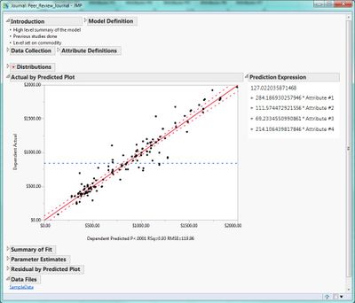
Figure 8 shows an example layout for a peer review JMP® Journal. Key charts are located in the JMP® Journal along with written notes relating to the analysis and a link to the original data file. Each of these outline sections can be expanded or collapsed to show relevant information. Additionally, the location of each of the outline sections can be changed to put related items close together or direct flow from one item to the next. This sort of presentation also lends itself well to fellow JMP® users that would like to use the analysis results or the underlying data.
Figure 8. Sample layout for peer review in JMP® Journal.
Beyond the initial review of the analysis, documentation is important for any future use and collaborative activity. The format of JMP® Journals lend themselves well to thorough documentation to allow future analysts to replicate the analysis as data is updated. Working files along with any additional information can be linked to the JMP® Journal.
One drawback to the JMP® Journal is that use of its dynamic features is limited to JMP® users. However, a static form of the Journal can be saved as a PDF that will display the contents of all open outline items but remove any interactive functionality.
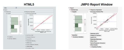
In the case where reviews need to be performed by those that do not have access to JMP® the ability to save report outputs as interactive HTML5 output can be very useful. While not all report outputs are compatible with HTML5, those that are generate an interactive report that can be shared with peers without access to JMP®. Figure 9 shows how HTML5 allows interaction with data points in the same way as report windows in JMP®. Combining report windows to create a layout or creating a script to produce a custom report can make interaction with the data in the HTML5 format more useful.
Figure 9. HTML5 allows non-JMP® user to interact with the data points in a way that mimics JMP® report window.
Leadership/Management
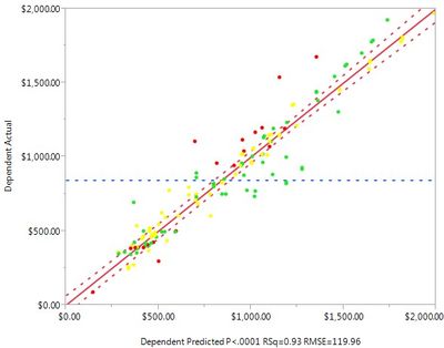
When reporting results to leadership/management, maximizing the amount of information presented in each visual is important. Simple scripts can be created to enhance the information presented in JMP’s built-in visuals. Something as simple as standard color coding of points in a scatterplot can provide quick insight. Figure 10 shows how color coding the data points can add another dimension of information to a regression plot. In this case, it allows leaders to not only see how a part’s actual price compares to its prediction, but also how the part’s supplier has performed in quality.
Figure 10. Supplier quality measured as red, yellow, or green displayed with actual vs. predicted price.
Built-in JMP® color schemes can be used to color by the value in a given column. For examples like the one above, where the color has specific meaning, coloring can be done manually or with a simple script to create the colored row states.
Often times, leadership will want to see the data presented in many different ways. Graph Builder is a useful tool to visualize data in multiple ways adding detail or changing the layout almost instantly. These outputs can be saved easily to incorporate into PowerPoint or other presentation methods for presentation and sharing with non-JMP® users or added to a JMP® Journal. Several different looks at the data can quickly be generated, enabling the analyst to describe details of the data very easily. Figure 11 shows how graph builder can be used to show a simple scatter plot as well display underlying differences in groups within the data.
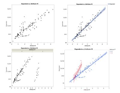
Figure 11. Use of Graph Builder to quickly parse data visually to communicate an aspect of the analysis.
Again, there are often times where a static output is not the optimal method for discussing or communicating results with leadership. The use of the interactive HTML5 allows an analyst to dig into some details real time when reviewing with leadership without the necessity of working in JMP®. Looking back at Figure 9, if a leader was interested only in data points related to a specific supplier, they could instantly identify the relevant data points. Not all features are fully supported by the HTML5 format. However, warnings for unsupported features appear when the file is being saved and the data can still be viewed in a static format.
Summary
The JMP® analytical toolbox provides analysts with large amounts of information. This information is the foundation of any quality result or conclusion and analysts should transform this information into a simple and effective message. Whether presenting to suppliers, customers, peers, or leadership, JMP® provides capabilities to communicate information in a variety of manner. Putting forward an effective communication package is critical in achieving the desired result for any presentation. Once an analyst understands who their audience is and what the message needs to be, they can tailor the message to achieve a specific goal.
This paper highlighted many capabilities associated with specific situations. Determining the best route is dependent on thorough understanding of the purpose prior to building a communication package. Each of these capabilities, however, can be applied in a variety of other situations and in far more complicated manners. Using the JMP® manual can provide step-by-step direction of how to use these methods and other options for using advanced features.
It is important to remind people (i.e., management) that ALL data costs money to collect. WHY do we collect data? The answer should be simple, but it is actually profound in its simplicity: The ONLY reason to collect data is to turn it into knowledge/insight as a basis for ACTION. If this is not happening, then collecting the data is a total waste of resources.
JMP has been a great help to me in presenting data to senior management in a visual format that can be easily understood.
Discovery Summit 2015 Resources
Discovery Summit 2015 is over, but it's not too late to participate in the conversation!
Below, you'll find papers, posters and selected video clips from Discovery Summit Europe 2015.
- © 2024 JMP Statistical Discovery LLC. All Rights Reserved.
- Terms of Use
- Privacy Statement
- Contact Us


