- New to JMP? Let the Data Analysis Director guide you through selecting an analysis task, an analysis goal, and a data type. Available now in the JMP Marketplace!
- See how to install JMP Marketplace extensions to customize and enhance JMP.
- Subscribe to RSS Feed
- Mark Topic as New
- Mark Topic as Read
- Float this Topic for Current User
- Bookmark
- Subscribe
- Mute
- Printer Friendly Page
Community Discussions
Got a question about using the JMP User Community? A complaint or a compliment? Post it here.- JMP User Community
- :
- Welcome
- :
- Community Discussions
- :
- I hate it
- Mark as New
- Bookmark
- Subscribe
- Mute
- Subscribe to RSS Feed
- Get Direct Link
- Report Inappropriate Content
I hate it
Due to many reasons, it's been a while since I've come to the JSL Forums and it's recieved a complete redesign, and I definately have opinions.
I will start off by stating the new site is beautiful, and that is pretty much the end of my compliments.
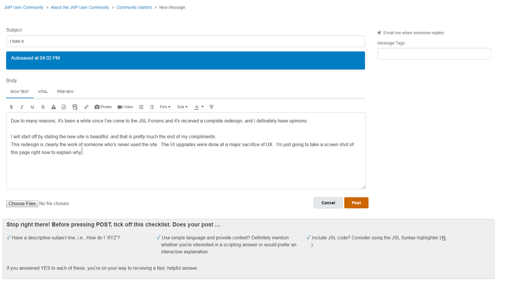
This redesign is clearly the work of someone who's never used the site. The UI upgrades were done at a major sacrifice of UX. I'm just going to take a screen shot of this page right now to explain why.

Oh, My, Wow! I can't believe how long that took. Side rant: why would you remove the ability to copy and paste pictures into a forum post? I have to now insert it?! Which loaded up a new frame which took FOREVER! On top of that, if you try and copy and paste into the iframe, it accepts the picture but never actually uploads it, so then you have to close the webpage and start over. After starting over, I actually had to paste my screen shot into a image processor and save it, then I could finally upload it. It's a good thing I enjoy detours, extending processes that use to take 1 step into 10, and beaurocratic red tape.
Sadly that was the side rant, that's just one example of the bad UX. Lets take a look at the screen shot for a minute. Take a look at the Subject. See how small the box is? See how small the print is? If I didn't know better, I'd image Autosave was the title of this post. Honestly, why is that so big? Why is it colored to stand out? WHY is the time off?! Am I suppose to care about that, like at all? I'm telling you, the only time a user cares if you autosave a draft is when they lose it. This doesn't need to be broadcast to the world, it just needs to work!
All the same comments to the body and the tips. Why is the text of the body so small? Why is the box it sits in so small? Why is the TIP box so large? Do they think I'm actually going to read it because it's larger? It's looks like the worst Ad in history, and I defineately don't care about the contents.
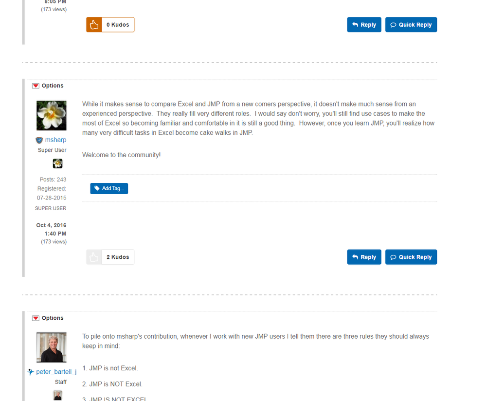
Can we move onto the actual forums? And despite my better judgment I'm going to add another screen shot... I'm all ready mad, and am currently writing this as a form of procrastination b/c the experience is so aweful. Here it goes...

Can I ask the first thing on everyone's mind? And if it's not on yours it will be. Why do we need two icons of everyone avatar? Why do we need to know how many posts a user has made on every single post they make? Honestly, almost all the user stats need to go. It's information overload, it's tacky, and it's distracting. It's eating spaghetti with two forks when one is needed. Honestly, two icons!?
Next, why are all the posts so far apart? Yes, white space makes it look nice, but this is a FORUM. You know, a conversation. How can it be a conversation when I can only see one post on my screen at a time (and I have a large monitor)? It's not like each post is meant to be segregated and taken out of context. These aren't tweets. The point is to see how each post relates to the others. Not to see each post individually. Scrolling through one of these discussion is like listening to the Apollo missions with HUGE delays between people talking. And since a forum can have many side conversations going, it's become real easy to get lost.
Other points I'm not going to go into, but need to be mentioned: having navigation only at the top sucks. Why am I hitting the back button all the time? Why is there only 1 navigation to page through a collection/list on any given page, and why is it always so hard to find? In many of your user profile pages this navigation is awkwardly in the top right, in the discussion forum it's at the bottom, in other places it's who know's where. While it's common to put it at both the top and bottom, it's also common to only put it in one spot. If you do this though, at least be consistent.
Anyways, congrats on the redesign. I'm glad it's pretty. I will probably be frequenting less often.
- Mark as New
- Bookmark
- Subscribe
- Mute
- Subscribe to RSS Feed
- Get Direct Link
- Report Inappropriate Content
Re: I hate it
Ignoring the tone of your post, you're right on a number of points.
We are still hard at work styling and designing, and improving many parts of the Community. Most of the items you point out are on our list and we're happy to have the feedback.
Just a couple comments on some specific issues.
- I'm intrigued by the fact that pasting images into the editor worked for you in the previous version of the Community. I tried that a number of times myself and it never worked for me. In fact, it seemed confusing that the the editor seemed to take the image but when published it wasn't actually there. In that way, the new behavior seems better to me, since I know that it's not losing an image that someone thought was going to be posted.
- I think the time on your autosave message (agreed that the message is too big) is off because you have set your Community preferences to know what timezone you're in.
I do appreciate your comments and we agree that there's still plenty that can be done to make the site better looking and more functional. We are working on it and hope that you'll be around to see the improvements as we make them.
- Mark as New
- Bookmark
- Subscribe
- Mute
- Subscribe to RSS Feed
- Get Direct Link
- Report Inappropriate Content
Re: I hate it
Jeff, thank you for the informative reply. Unfortuneately my current work schedule has made it difficult to be as active in the community as I'd like, and I'm just now getting back to reading this. I'm very glad to hear that many of the items I pointed out were already on the list to be fixed. I can see in the few short weeks I've been gone many of my strongest annoyances have ALREADY been fixed. It's great to work with a company who can quickly act.
- © 2026 JMP Statistical Discovery LLC. All Rights Reserved.
- Terms of Use
- Privacy Statement
- Contact Us

