In a recent blog post, I discussed control limits and specification limits, where they come from and what they are. This post goes into more detail about specification limits. We will use Process Capability in JMP to generate a capability analysis. We will then use this analysis to make decisions about our process. You can read more about Process Capability in a post by my colleague Laura Lancaster.
Example
In an earlier post on generating control limits using Control Chart Builder, we saw that stability should always be checked prior to performing a capability analysis. I introduced an example that involved a printing process. Let’s review this example.
Variations in the printing process can cause distortion in the line, including skew, thickness, and length problems. For our purposes, we are considering the length of the line. The line is considered good if it has a printed length of 16 cm +/- 0.2 cm. Any longer, and the sentence may run off of the page. Any shorter and there would be a lot of wasted space on the page. For every print run, the first and last books are taken for measurement. The line lengths are measured on a specified page in the middle of each book.
Analysis
We determined in the previous blog post on control charts that the process was stable. Now that we know the process is stable, we can determine whether or not our process is capable. The capability of the process is defined by how well the process produces product that is within specification. In our example, the line is considered good if it has a printed length of 16 cm +/- 0.2 cm. Even though we knew this and defined this prior to creating our control charts, this information was not used in our control chart analysis. This information defines our specification limits. These values are not calculated values. We know given the size of the page, that a good line has the length stated above.
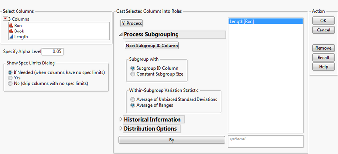
We can use our same data to perform the capability analysis. To generate the analysis, go to Analyze->Quality and Process->Process Capability. Select Length as the Y, Process. In the Column Roles section, select Length. Open the Process Subgrouping section by clicking on the triangle next to Process Subgrouping. Select Run in the Select Columns section and click Nest Subgroup ID Column. In the Within-Subgroup Variation Statistic section, choose Average of Ranges. Since we used ranges for our control chart, let’s use ranges here as well.
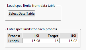
Click OK. You are presented with a dialog that allows you to define the spec limits. You can either select a data table that contains your spec limits or you can enter your spec limits directly. We will enter them directly. Enter 15.98 (16-.02) for the LSL, 16 for the Target, and 16.02 (16+.02) for the USL. Click OK.
Goal Plot
You are first presented with a Goal Plot.
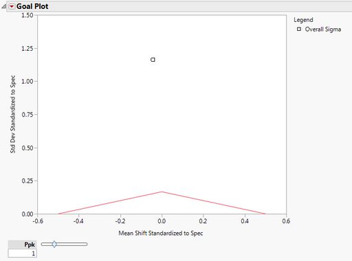 The y axis is the std dev standardized to spec. This shows the variability in the data. We notice that the point falls well above the red triangle, indicating high variability. The x axis is the Mean Shift Standardized to Spec. Since the point occurs near the apex of the triangle, we note that the process is close to target (a small amount below target). The area under the red triangle denotes a non-conformance rate of 0.0027 or better (this corresponds to Ppk =1), if the distribution is normal. We see that our process has a much higher non-conformance rate. The Ppk slider can be adjusted so that the triangle denotes different non-conformance rates.
Box Plot
The Capability Box Plot shows that not all of our data meets the specification limits. This box plot is very wide and spans a width much larger than the green standardized specification limits. We also notice that the process is close to the target value, but a little on the lower side. We see this because the solid black line that appears inside the box plot is slightly to the left of the solid green line which denotes the standardized target value.

Individual Detail Reports
To look at this process in more detail, select Individual Detail Reports from the red triangle next to Process Capability. The histogram suggests that the data is normal. If you wanted to perform an actual goodness of fit test for normality, you could use the Distribution platform.
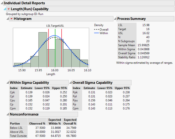
The blue density curve for Within Sigma falls pretty close to the black dotted density curve for Overall Sigma. This indicates that the process is stable, which we already showed via Control Chart Builder. In the nonconformance report, we see that the total outside is 67.5. So 67.5% of our measurements do not meet the specification limits.
Further Investigations
To further investigate this process, click on the red triangle next to Process Capability and select Out of Spec Values->Color Out of Spec Values.
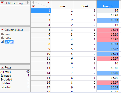 We see in the data table that less than half of the observations met the specification limits. The number of observations that fell above the specification limit is about the same as the number of observations that fell below the spec limit. This problem needs further investigation. Perhaps we need to take a closer look at how the spec limits were determined. Perhaps there are other variables that we did not take into account. Remember in the description of the process that measurements were taken on the first and last book of each run. In our analysis, we only used the variables Length and Run. We did not take into account book which may also be a source of variation that we need to account for.
Conclusions
The printing process is stable, but not capable. So while we can predict what the process is going to do, we can’t consistently produce lines of the appropriate length (between 15.98 and 16.02 cm). This process needs further investigation.
References
JMP Software: Statistical Process Control Course Notes