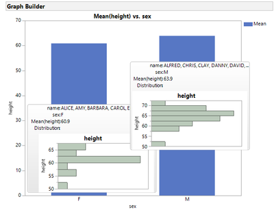
Problem
While looking at an aggregated data visualization, I want to get insights into the underlying data distribution by having the associated histogram displayed directly on the graph tooltip.
Solution
1) Create an "expression" type column (so that its value is treated as an image);
2) Add a "formula" property to it using the JSL listed below.
3) Set the "Label" flag for this column (so that it is displayed in graph tooltips);
4) Create summary graphs like bar charts and treemaps, preferably aggregated by the same column used in the formula by-group definition.
5) Explore!

this_row = Row();
this_col = Column( "sex" );
this_cell = this_col[this_row];
dt = Current Data Table();
dt << clear select();
rpt = As Constant(
	Platform(
		dt,
		Graph Builder(
			Size( 256, 128 ),
			Show Control Panel( 0 ),
			Show Legend( 0 ),
			Variables( Y( :height ) ),
			Elements( Histogram( Y, Legend( 2 ) ) ),
			By( :sex )
		)
	)
);
xpt = "//OutlineBox[text() = 'Graph Builder sex=^this_cell^']";
L = rpt << xpath( Eval Insert( xpt ) );
L[1][1] << Get Picture();