- New to JMP? Let the Data Analysis Director guide you through selecting an analysis task, an analysis goal, and a data type. Available now in the JMP Marketplace!
- See how to install JMP Marketplace extensions to customize and enhance JMP.
JMPer Cable
A technical blog for JMP users of all levels, full of how-to's, tips and tricks, and detailed information on JMP features- JMP User Community
- :
- Blogs
- :
- JMPer Cable
- :
- Moving from Minitab to JMP and JMP Pro: A Transition Guide
- Subscribe to RSS Feed
- Mark as New
- Mark as Read
- Bookmark
- Subscribe
- Printer Friendly Page
- Report Inappropriate Content

This white paper explores two popular software packages – Minitab and JMP. Differences between the two will be illustrated with the goal of easing the transition for experienced Minitab users to move over to JMP. Focus is on the user interface, how tools are accessed, how analyses are performed, and the general workflow that a user follows to analyze data.
Minitab is a graphical user interface-based (GUI) statistical software program first developed in 1978 as a computing tool to support introductory statistics courses. Minitab v19, released in June 2020, is the version featured in this white paper.
JMP and JMP Pro are also GUI-based software, first developed by SAS in 1989 to support engineers, scientists and researchers in applying the tools of the statistical sciences in a nonprogramming, highly interactive environment. JMP and JMP Pro are used across a wide range of industries and academic disciplines. JMP 16 and JMP Pro 16, released in March 2021, are the versions featured in this paper.
As this is a transition guide rather than a comprehensive coverage of their individual capabilities, we are unable to cover all the differences between the two in this white paper. Visit minitab.com and jmp.com to learn more.
Topics covered in this paper include:
- Introduction
- Overview
- Datasets
- File Format
- Minitab Project File
- JMP Data Table File
- JMP Project File
- Importing Data
- Cleaning and Formatting Data
- Creating New Variables
- Data Filter and Row States
- Descriptive Statistics
- Graphing
- Univariate Analyses
- Saving and Sharing Results
- One-Factor Analysis
- Multivariable Statistical Models
- Conclusion
- About the Author
The full text of the white paper appears below.
(Note: You can jump directly to a particular section by clicking on the hyperlinks above.)
Introduction
Easy to use statistical software has become a essential tool in almost all businesses as more companies seek to have their employees basing decisions on data. Comprehensive statistical analyses, building of sophisticated descriptive and predictive models, and mining data to discover insights are no longer just done by statisticians but by those across many functional areas within an organization. Academia is experiencing a similar need. There has been a substantial increase in the number of programs and courses across a wide range of disciplines exposing students to the tools and techniques of the statistical sciences. Interactive point-and-click software can greatly reduce the barrior for students to develop the necessary skills and enjoy the data exploration process without the need for programming.
This white paper explores two popular software packages – Minitab and JMP. Differences between the two will be illustrated with the goal of easing the transition for experienced Minitab users to move over to JMP . Focus is on the user interface, how tools are accessed, how analyses are performed, and the general workflow that a user follows to analyze data.
Minitab is a graphical user interface-based (GUI) statistical software program first developed in 1978 as a computing tool to support introductory statistics courses. It gained much popularity in industry during the mid-to-late ‘90s as companies that were engaged in quality initiatives such as Six Sigma began using statistical techniques to improve the quality of their processes and products. Minitab v19, released in June 2020, is the version featured in this white paper.
JMP and JMP Pro are also GUI-based software, first developed by SAS in 1989 to support engineers, scientists and researchers in applying the tools of the statistical sciences in a nonprogramming, highly interactive environment. JMP and JMP Pro are used across a wide range of industries and academic disciplines. JMP 16 and JMP Pro 16, released in March 2021, are the versions featured in this paper.
As this is a transition guide rather than a comprehensive coverage of their individual capabilities, we are unable to cover all the differences between the two in this white paper. Visit www.minitab.com and www.jmp.com to learn more.
Overview
While there are some similarities between Minitab and JMP, there are some fundamental differences that are important for one who is transitioning to JMP should know.
1. Interactive analysis output. When performing an analysis in JMP, the output is presented in an interactive window. All the analysis output created, including what’s created across different platforms, are dynamically linked to each other and to the data table. This allows the user to interact directly with the analysis output. Changes such as removing/adding variables to a model, switching the role of a variable and subsetting the data can be done directly from the analysis output without the need to rerun an analysis. Changes can also be made to the data table (e.g., adding/deleting data) and all the output can be set to automatically update.
Minitab output is predominantly static and is not connected across different analysis tools. To remove a variable from a model, for example, the analysis tool would need to be relaunched, those changes specified, and then the analysis rerun. In many of Minitab’s tools, making changes to the data will not automatically update analysis results.
2. Contextual menus. Each analysis output performed in JMP is connected with access to a set of tools related to that analysis. In this way, the approach to analyzing data is more exploratory and interactive in nature, with the results of one analysis guiding the user to a set of tools that are designed as next steps in the analysis workflow.
Minitab runs analyses in a more traditional batch mode, with the user often having to decide upon which analysis to perform entirely separate from seeing features in the data. When a tool is selected, a dialog box is open. Variables are assigned roles and options are chosen. Running the analysis produces a set of output that is typically static. The next step in a typical analysis workflow often requires a new tool to be launched requiring another round of specifying variable roles and options.
3. Defining data to be used for analysis. The typical approach in Minitab is to create a worksheet that contains all the data that a particular analysis will be based on. If it is desired, for example, to perform an analysis on a subset of that data, it is usually required to perform an operation (e.g., Subset, Split Worksheet, etc.) to create a new worksheet. If outliers are discovered an the analyst wishes to see the results without those data points, another new worksheet would typically need to be created and the analysis run again. This requires the need to manage many worksheets in a typical analysis session.
Though one is also able to work with multiple data tables in JMP, it can often be easiest to use Data Filters and Row State operations to define the data to base a specific analysis on. These data filters and row states can be saved and accessed at any time, which allows the analyst to have a single data table upon which all analyses on various subsets of that data can be performed.
In addition, the Local Data Filter tool in JMP allows users to filter the data even after an analysis is performed. For example, a linear regression model can be create from all of the data in a data table. From within the regression analysis output, a local data filter can be launched, which instantly changes all the results for different subsets of the data selected.
4. Simultaneous multiple analyses. A key feature of JMP is its ability to perform a large number of analyses simultaneously. In nearly all analysis platforms within JMP, a By Variable option is available, allowing analyses to be performed for each level of that variable. For example, if one wanted to perform separate hypothesis tests comparing two means for each of 10 different groups of a categorical variable, then that By Variable simply needs to be specified. Minitab would require running that analysis 10 separate times.
JMP platforms also allow you to run a large number of individual analyses together by simply selecting all the response variables and factors. For example, if one wanted to perform every possible one factor analysis for three different response variables and five different explanatory factors, all 3x5=15 different analyses can be performed in one step, including different one factor analysis techniques based on the data type for the response variables and factors. ANOVA, Linear Regression, Logistic Regression, and a Chi-Square Analysis can all be performed simultaneously with the results displayed in the same output window. Minitab would require running each of these analyses separately using different tools.
JMP has unique platforms designed for executing a very large number of analyses together with custom graphs and output created. For example, a multivariable capability analysis can be performed on 50 different process variables. In addition to producing output for 50 different individual capability analyses, unique graphs and numerical output will be created, standardizing all the individual results, to allow for easy comparisons across these 50 variables – a true multivariate analysis.
There are also specialized platforms in JMP custom designed for applications when an extremely large number of analyses are needed. In certain scientific fields, it’s quite typical that one may have, for example, a thousand different response variables and a single explanatory factor. A response screening analysis can be performed resulting in 1,000 separate one-way ANOVAs. The results (statistically adjusted based of the number of analyses) are displayed together using a custom set of graphs and data tables designed for easy comparison and follow-up analyses.
5. Integration. JMP has the capability to integrate with external computational environments such as SAS, MATLAB, R and Python. Through JSL (JMP’s Scripting Language), an analyst can leverage the power of those tools while also being able to work within the interactive GUI of JMP.
Minitab currently has the ability to integrate solely with Python, but not SAS, R or MATLAB.
6. Publishing reports. Both Minitab and JMP have tools to export and save reports outside of the software (e.g., .jpg, Microsoft PowerPoint and Word). JMP can also generate interactive .html reports, allowing others to view analysis reports outside JMP with interactive tools to drill down into the data further. Another product in the JMP suite of products is JMP Live, which provides additional capabilities for automating the generation and sharing of reports updating a dashboard as data and models change.
7. Statistical analysis techniques. Though both software contain many of the more common statistical analysis tools, there are myriad more advanced statistical techniques and data management tools available in JMP and JMP Pro that are not available in Minitab. JMP also typically has more options and capabilities within a particular statistical analysis technique. Visit www.jmp.com to learn more.
Datasets
Various datasets will be used throughout this guide. They can be found here.
File Format
One difference that an experienced Minitab user may first notice when learning JMP is that it is not necessary to work within a Project File structure.
Minitab Project File
Users of Minitab are most familiar with Minitab Project Files denoted with the extension .mpx. Within this Project File, multiple worksheets (i.e., data tables) can be imported or created. Figure 1 shows a sample Minitab Project File containing four worksheets. The display is split into three panes. The bottom-right pane shows the active worksheet (Full 4 Data) along with tabs at the bottom for each of the worksheets. The left pane, known as the Navigator, shows a list of the analyses and operations that have been performed (e.g., Graphical Summary of Yield and Moisture Content, … , Split Worksheet). The top-right pane is the output window displaying the particular analysis output that has been. There are three different views that can be chosen (Data and Output, Data only and Output only). In this figure, Data and Output view was chosen.
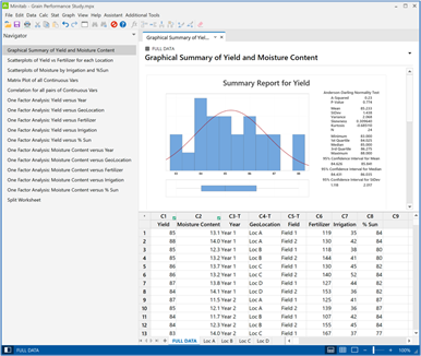
Any analysis or operation chosen is performed on the active worksheet. If a user wishes to perform an analysis on a subset of the data, a new worksheet would need to be created from the parent worksheet. Here a set of worksheets were created, one for each of the four GeoLocations (A, B, C and D) using the Data>Split Worksheet command. To perform an analysis on just one of the GeoLocations, that worksheet would first need to be selected to make it the active worksheet before running the analysis.
JMP Data Table File
JMP can also be used from within a Project File structure. First, let’s take a look at how JMP data table files work since many users opt to work from that type of file. JMP data table files are denoted with the extension .jmp.
Figure 2 shows a sample of a JMP data table file. There are four panes to the file. The data table is to the right, the Row Pane is in the lower-left and provides a summary of the rows in the data table, including the number of rows that have been selected, excluded or hidden. The Column Pane in the middle-left displays the variables in the data table, identifying properties for that variable, such as the modeling type and use of a label. The upper-left pane shows the scripts that have been saved to this data table file. The steps to run and save scripts will be shown in a later section.
The red triangles, seen in the different panes, access a variety of tools to perform operations on the data table, columns or rows. Columns can be reordered in the data table by clicking and dragging the columns list in the Columns Pane to the desired location. A more comprehensive list of tools and operations that can be performed on columns can be found under the Cols menu or by right-clicking on a column in the data table.
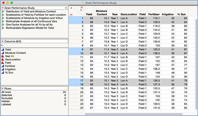
JMP has a collection of tools, which we will illustrate later, that allows users to perform analyses on specific subsets of the data. In many cases, you will find that working from one master data table in this way allows you to perform all the desired analyses without needing to create and manage multiple data tables, as is required in Minitab.
JMP Project File
JMP Project files are another file structure that can be helpful to work from. Project files provide a single interface to JMP, acting as a container for many different project elements. It can contain (or reference) data tables, analysis scripts, JMP journals, reports, as well as non-JMP elements such as documents, data files, etc.
Figure 3A is an example of a JMP Project file.
In this example, two panes are displayed on the left.
Contents: List of all the files contained within the Project file such as folders, JMP data tables, and other non-JMP files (e.g., .xls, .csv, .doc. .ppt, .jpg, etc.). Here we have a folder, two JMP data tables, a JMP Journal, two excel files, and one word document.
Workspace: Hierarchical list of the project contents that are currently being displayed. Here we have the JMP Journal and two JMP data tables along with an analysis report associated with a script in one of the JMP data tables.
A tabbed collection of windows, one for each of the elements listed in the Workspace pane, is organized to the right. Here we have one of the data tables as the active window. You should recognize this as the JMP data table shown in Figure 2.
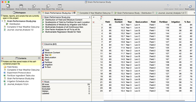
Each of the panes, including any of the tabs, can be moved to reconfigure the display to a desired view.
Figure 3B shows an example of the Project with the tabs having been arranged so that the two JMP data tables and Journal are placed directly to the right of the Workspace and Content panes with one of them selected to be displayed. On the right side are two analysis reports organized with one placed above the other.
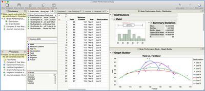
This tabbed configurable environment provides the user with the flexibility to reveal, hide, and display the contents of the project file in whatever way is best for the situation.
Project files can be shared and all of the contents, including non-JMP files, will be included.
Visit jmp.com, jmp.com/help or community.jmp.com and search for “Projects” to see a list of resources, including recordings, tutorials, documentation and user discussions, to learn more about the functionality of JMP Projects.
Importing Data
Often, data is produced within other applications, rather than inside statistical software. For example, an engineer may record data from an experiment in an Excel spreadsheet or a central database containing a large collection of customer behavior data from which certain subsets of that data need to be retrieved and analyzed. Both Minitab and JMP can open many different file types, including .csv, .txt, .xls, among others, and each is able to query a database via ODBC (Open Database Connectivity).
JMP
JMP is able to open other file types that Minitab cannot, such as SAS, R, MATLAB, .html, and .pdf files. JMP can also open tables that are built into web pages using the Internet Open functionality.
JMP also has added advantage of being able to import multiple files combining them into one data table. Figure 4 shows a folder containing a collection of different text files related to a survey along with the content of one of those files.
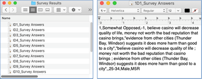
Selecting File > Open Multiple, will launch an import wizard that will guide you through the process of importing all of the data across these many files into one JMP data table.
To import data you currently have in a Minitab file into JMP, it is best to first save the Minitab worksheet in a format such as .xls, .csv, or .txt. Then simply choose File > Open in JMP to import that data into a JMP data table. An import wizard will be launched to specify how the data is to be imported (e.g., choose the variables and rows to import, include/exclude variable names, etc.).
Cleaning and Formatting Data
Both Minitab and JMP have a collection of tools that allow the user to clean and format data to prepare it for analysis.
Minitab
Most of Minitab’s tools to format, clean and prepare data are found under the Data and Calc menus. Figure 5 shows the list of tools under those menus.
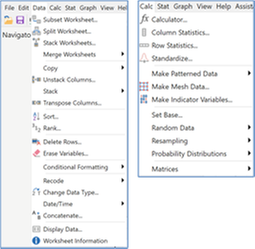
Once a tool is selected, a dialog box will appear, allowing variables to be placed into different roles to describe the specific set of operations to be performed.
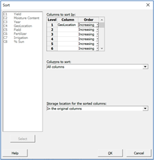
Figure 6 is an example of the dialog box for Minitab’s Sort Tool. Here we have chosen to sort all of the data in alphabetical ascending order based on the GeoLocation variable saving the data into the same worksheet (i.e., “In the original columns”).
JMP
Most of JMP’s tools to format, clean and prepare data for analysis are found under three different menus: Tables, Rows and Cols (shown in Figure 7).
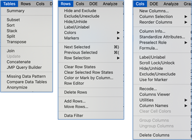
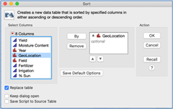
Figure 8 is an example of JMP’s Sort Tool. Though the dialog box has a difference appearance and uses different names for operations, the general procedure is quite similar.
All of the data manipulation operations you’ve performed in Minitab will also be able to be performed in JMP. It will just take a little bit of practice to learn how the tools are accessed and how the desired operation is specified in the dialog box.
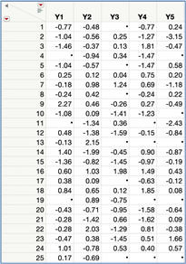
One JMP tool in the Tables menu (that is not available in Minitab) that can be quite useful in an initial examination of a data set is the Missing Data Pattern platform. This following example uses a small data set, but you’ll find this tool to be most valuable when examining large data sets. Figure 9 displays a data table with five variables, 25 rows and 18 missing values.
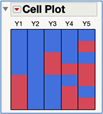
The Missing Data Pattern tool under the Tables menu will summarize the “missingness” in the data via a new JMP data table. Figure 10 shows the resulting table along with the accompanying Cell Plot.

This new data table describes the Missing Data Pattern in the data. In particular, there are 15 rows with no missing values; one row has a missing value in variable Y5; four rows have one missing value in variable Y3; two rows have a missing value across 3 variables - Y3, Y4, and Y5 and so on. Highlighting a row in this Missing Data Pattern table will highlight all of those rows with that missing data pattern in the original data table. This allows you to hide and/or exclude that data from future analyses, or generate row states such as assigning unique symbols to be displayed in graphs. There is a related platform called Explore Missing Values under the in Analyze>Screening menu that offers additional tools for working with missing data, including statistical techniques to find commonalities between the missing pattern in the variables and rows as well the ability to impute the missing data replacing them with estimated values.
Creating New Variables
Both Minitab and JMP allow the creation of new variables. These new variables can be, for example, simple arithmetic operations using other variables in the data table or a logic conditional argument.
Minitab
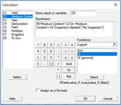
New variables are created in Minitab through the Calculator Tool under the Calc menu. Figure 11 illustrates how a new text variable was created based upon the value of the variable ‘Moisture Content’ with the results saved in Column C9.
JMP
To create a new variable in JMP, access the formula tool for that new column by highlighting a column and choosing Cols>Formula. It can also be accessed by right-clicking on a column and selecting “formula” from the menu. In Figure 12, the formula tool was used to create the same text variable based upon a conditional argument. Note that there is a Preview function available that allows you to see the results of applying the formula as it’s being created.
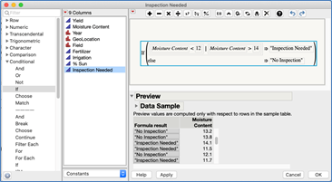
JMP’s Formula Tool is also where new variables can be created using a patterned sequence, a random sample from other columns or a specified probability distribution. In Minitab, other tools would need to be accessed to generate those types of operations.
Data Filter and Row States
Minitab
When performing an analysis in Minitab, a worksheet containing the data for that analysis is made active. If an analysis is to be performed on a subset of a parent data set, most likely a new worksheet will need to be created that contains only that subset of data. If outliers are identified and need to be excluded from future analyses, another new worksheet would need to be created without those data points. As a result, it is typical that one has to manage many worksheets within a project file.
JMP
Multiple data tables can also be set up in a JMP Project file as was shown earlier. Data filters and row state operations can instead be used to define the specific data to base a particular analysis on resulting in many users opting to do all their analyses from one data table. These data filters and row states can be saved and accessed at any time.
We’ll illustrate these analyses using the Grain Yield data.
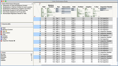
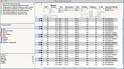
Figure 13A shows the data table with GeoLocations and C selected. This was done by clicking on the small histogram icon in the upper left of the data table to turn on the Header Graph, and then simply selecting those GeoLocations. The Header Graph is a convenient tool that displays high level summary of a variable at the top of each column (e.g., histograms and min/max values for continuous variables, a bar chart for categorial variables). Figure 13B shows the the result when the tool Rows>Hide and Exclude is selected. Any analysis performed with this Row State active will not include GeoLocations A and C in the calculations nor appear in any graphical display. Other options include using selected data in calcuations but not displayed in a graph (Hide only) or display data in a graph but not used in calculations (Exclude only). This row state can be turned off by again selecting Rows>Hide and Exclude or Rows>Clear Row States.
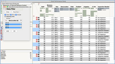
The Global Data Filter is another useful tool for defining a subset of data. This tool is accessed by choosing Rows>Data Filer. Figure 14 shows the data filter open with the GeoLocations B and D selected. Here we turned on the check boxes Show and Include and then selected the GeoLocations we want to use. The data filter can include many variables, and both categorical and continuous variables can be used. This data filter can be saved to the data table, row states can be cleared and then accessed again at any time.
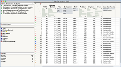
Other characteristics can be set up as row states. For example, you may want all the graphs produced in an analysis to use different colors for the different GeoLocations. This preference can be set up through Rows>Color or Mark by Column. Figure 15 is the resulting data table with the colors shown as row states. Any graphical display created with this row state active will use this color coding. This row can also be saved and accessed at any time.
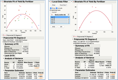
The Local Data Filter in JMP provides another means to work with a subset of the data. This approach provides an interactive tool in which to see analysis results change instantly as different subsets of the data are chosen. The Local Data Filter is accessed under the top red triangle in an analysis report window. Figure 16 shows the results of a Regression Analysis using all the data (left), then that same output changing based upon selecting only GeoLocation A from the Local Data Filter. Note that the data points are using the color row state we had set up in Figure 15.
Descriptive Statistics
Both Minitab and JMP are able to calculate summary statistics that describing features in the data.
We’ll illustrate some of these analyses using the Grain Yield data.
Minitab
There are a few ways to generate descriptive statistics in Minitab (e.g, Display Descriptive Statistics, Store Descriptive Statistics and Graphical Summary under the Stat Menu). Descriptive statistics can also be generated using the Tables tool, which we’ll illustrate here. Figure 17 show the steps for calculating the sample mean and sample standard deviation for for Yield for each GeoLocation/Year combination and the resulting table.
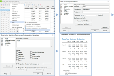
If different summary statistics are desired, or if different categorical and/or associated variables are to be used, the Tables>Descriptive Statistics tool is relaunched, the dialog box updated, and the analysis rerun.
JMP
JMP can also calculate descriptive statistics in a variety of ways, including the Distribution platform, Graph Builder, Column Viewer, and through column formulas. Similar to what was shown using Minitab, we illustrate how to calculate summary statistics through the Analyze>Tabulate platform.
Launching the Tabulate platform opens the window shown in Figure 18A. Variables are simply placed into different roles to create the table. Those variables can be moved to change the way the table is displayed. Variables can be removed, added, new statistics calculated, among other capabilities with the table updating the instant those changes are made. Think of it as a blank canvas that you create the desired table.
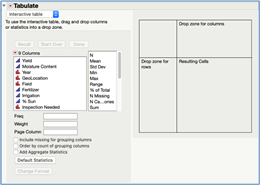
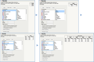
Figure 18B shows thes the steps to create the table displaying the mean and standard deviation of Yield for the 6 different combinations of Year and GeoLocation.
We begin by placing Yield into the Resulting Cells Drop zone. The default is to display the sum (the default statistic) of that variable as a single cell (upper-left image in Figure 18B). Note: You can choose to also display the mean and standard deviation by default via preferences (JMP > Preferences > Platforms > Tabulate).
In this case we will replace the sum with the mean and standard deviation by dragging those two statistics from the list on top of the cell where the word sum is shown. The table will updated, replacing the sum statistic with the mean and standard deviation (upper-right image in Figure 18B).
The categorical variables (Year and GeoLocation) are simply dropped into the desired locations. Year is placed as the rows (lower-left image in Figure 18B) and GeoLocation as the columns (lower-right image).
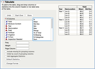
This table can be easily changed to create different views by moving variables into different drop zones. Figure 18C shows the resulting table when the variable GeoLocation is moved to be another row variable inside of Year.
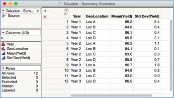
This table of summary statistics can be made into a JMP data table for further analysis by selecting Make into Data Table under the red triangle. Figure 18D shows the resulting data table.
Graphing
Minitab and JMP approach graphing data very differently; it is one of the more significant differences between the two software that a new JMP user will experience.
We’ll illustrate some of these analyses using the Grain Yield data.
Minitab
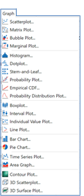
To create a graph in Minitab, one must first decide which graph is needed and then select it from the Graph menu. Figure 19 shows a list of the graphs available under that menu.
We’ll illustrate the process of creating a graph in Minitab by creating a scatterplot. When the scatterplot tool is launched, a screen appears (left image in Figure 20A). At that point, the user must pick one of the scatterplot options. In this example, Simple was chosen. A dialog box then appears to enter the variables to be plotted on the Y and X axes (right image in Figure 20A).
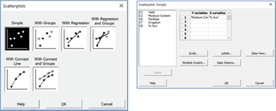
The buttons Scale, Labels, Data View, Multiple Graphs and Data Options provide additional options. Figure 20B shows the resulting graph if no additional options are chosen.
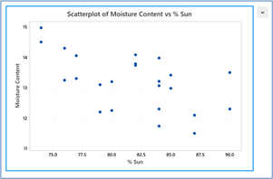
A few elements of the graph can be edited (e.g., changing the color of the points) by launching the Edit Graph tool under the drop-down menu in the upper right.
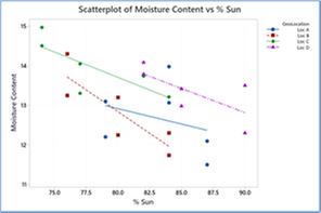
To make the scatterplot shown in Figure 20C that has a separate regression line for each of the 4 GeoLocations would require creating an entirely new graph. This would be done by relaunching the Scatterplot tool and selecting the “With Regression and Groups” from the dialog box shown in Figure 20A.
To create an entirely different type of graph with the same data (e.g., comparative box plots, etc.), then the user would return to the Graph menu, launch that specific graphing tools and specify the appropriate options. Each iteration of exploring the data graphically typically requires this approach until the desired graph is produced.
JMP
JMP approaches creating graphs very differently than Minitab. Though there are tools to create graph across every analysis platform in JMP, we’ll illustrate creating visualizations via the powerful Graph Builder platform. This tool has been designed to match the typical way in which one would explore and analyze data in practice. Upon launching the Graph Builder platform (Graph > Graph Builder), the display starts with what can be thought of as a blank canvas and a graph palette (Figure 21A).
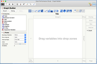
A graph is created by placing variables into different roles and selecting the desired graphical display. For example, if the variable Moisture Content is dropped into the Y zone, JMP will begin by displaying a dot plot (Figure 21B).
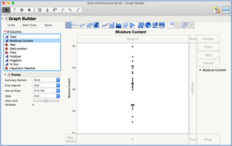
If instead of a dot plot, a different graph is desired (e.g., box plot), simply select that option from the graph palette at the top and the graph instantly changes. Figure 21C shows a graph where both a dot plot and box plot were selected.
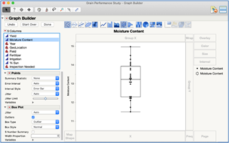
If another continuous variable is dropped in the X zone, JMP will automatically change the graph to a scatterplot. Figure 21D shows an example of such a graph with a regression line included.
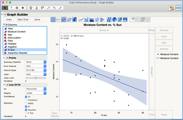
For each type of graph selected, tools and options are displayed on the left to alter or augment the graph even more. For example, the equation, 95% Confidence Interval and RSquared value was added to the graph.
Each one of these graphs created during this process can be saved to the data table if desired. Alternatively, the analyst can continue visually exploring the data. Figure 21E shows how the graph would change if the variable GeoLocation were dropped into the Wrap drop zone.
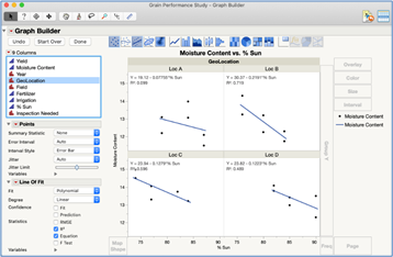
If GeoLocation were moved from the Wrap drop zone to the Overlay drop zone, and the option to display the equation and RSquared were turned off, the graph would change to that shown in Figure 21F.
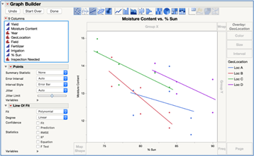
Floating the cursor over one of the axes, the pointer changes to a hand symbol, allowing a simple way to move and/or rescale the axes. Double-clicking on an axis brings up a set of tools to alter the graph even further such as changing from a linear scale to a log scale for example.
Right-clicking on the graph brings up a menu of additional tools to alter the display, such as changing the colors and symbols used.
This process illustrates the fundamental difference in how each software approaches graphical analyses. In Minitab, graph types are chosen and options selected without seeing what those choices will do. In JMP, you build graphs interactively seeing how each choice would change and enhance the graph. This results in a much more efficient and richer exploration of data allowing you to quickly generate myriad graphs to uncover features in the data and to create the visualizations that best communicate your findings.
Two very powerful tools that can greatly enhance visually exploring data is JMP’s Local Data Filter and Column Switcher. Illustrated with the Advertising Experiment data.
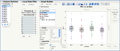
With JMP’s dynamically linked data, new variables can be switched and/or the data filtered, and the graph will instantly update to reflect those changes. Figure 22 shows a comparative dot plot for the variable WS1with 95% confidence intervals for four different categories of the variable Ad Style. The Column Switcher, seen in the upper-left, was set up so that the analyst can simply select (or play through) 9 other possible outcome variables to display on the Y axis. The Local Data Filter was also set up using the explanatory factors Promotion (three levels) and Time Period (10 levels). The analyst can subset the data by these variables. For each selection, the graph will instantly update to display the selected variable for the Y axis and to include only the data as chosen with the Local Data Filter. In Minitab, a new graph would have to be created separately for each possible combination of these variables.
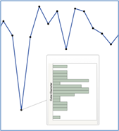
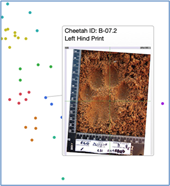
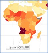
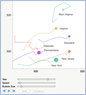
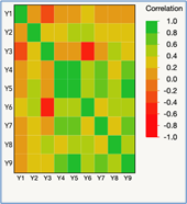
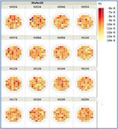
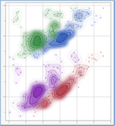
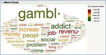
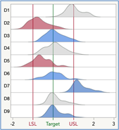
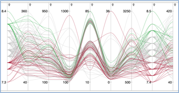
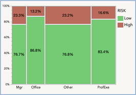
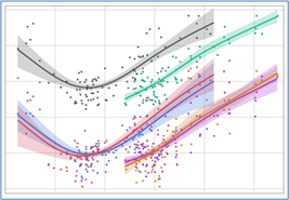
JMP contains many graphical tools not currently available in Minitab. These greatly expand your ability to explore and present data. Figure 23A-J show some of these visualizations.
Univariate Analyses
Minitab and JMP approach running statistical analyses quite differently. We’ll step through the analysis of a single continuous variable for each software to demonstrate these differences.
We’ll illustrate these analyses using the Yogurt Production data.
Minitab
In Minitab, the Graphical Summary tool is a useful way to analyze a single variable. To run this analysis, select this tool in the Stat menu. A dialog box appears to select the variable upon which to perform the analysis. Figure 24A show the steps to run the analysis and 24B displays the resulting output. The normal distribution curve that is shown on the graph is the only distribution that can be displayed in this output. Using other probability distributions would require a different tool in Minitab.
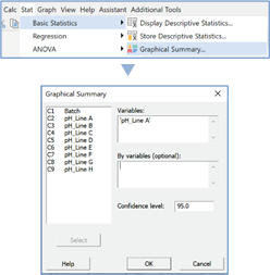
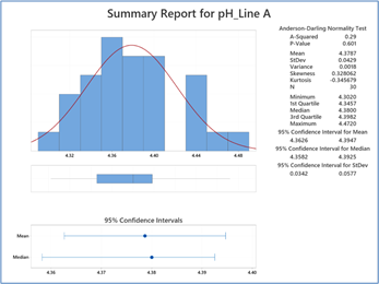
If different statistics other than those displayed were desired, a different tool would need to be launched (Stat > Basic Statistics > Display Descriptive Statistics) and those options selected. Steps and output now shown.
The Graphical Summary displays the results of the Anderson-Darling normality test. If you wanted to examine a probability plot and/or an empirical Cumulative Distribution Function graph to accompany the test, it would need to be done using two different additional tools (Stat>Basic Stat>Normality Test and Graph>Empirical CDF). The procedure is similar to running any other analysis. A dialog box appears upon launching the tool for the user to specify the variable to run the analysis on and to select options. Figure 25A shows the steps to run the normality test analysis and 25B shows the resulting output.
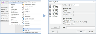
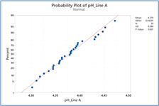
To create the CDF plot, a different tool (Graph>Empirical CDF) would be launched and the analysis run (steps and output now shown).
If, for example, the normal distribution was not a good model to use for a variable, other distributions may need to be evaluated. This evaluation is performed in a different tool (Stat>Quality Tools>Individual Distribution Identification) (steps and output not shown).
Let’s say the next step in the analysis is to perform a hypothesis test for the population mean. To do so would require accessing yet another tool (Stat > Basic Stat > 1-sample t) (steps and output not shown). To perform a hypothesis test regarding the variance, this same procedure of using a new tool (Stat > Basic Stat > 1 variance)
Other analyses common to analyzing a single continuous variable are: Equivalence Test, Tolerance Interval, Prediction Interval, Capability Analysis, among others. Each would require a different tool in Minitab and each producing a separate output. Current, Minitab does not have the capability to produce a prediction interval so this would actually require manually creating a formula.
JMP
JMP approaches univariate analyses very differently and is more aligned to the natural work flow of exploring and analyzing data. JMP has a single platform (Analyze > Distribution) that can perform all the analyses mentioned in the previous section. The platform is accessed by selecting it from a menu and completing a dialog box, as demonstrated in Figure 26A. Figure 26B displays the initial output.
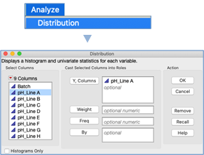
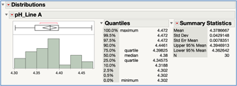
The initial output provides both a graphical and numerical display of the data, including a histogram, box plot, summary statistics and a confidence interval for the mean. Clicking on the red triangle at the top of the summary statistics table provides access to a set of tools to change the statistics that are displayed.
All the analyses mentioned among many others can be conducted from within this one report window. These are all accessed via the red triangle next to the variable name. These contextual menus provide you with a set of analyses that would be next to consider in your analysis workflow. Figure 27 shows that menu along with the Continuous Fit>Normal analysis selected.
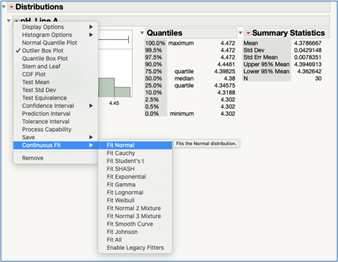
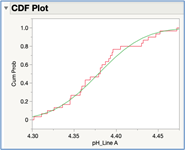
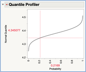
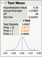
Figure 28A through 28K show results from the Continuous Fit and all the other univariate analyses performed on these data with each new set of output added to the one report window allowing for easy comparison.
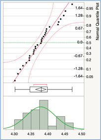
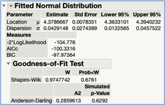
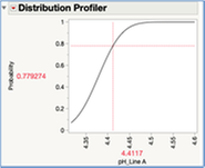
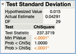


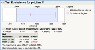
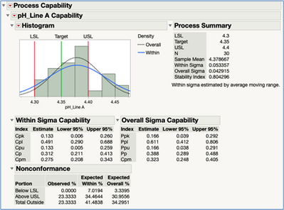
Additional interactive tools are available bringing an extra level of analysis capabilities via “what-if” scenarios. Figure 29A – 29C show three of these (p-value animation, power animation, and capability animation). In addition to helping better understand the process being studied, these interactive tools provide a great way to understand or teach statistical concepts.


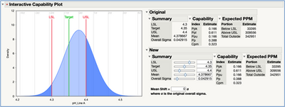
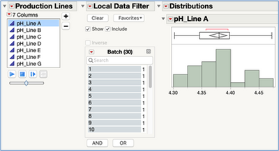
The Local Data Filter and Column Switcher is also available within this interactive report. Figure 30 shows the Column Switcher set up for the 7 production lines and the Local Data Filter set up for Batch Number. You can now choose the production line and the batches to include in the analysis and all of the numerical and graphical output is instantly updated. With Minitab, each outcome variable and/or subset of the data one wishes to analyze would require rerunning each and every analysis across all the various tools creating a substantial amount of reports to manage.
Saving and Sharing Results
Minitab
Each time an analysis is performed in Minitab, the output will be placed in the Navigator pane as a separate element. Saving the Project File will save all those output elements along with all the worksheets into the Project File. Individual output can also be saved as an image file (e.g., .png, .jpg) and placed into other applications.
JMP
There are many ways to save your analysis results in JMP. These include saving as an interactive .html file, to a JMP Journal file, as an image file placed into other applications, and even published to a private secure dashboard via. JMP Live providing the ability to view and interact with reports outside of JMP. We will illustrate saving reports as a script to the data table as that is the most common way you will save your analysis work.
From within a report, choose Save Script > To Data Table under the Red Triangle in the top left of the report window (Figure 31A).

The saved scripts will appear in the top-left pane of the data file window (Figure 31B).
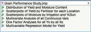
Clicking the green triangle will rerun the saved script to perform all the analyses associated with that report. This allows you to rerun a full set of analyses on a modified data set (e.g., removing/adding data, recoding values, subsetting via the global data filter, new row states). Scripts can be reorded in the pane or grouped together to aid in management of your analysis work.
One-Factor Analysis
Both Minitab and JMP have tools to perform one-factor analyses (e.g., simple linear
regression, simple logistic regression, one-way ANOVA, and Chi-square test for
comparing proportions). Similar to univariate analyses, they approach how the
analyses are performed very differently.
We’ll illustrate some of these analyses using the Tablet Production data.
Minitab
When performing a one-factor analysis in Minitab, the appropriate tool is launched (Stat>Regression>Fitted Line Plot, for example). The appropriate variables are specified within the dialog box and other options chosen. Output is generated and placed in the output window. Consider upon examining the the output of a simple linear regression for example, it is desired to add a confidence interval to the graph, or to examine residual plots, or perhaps it’s desired to change the scale of one of the variables from linear to log or perhaps use a different response or predictor variable all together. The fitted line plot tool would need to be relaunched, the options changed, and then a new set of output created. Each set of output in Minitab is primarily static, allowing only a few alterations.
Different one-factor analyses (e.g., logistic regression, ANOVA, chi-square test) require the use of other tools.
JMP
In JMP, all one-factor analyses are performed from one platform, Analyze>Fit Y by X. Figure 32A shows the dialog box for this platform. When the Y, Response Variable and X, Factor is chosen, JMP automatically determines the correct analysis.
To illustrate how JMP can perform multiple analyses simultaneously, we have chosen two variables for the Y, Response (Dissolution, a continuous variable; Lot Acceptance, a binary variable) and two variables for the Factor (API Particle Size, a categorical variable with three levels; Mill Time, a continuous variable).
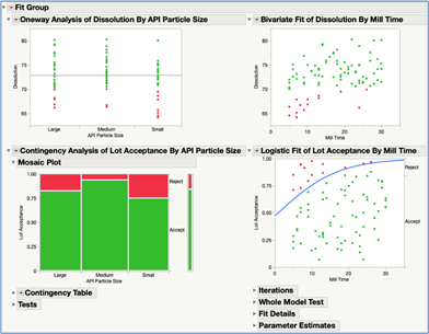
JMP will create four different analyses:
- One-way ANOVA for Dissolution vs API Particle Size.
- Simple linear regression for Dissolution vs Mill Time.
- Contingency table analysis for Lot Acceptance vs. API Particle Size.
- Simple logistic regression for Lot Acceptance vs. Mill Time
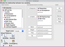
As in many other platforms in JMP, Fit Y by X has the capability for the analysis to include a categorical By Variable, running a separate analysis for each level of that variable. The models can also be fit assigning weighted values for the observations. The platform can also be used on data that is in summarized Frequency/Table format.
The initial output for these four analyses is shown in Figure 32B. Note: Row states were set up so that lots meeting the specification of dissolution ≥70 are color coded green and those < 70 are color coded red.
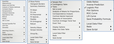
Next to each analysis is a red triangle hot spot that reveals a contextual menu with the tools JMP recommends as possible next steps in the overall analysis. As there are four different statistical analysis techniques performed, there are four different sets of tools under each menu. Figure 33 shows each of these contextual menus. You are now ready to choose the next step in the analysis workflow. Each subsequent analysis produces another set of output added to the report with a new red triangle hot spot providing additional options.
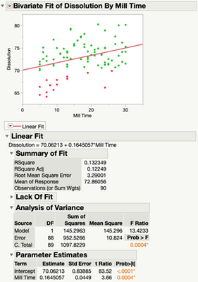
To illustrate how an analysis might unfold in the Fit Y by X platform, the Fit Line option under the red triangle for the Bivariate Fit of Dissolution by Mill Time was selected. Figure 34 shows the output that now gets added to the report based on that selection.
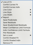
Notice that a new red triangle hot spot has appeared next to the chosen linear fit. Figure 35 shows the options available under that contextual menu. Here you see the option to add confidence or prediction intervals to the graph, create residual plots, save values to the data table, among others.
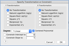
As shown in the Bivariate Fit menu in Figure 33, other models can be fit and compared. For example: polynomials, splines, orthogonal, non-parametric densities, and robust regression. Transformation are available under Fit special. Figure 36 shows those options.
Each model fit being considered can be added or removed from the report as you explore and compare different model choices finding the one best for the data. Figure 37 shows the display with a quadratic fit and non-parametric density added.
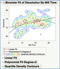
The Local Data Filter and Column Switcher can be accessed if you wish to change the variables used or select a subset of the data to base the analyses on. All the output will instantly update to reflect those choices. It’s not necessary to subset the data into a new data table and rerun the analysis as it is with Minitab.
As this example again illustrates, analyzing data in JMP is much more than simply performing a particular statistical technique on a dataset and observing a static collection of output. The platforms are designed to follow a natural analysis workflow aligned with how you would analyze data in practice. You explore, interact with the data and results, change variables, filter the data, try different model options, with each result leading to the next logical step in a sequence of analysis steps.
Multivariable Statistical Models
Building statistical models that involve many variables is probably the most powerful and frequently needed type of analysis. There is usally four purposes for building these models:
- For testing specific hypotheses.
Example: Does Drug Treatment A reduce the recovery rate by at least 15% for males over 70 years of age as compared to a placebo? Is the effect the same for females? - Finding the few variables out of many that are most correlated with an outcome.
Example: What are the key socio-economic conditions most correlated with poor health outcomes for a community? - Quantitatively describing the relationships between variables.
Example: How much does viscosity of a solution decrease when the processing temperature increases by 5 0C and the processing time increases by 10 minutes? - Create a method on which to predict an outcome.
Example: What is the likelihood a customer would be interested in learning about a new mortgage refinance program based upon characteristics of the customer and their current mortgage?
The primary goal for a model may be just one of these, some or even all of them. The modeling technique chosen is often driven by which of these goals are most important.
Minitab
Minitab v19 has three multivariable modeling techniques:
· Generalized Linear Models (e.g., ANOVA, Linear Regression, Logistic Regression)
· Classification and Regression Trees
· Discriminant Analysis
Similar to performing a one-factor analysis, building a multivariable statistical model requires first choosing a modeling type appropriate for the situation (Stat>ANOVA>General Linear Model, for example). Within the dialog box, the user then specifies the variables to be included and any other relevant options.
The output is generated upon running the analysis and placed in the output window. In the process of building a statistical model, an analyst typically needs to fit many different models, with each including a different set of variables and model terms until a final model is determined. If it is decided to remove a variable or term from the model, the dialog box is relaunched, changes made, and the analysis is rerun. Each possible model considered must be run separately each producing a different set of output. As is most analysis results in Minitab, the numerical and graphical output is mostly static with just a few options to make changes. If one wishes to remove some observations from the data, for example, a new worksheet must be created and all of the models run again.
JMP and JMP Pro
JMP and JMP Pro v16 have the following multivariable modeling techniques along with many variants within each.
· Generalized Linear Models (e.g., ANOVA, Linear Regression, Logistic Regression)
· Partition (Decision Tree)
· Neural Network
· Discriminant Analysis
· Bootstrap Forest *
· Boosted Trees *
· K Nearest Neighbors *
· Naïve Bayes *
· Support Vector Machines *
* JMP Pro Only
There are other modeling techniques in JMP and JMP Pro beyond these. They are typically used for more specialized applications vs. for general modeling purposes and thus not listed above (e.g., Structural Equation Models in social sciences; Uplift, Choice, and MaxDiff for consumer research; Functional Data Explorer to model data that are functions, signals, or series).
Each of JMP’s modeling platforms also has many options regarding estimation methods and model fitting specifications. These provide the ability to generate even more models to consider and allow for greater capabilities in handling complex situations (e.g., Weighted Least Squares, Penalized Regression, Informative Missing, K-Fold Cross Validation to name a few).
We’ll illustrate the model building process in JMP Pro by fitting a Logistic Regression Model using the Mortgage Refinance Outreach data.
Logistic Regression Model:
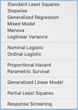
In JMP, all linear models are created using the Fit Model platform under the Analyze menu. This one platform allows you to choose from a variety of model forms and model fitting techniques by selecting the desired option under the Personality drop down menu. Figure 38 shows the options available in JMP (left) and JMP Pro (right).
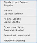
Figure 39A shows the dialog box for the Fit Model platform with the outcome variable and model terms added. Here we are fitting a main effects only model. The option to include interaction terms, quadratic effects, defining terms as: (crossed or nested) and (fixed or random) are available. We have also included a validation column. This column has random allocated the data into: 75% training and 25% validation. JMP will use only the training data to fit the model. The validation data will be used to evaluate the predictive ability of the fitted model. This approach can help avoid the undesired result of a model overfitting the data.
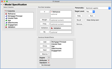
Upon running the analysis, JMP will produce the nominal logistic regression report.
As in all of JMP’s analysis output, it’s best to think of a report as an interactive platform vs. static output. For example, model terms can be removed from the fitted model without the need to return to the Fit Model dialog box, making the changes, and rerunning the analysis. Figure 39B shows the Effect Summary table from the report with the variable Age selected.

Figure 40 shows options that are available under the top red triangle.
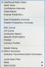
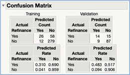
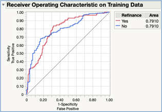
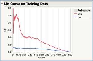
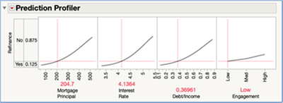
Figure 41A – 41D shows some of the common types of output that is examined when building a logistic regression model added to the report.
When the primary objective of a statistical model is for prediction only and it’s not necessary that the equation has a simple form with interpretable coefficents, other more complex models should be explored. JMP Pro has a very powerful platform called Model Screening that will fit many different models using various techniques presenting the result together in one report. Figure 42 shows the dialog box for that platform with the variables assigned to their roles and a set of model types selected.
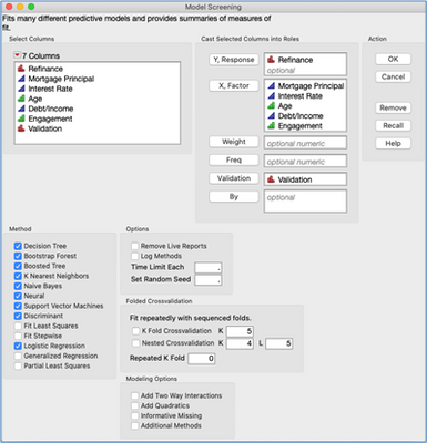
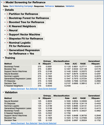
Figure 43 shows some of the summary results produced in the report allowing for you to easily see and compare model performance. Notice that the Boosted Neural Network model has the lowest overall error rate on the validation data (16.0%) with the Nominal Logistic Regression at 19.2%.
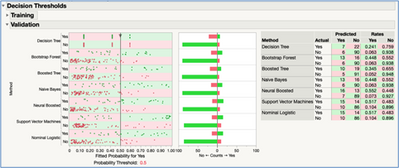
Figure 44 displays the Decision Threshold tool which can be important to evaluate when predicting a categorical outcome as we are doing here. This tool provides an interactive means to evaluate how the error rates change for each model as you consider different probability threshold values.
Each of the model platforms can be launched from this report providing access to the full set of tools available for each.
Conclusion
Both Minitab and JMP offer users an easy to use point-and-click environment to analyze data. Though they both contain many of the same statistical techniques, you access and use them in different ways. For example: most univariate analyses in JMP are performed within the Distribution platform where in Minitab, many different tools are used depending upon the specific data type being analyzed and the statistical technique to be chosen. In JMP, the output from each univariate analysis can be added to the same report window.
As was illustrated in this transition guide, the data tables, graphs, and reports are dynamically linked in JMP providing you with a more interactive environment to explore and analyze data. This capability allows you to conduct an entire set of analyses on various subsets of data using only one data table and one set of analysis reports. In contrast, a typical analysis session in Minitab requires you to manage many different worksheets and a large collection of analysis output.
JMP’s approach to visually exploring data via the Graph Builder is a very different paradigm than how Minitab approaches graphing data. As we demonstrated in the guide, JMP’s Graph Builder allows you to see how each option you are considering changes the visualization providing you with a dynamic way to discover features and patterns in the data.
Visit jmp.com to learn more about JMP’s capabilities and to find learning resources such as books, webinars, white papers, courses, among others.
About the Author
You must be a registered user to add a comment. If you've already registered, sign in. Otherwise, register and sign in.
- © 2026 JMP Statistical Discovery LLC. All Rights Reserved.
- Terms of Use
- Privacy Statement
- Contact Us

