☑ cool new feature
☑ could help many users!
☐ removes a "feels like bug“
☐ nice to have
☐ nobody needs it
What inspired this wish list request?
A GraphBuilder plot with a categorical value on the X axis and another categorical value used as X Group generates a lot of white space:
every X category shows up for every X Group.A
wish to fix this issue is already under investigation:
X group: restrict the values on the axis to the respective group

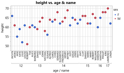
A proposal to get rid of the white space even without an optimized Graph builder: use categorical columns on the X axis and generate a hierarchical pattern.
Indeed one gets rid of the unnecessary white space - but it's really hard to distinguish between 1st and 2nd order items (names and ages):

It helps a bit to use different colors for the different grid lines, but the contrast could still be better ...
Unfortunately, it's not possible to adjust the line width of the grid lines - this is just possible for the Tick marks.
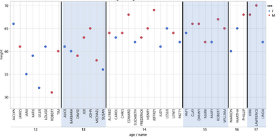
Nor is it possible to apply different colors to the backgrounds of the individual top-level blocks.
What is the improvement you would like to see?
1) In the Properties menu, please add an option to specify the line width of the grid lines.

2) Please provide an option to apply different background colors to top-level blocks, or alternatively, automatically apply alternatingly two different colors to the top-level X-Axis categories.
Why is this idea important?
The improvement will help the user to generate graphs in Jmp which are easier to understand.

more wishes submitted by 