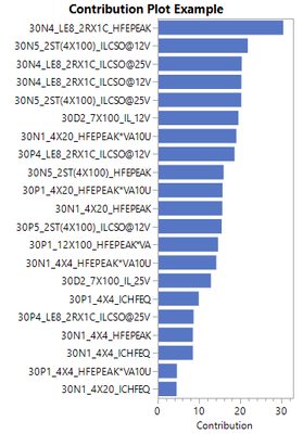
In JMP 15 it became possible to to view contribution plots for T2 within PLS and PCA models. To make these more usable, bring some functions from the [also new] Multivariate Drive Multivariate Control Chart to the PLS and PCA platforms, and add some new features.
Specifically:
- Sort contribution plots by descending contribution, make sure it continues to be possible to scale the axis to only show the top few variables.
- Transform the contribution plot so column labels are in rows to make them easier to read
- Let the user display contributions for selected rows in a table (or mean for selected rows)
- Link to uni-variate control charts for selected variables within the contribution plots or tables
- Show contributions for T2 and DModX in both platforms, plus DModY in PLS
- On both distance and T2 charts, let the user change the x axis to any other variable. For example for time series data I frequently want this to be time.
As a use case, here is the chart I would use to explain to someone what is different about row 4893 of the Responses in the Probe sample data set. Right now this is difficult and resource intensive to draw. Please make this easy for new JMP users to create the same chart:
