cancel
Showing results for 
Show  only  | Search instead for 
Did you mean: 
Choose Language Hide Translation Bar
0 Kudos

Multiple x and y data sets plotted as "pairs" without having to stack columns

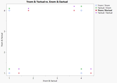
I have sets of xy data measured on a part.  There are data points for "nominal" (ex: as designed location) as well as actual (where we measured).  If both PAIRS of data are plotted in JMP (using the trapezoid landing zone to add 2nd series on each axis), it gives 4 series as outputs -

Xnom, Ynom - GOOD

Xnom, Yactual - this is nonsense

Xactual, Ynom - this is nonsense

Xactual, Yactual - GOOD


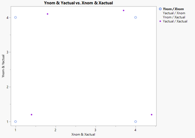
I would like an option to have Y values tied to a set of X values so that only the GOOD (real) pairs plot on the chart.

Comparison - in Excel, I would "paste special" a new set of data with both an X and Y column, and it asks if I would like to make it a new series and if I would like to define new x values for this new series.


Another typical instance where this is helpful is plotting Pi data.  The tags often don't have matching time stamps, but I want to see them together on the same chart.  Forcing matching time stamps can skew some data sets depending on how it is captured.  (I haven't used the new Pi import in JMP - I was working with Pi data pasted from Excel - just another recent example for me where I had many Xs that went to specific Y series and they weren't the same.)


This is an ease of use issue.  The work around is to stack the data so X and Y are all in the same column, with a label field that defines the series.  This can work for some data sets, but it is harder for many users to wrap their mind around or to know how to do.  This is a rare time I leave JMP and go back to Excel to plot a graph.


Example - bad graph (this is made up data as I can't share real data).  The "nonsense" series are * markers
LoveDataViz7_2-1699551163636.png


Example of what a graph could look like (I made "nonsense" series a white tiny marker so they don't show):
LoveDataViz7_1-1699551088715.png


5 Comments
hogi
Level XI

Did you know that you can disable individual X and Y columns via the "variables" option or via JSL?


hogi_0-1710268216634.png


Names Default to Here(1);
dt = Open( "$SAMPLE_DATA/Big Class.jmp" );
Graph Builder(
	Size( 534, 464 ),
	Show Control Panel( 0 ),
	Summary Statistic( "Median" ),
	Graph Spacing( 4 ),
	Variables(
		X( :weight ),
		X( :height, Position( 1 ) ),
		Y( :height ),
		Y( :weight, Position( 1 ) )
	),
	Elements(
		Points( X( 1 ), Y( 1 ), Legend( 11 ) ),
		Smoother( X( 1 ), X( 2 ), Y( 1 ), Y( 2 ), Legend( 12 ) ),
		Points( X( 2 ), Y( 2 ), Legend( 13 ) )
	)
)  


LoveDataViz7
Level III

I looked into the suggestion by @hogi - sorry I missed this earlier.

This does not work for what I am trying to do.  I need every variable included as part of a pair.  If I uncheck the box under the variables option, the pair I need to be visible that includes that variable will no longer show on the graph.  All 4 variables are needed to be plotted.  But I only want them matched in their respective XY pairs - Xnom to Ynom and Xactual to Yactual.  If I uncheck Yactual so that it doesn't show with a Xnom-Yactual "nonsense" pairing, the real Xactual-Yactual pairing that I need to see also disappears.


Visual with 2 good pairs (solid dots) and 2 nonsense pairs (open circles):

LoveDataViz7_0-1709920272342.png


Visual if I uncheck Xactual - one good pair (Xactual-Yactual) disappears and one nonsense pair (Xactual-Ynom) disappears. 

LoveDataViz7_1-1709920327955.png

If I uncheck both Actuals, then I am left with only Xnom-Ynom.  This is the same as if I only put Xnom and Ynom on the graph.  It doesn't show me any data from the actuals, which I need plotted on the same graph pane with the nominals.

LoveDataViz7_2-1709920408225.png

hogi
Level XI

Seems that you just used one Points element - instead of the two points elements which were suggested

LoveDataViz7
Level III

@hogi "Elements" was a useful key word!  I was not aware of this term before.  I am far more comfortable with Graph builder than writing JSL, and I am looking for something I can share with other users who are far less comfortable in JMP, let alone writing code.  The image only showed one set of points, so I attempted to copy in JMP graph builder what was in the image.  After getting the graph to draw via code and seeing what it looks like, I was able to do a bit more googling to figure out the Graph Builder method.    


For anyone else looking to solve this issue, the key is to right click on the graph and select "add", then "points".  Then you can do as hogi suggested above and click off the variable combinations that don't apply - see image below.


For JMP - I still think this is a gap for a certain type of users.  Some users are power-users and go deep into scripting.  For users you want to pull over from Excel with the lure of simpler, better graphs, being able to easily access a paired xy graph with multiple pairs from a quick menu would be ideal.  At the very least, a help menu option that comes up using typical terms from experience graphing in Excel could help (ex: "paired xy graph").  I would never have known to search for "how to create two points elements jmp graph builder".  That is how I finally found the answer!   

LoveDataViz7_0-1710262227909.png


hogi
Level XI

Thanks for pointing this out, another way to get an additional XYZ Plot type into a graph window: select the XYZ Plot type on the top and drag it into the graph. 


Or via ctrl / shift click.