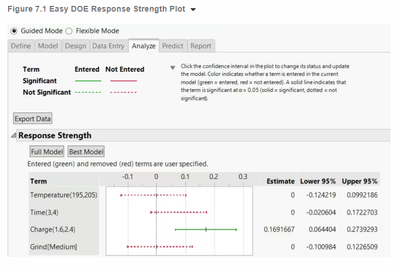
What inspired this wish list request? Please describe the current issue that needs improvement or the problem to be solved that is not easy or possible right now, with an example use case. The Analyze tab in the Easy DOE platform gives a cool plot of the model terms included in the chosen model along with associated confidence intervals. Easy DOE is better for newer users, but more intermediate/advanced users could benefit from this graphical display as well. The full reference to the plot is found here - Analyze (jmp.com).

What is the improvement you would like to see? Please describe the idea for improving JMP. Please include mock-ups, wireframes, screenshots, scripts, other documents or examples from other software that help describe the change you would like to see. Implementing this in either the Fit Least Squares or Generalized Regression platforms (it would look good potentially as an option near the Solution Path graphs).
Why is this idea important? Please describe the value to you and/or other users if the idea is implemented (for example, ease of use, must have,…). Being able to harmonize output across platforms can be important to the user experience. A newer engineer leveraging Easy DOE can make a nice plot that a more experienced engineer that is using standard menus such as Fit Model are unable to reproduce. Easy DOE is also more of a front-to-back, end-to-end bundle of content for a DOE, so it is difficult to just get a singular extraction from the platform. It would be simpler to implement the Effect Plot in other model-fitting platforms.