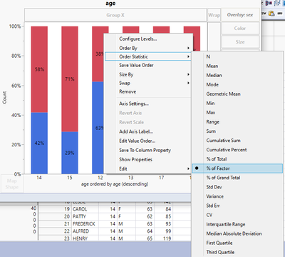
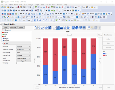
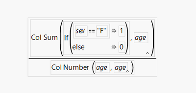
What inspired this wish list request? When I use % of factor as the summary statistic in graph builders bar charts or am using a mosaic plot I cannot use the sort by option for the X axis. I have to make a new column that gives the % value I am seeing on the charts and then I can use "sort by" and choose that column.
This is from the Big class data set:


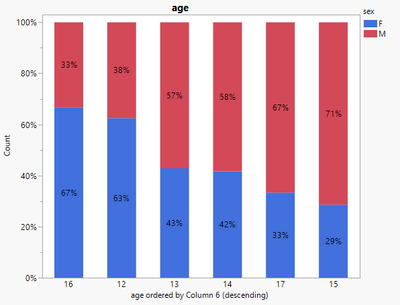
If I make this column I can make it do what I would want

As I can now sort by this column

What is the improvement you would like to see? I would like to be able to choose the level to sort by in the menu options. In the case above there would also be a "levels" option that would show "M" and "F". Which ever one was chosen would be the value the bars are sorted by.
Why is this idea important? Pareto'ing out factor levels for reject rates is a common activity in the manufacturing industry and the additional steps you need to take are not intuitive for new users (who then get frustrated because the sorting is not working like they are used to and they can't figure out how to make it work) as well as a lot of unnecessary steps, especially if you change around the factor in the X axis.
Thanks for looking this over with me @Jordan_Hiller