- New to JMP? Let the Data Analysis Director guide you through selecting an analysis task, an analysis goal, and a data type. Available now in the JMP Marketplace!
- See how to install JMP Marketplace extensions to customize and enhance JMP.
- Subscribe to RSS Feed
- Mark as New
- Mark as Read
- Bookmark
- Subscribe
- Printer Friendly Page
- Report Inappropriate Content
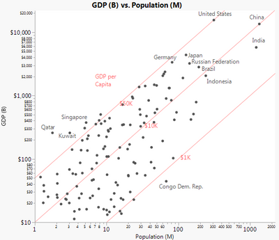
After Kaiser Fung critiqued a chart of World Bank GDP data in a Junk Charts blog post, I tried a JMP version and posted it to twitter a few months ago. Since others have asked for more details, I'm posting the file and info here.
The challenge is to represent two variables (GDP and population) and their ratio across very wide scales. I tried a scatter plot with added lines to show levels of the ratio. There is still a labeling challenge, and I've hand-picked some "interesting" countries to avoid overlapping labels. Others can be identified interactively with hover labels.
In this graph GDP uses PPP (Purchasing Power Parity), which explains why India is ahead of Germany and Japan in total GDP.
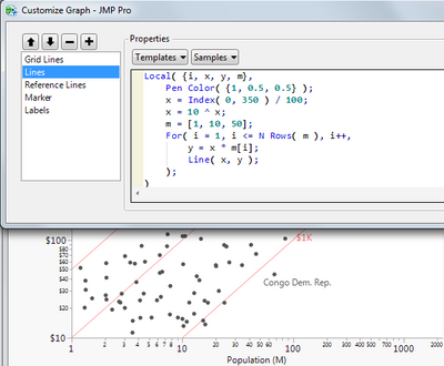
I made the pink lines and labels with custom graphic scripts. Here's the Customize dialog with the lines script.
A nice feature of the Customize dialog is that you can apply your script changes without closing the dialog, making it easy to experiment. The x and y variables are each arrays of 350 values. Only 2 points are needed to make a line, of course, but having all those points is useful if one of the axes is changed to a linear scale. Then the "line" becomes a curve.
Recommended Articles
- © 2026 JMP Statistical Discovery LLC. All Rights Reserved.
- Terms of Use
- Privacy Statement
- Contact Us


