Introduction:
Tableplots have just recently entered into the realm of statistical analytics, but they are quickly gaining popularity as a preliminary tool for cleaning data sets. For information regarding tableplots, I refer to Visualizing and Inspecting Large Datasets with Tableplots by Martijn Tennekes, Edwin de Jonge and Pi... of Statistics Netherlands. This paper stresses the use of tableplots as a visual tool for gauging the accuracy and reliability of large data sets. Tableplots display both the numeric and categorical aspects of an entire data set. In doing so, they expose collected data errors and outliers in data sets that are otherwise too large to visualize. This tableplot add-in relies on JMP's Graph Builder platform and automatically chooses the Current Data Table() for analysis.


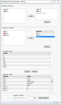
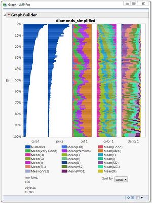
Input Panel Output Tableplot
Steps:
To display the data set, the tableplot...
- Sorts all data entries by one numeric variable
- Splits data entries into row bins, giving each bin the same number of entries
- If numeric, averages the values in each bin to determine the bin's corresponding bar length
- If categorical, stacks all present values into a single bar
Features:
In their paper, Tennekes, de Jonge, and Daas stress the importance of a handful of features necessary for any useful, interactive tableplot. I have listed them in the following categories.
Features via add-in:
- Adjustable number of row bins: row bins range from 1 to the size of the data table, as indicated by the slide bar and number box in the bottom panel of the input window. The preset number is 100, which is standard for data sets with more than 10K entries.
- 12 values per categorical graph: the paper suggests no more than 12 values per column bar graph. Instead, multiple column bar graphs can be added to the same tableplot. This is why the categorical columns are numbered upon inclusion.
- Adjustable sorting: While the tableplot automatically sorts by the first numeric column provided, the drop-down menu in the output window allows sorting by any numeric column included.
Features via JMP:
- Adjustable colors: As with any other graph made with Graph Builder, the colors of bars within the tableplot can be adjusted by changing the fill color with legend settings.
- Filtering of large data sets: Large data sets can be filtered using a "Select Where" clause and taking the subset of selected rows
- "Zoom in" ability on large data sets: similar to the filtering feature mentioned above, subsets can be taken of large data sets to "zoom in" on particular entries.
Unavailable Features:
- Lighter colors for bars with missing values: Incomplete rows that do not contain every value displayed in the tableplot do not take on a lighter color shade to visualize the missing values.