- Subscribe to RSS Feed
- Mark as New
- Mark as Read
- Bookmark
- Subscribe
- Printer Friendly Page
- Report Inappropriate Content
JMP Add-Ins
Download and share JMP add-ins- JMP User Community
- :
- File Exchange
- :
- JMP Add-Ins
- :
- Funnel Plot Add-In
A funnel plot is a scatter plot that displays proportions of measurements (Y Axis) collected from various sample sizes (X Axis). The purpose of a funnel plot is to help distinguish random from non-random variations in the data. Points inside the limit curves are more likely to differ based on randomness, while points outside the curves are more likely to be the result of some special situation not caused by randomness.
This example shows you how to use the Funnel Plot add-in to create a funnel plot with a z-score distribution based on a Sample Size column and an Occurrences column. The columns should be set up so that when any given value in the Occurrence column gets divided by its corresponding value in the Sample Size column, the resulting plotted proportion value is between zero and one inclusively.
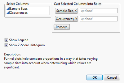
First, open a data table with occurrences and sample sizes that you want to use a funnel plot to analyze. With the data table open, select Add-ins > Funnel Plot Generator. From the launch window, assign Sample Size and Occurrences to their respective roles. See the figure below:
Figure 1.1 Launch Window
Use the Show Legend and Show Histogram options to control what appears on the plot.
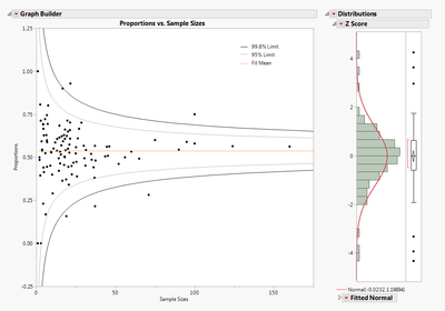
After you click OK, your graph looks similar to the figure 1.2.
Figure 1.2 Proportions vs. Sample Size
Points that fall outside the 95% limit curves represent data that can only be attributed to randomness 5% of the time. Similarly, points that fall outside the 99.8% limit curves represent data that can only be attributed to randomness .2% of the time (which is extremely rare).
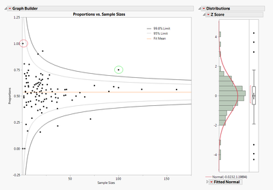
Figure 1.3
If you look at the circled points in the funnel plot, you might assume the point circled in red has a higher significance than the point circled in green; however, this is not the case. In fact, the point circled in green represents a much more extreme value. Since the sample size of the value circled in red is so small, it is much more likely to be the result of randomness. Whereas for the data of the point circled in green, the proportion is much more significant in relation to the rest of the values, and therefore cannot be due to randomness. Instead, the proportion’s extreme value is much more likely to be the result of some significant situation or special cause. (See the links below for more information.)
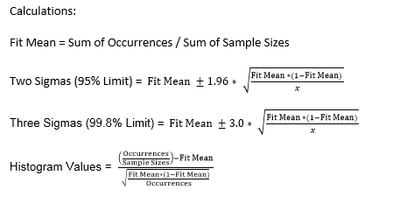
The histogram on the right is a distribution of z-scores calculated from the data. Z-scores are used to normalize the data given that the original data samples do not come from the same distribution. By using z-scores, the points now have a mean of 0 and a standard deviation of 1, following a normal distribution.
Statistical Details
Potential issues
Ensure that no occurrences are greater than their corresponding sample size, as this will disrupt the calculations used to generate the plot and the distribution.
For more information on funnel plots and their uses check out these links:
Thanks for the funnel plot add-in! Is there a way to label the points outside the limits if you have a column for the labels?
Thanks!
Any plans to add an "option" to account for over-dispersion? This typically happens when the denominators are relatively large, causing many points to (erroneously) lie outside the Funnel Plot's Control Limits...a not uncommon occurrence with healthcare metrics.
Another question:
How are the z-values calculated? 'Cause, when I use the sample mean and standard deviation to code the data, and compare to the results of the Funnel Plot's z score statistics, they are different. My results give the expected 0 for the mean and 1 for the standard deviation, but the Funnel Plot's mean is -0.466405 and its standard deviation is 7.6169797...and the Diagnostic Plots are quite different, too...???
Great add-in!
Ref Steven Moore's question: is there a way to add labels to the points?
Can you change the limit curves to say 80 and 90%?
Thanks,
Rosser
Recommended Articles
- © 2026 JMP Statistical Discovery LLC. All Rights Reserved.
- Terms of Use
- Privacy Statement
- Contact Us


