- Browse apps to extend the software in the new JMP Marketplace
- This add-in is now available on the Marketplace. Please find updated versions on its app page
- Subscribe to RSS Feed
- Mark as New
- Mark as Read
- Bookmark
- Subscribe
- Printer Friendly Page
- Report Inappropriate Content
JMP Add-Ins
Download and share JMP add-ins- JMP User Community
- :
- File Exchange
- :
- JMP Add-Ins
- :
- Forest Plot Add-In
The Forest Plot add-in displays several confidence or credible intervals vertically. The user supplies the lower and upper limits, the center value (which could represent the mean effect) and labels for each interval from a data table. The user may provide a second center value to present additional summary values (e.g., medians) in the figure. Color options allow you to highlight intervals that exclude the null value (default 0), and this color varies according to whether the interval is above or below the null value. A dotted vertical reference line is drawn at the null value. Intervals are ordered in the figure according to their order in the data table.
Version 3 allows the user the specify a variable to indicate the size of the Center Value. The area of the center value is proportional to to Marker Size. Users can specify the minimum size for center symbols, apply a scaling factor to control symbol size, and a transparency factor so that narrow intervals contained entirely within the Center Value symbol are visible. This does not affect the sizing of the Center Value 2 marker, which has been changed from a diamond to a pipe to improve visibility. See the JMP blog for some examples of the forest plot with the newly provided nicardipine data.
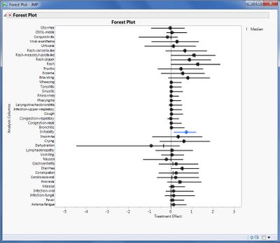
The figure below displays the dialog for an example using summary statistics for 20,000 MCMC samples from a Bayesian hierarchical model of 40 adverse events from Mehrotra & Heyse (2004).
The figure below displays the 95% equal-tailed credible intervals based on the lower 2.5% and upper 97.5% quantiles. Using the sample data, interested users can create a similar plot for the highest posterior density (HPD) intervals by changing the lower and upper limits.
Mehrotra DV & Heyse JF. (2004). Use of the False Discovery Rate for Evaluating Clinical Safety Data. Statistical Methods in Medical Research 13: 227-238.
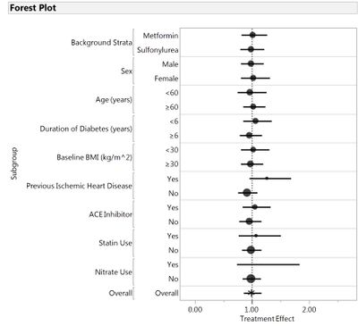
Version 4 fixes a bug when reproducing the plots when saved to a data table and adds a distinctive symbols when labels are either "total" or "overall". See below figure produced from RoseMeta.jmp. Center bubbles are sized according to the total count of subjects in a particular subgroup. In lieu of a bubble sized by number of subjects, the Overall confidence interval (representing the entire trial population) is displayed with an asterisk. Data is from a clinical trial in patients with type 2 diabetes to assess excess cardiovascular risk of rosiglitazone (Home et al., 2009).
Home PD, Pocock SJ, Beck-Nielsen H, Curtis PS, Gomis R, Hanefeld M, Jones NP, Komajda M & JJV McMurray. (2009). Rosiglitazone evaluated for cardiovascular outcomes in oral agent combination therapy for type 2 diabetes (RECORD): A multicentre, randomised, open-label trial. Lancet 373: 2125–2135.
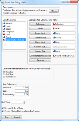
Version 5 adds two new features. The first feature is an option to add Confidence Interval Text. This allows the user to include a text string along the right axis. This could include text for a test of interaction for the particular subgroup or, as shown here, the estimate and 95% confidence interval for the hazard ratio for rosiglitazone versus control. The second feature is a check box to Reverse Order of Axes. This saves the manual step of having to reverse order for the vertical axes. Without the presence of this second feature, text provided using the first feature would require both axes to be reversed separately. With reverse order, the Overall group is placed at the bottom of the figure. When the option is unchecked, Overall is placed at the top.
Version 6 corrects a bug that would cause an error when the Forest Plot script was saved to a data table and rerun.
Version 7 adds a subgroup role to the dialog to more easily create subgroup forest plots with references lines, and an option to color Center Value 2 according to the selected color preference or not (which defaults to black). The resulting plot based on the above dialog selection is presented below.
Version 8 fixes a bug in JMP 13 when Marker Size option is used.
Is it possible to add another field into the dialog box that would make the marker size a variable? For example, I am comparing multiple trials and would like to represent the larger trials (more subjects) with larger markers
Hi, Phil. This is a good idea. I've looked into it and haven't found anything obvious yet, but I will try to keep working on it.
Hi, Phil,
I have figured out how to accommodate your request by allowing you to choose a sizing variable and a scaling variable for the bubbles. One thing I am still trying to address is coloring the confidence interval lines when the sizing of the bubble may completely contain the CI. This will likely only happen in cases with a large discrepency between small and large sizes. I should have something for you soon.
Sorry for the delay! Thanks for your patience and for the great idea!
Richard
Very much appreciated, Richard. Coloring the CIs is nice, but really not necessary. Almost all the forest plots I've seen are b&w.
- Mark as Read
- Mark as New
- Bookmark
- Get Direct Link
- Report Inappropriate Content
I have used the add-in V4.0 in a rather complex situation and found it working really very well. Two minor issues were as follows:
- When I used proportional marker sizes then the marker of the study with the smallest sample size was no longer visible but hidden in the line of the confidence interval. Perhaps in this case it should be possible to edit the shape of this disappearing marker to a vertical line.
- I was interested in applying the subgrouping of studies as indicated in the above Forest Plot by Home et al. but I did not find an option to implement this. So I inserted horizontal colored divider lines to separate groups of studies.
In general I consider the use of colors in such Forest plots a helful and I encourage further use of colours in the add-in. One reason why Forest Plots usually are seen as b&w may be that the cheaper standard versions of meta-analysis programs do not support colours but more expensive versions sometimes do. For me the use of colors is an important strength of JMP in general.
- Mark as Read
- Mark as New
- Bookmark
- Get Direct Link
- Report Inappropriate Content
Meanwhile I have successfully used the Forest Plot Add-Inn in a second project. The marker size option works well, one need only to experiment a little to set the Minimum Size correctly to make the center value visible for small groups. I want to report the following minor issues:
- the tool bar is not available in the plot although I have set the JMP preference on never auto-hide,
- when I saved a forest plot to a journal, the plot was corrupted when I reopened the journal at a later time point,
- when I saved the script of a forest plot to the data table and then sorted the rows of the table, the script did not re-run properly.
In general the Forest Plot Add-Inn is very helpful and can be used in many situations even beyond meta-analysis.
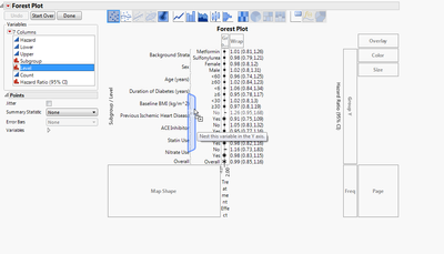
Hi Winfried. Sorry for the delay in response. The subgroup figure that was generated above for the Home et al study was generated in the following way. The dialog was run as above in the graphic. Then I click on the red triangle option to get the Graph Builder control panel, then I drag level to nest it on the y-axis. I need to drag out the x-axis to make it a bit nicer looking.
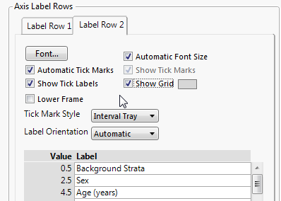
For the lines between subgroups, right click on axis and choose Axis Settings. Then turn on Show Grid on the second tab (Label Row 2). This will add lines to divide the subgroups.
Hi Winfried. I have turned off the option to hide the toolbar. It should be visible for you now in V5. The issue you are reporting with the JMP journal is likely due to the Add Graphics Script(). I can try to explore why this happens, but there may not be a way around it. However, I did notice that if the data table was open and current, reopening the closed journal would execute the plot correctly. It would be an additional step, but it may be possible to add some text to the journal file to open the data table and make it current. For example,
dt = Open("C:\Users\rizink\Desktop\rosemeta.jmp", invisible);
Current Data Table(dt);
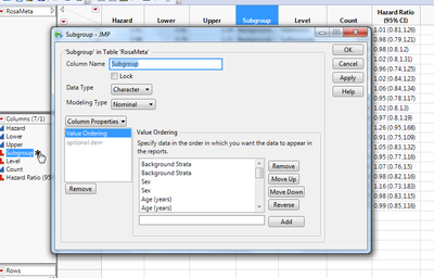
Regarding the last point, the add-in works by adding a Value Ordering property to the data table for the variable listed in Label. This is done to easily maintain the order of the data table (or the reverse) in the Forest Plot. Otherwise, the default behavior orders rows alphabetically which would likely not give what is wanted. Below is a data table that had a Forest Plot created. The star on Subgroup (where the hand is) will show there is a Value Ordering on the variable. Clicking it will open the properties for this column, and Value Ordering can be removed by clicking "Remove" the in the dialog. Data can be sorted, and the plot regenerated. In general, the order should be determined before running and saving the plot.
- Mark as Read
- Mark as New
- Bookmark
- Get Direct Link
- Report Inappropriate Content
Hi Richard,
I have just tested the new subgroup option of your V7 add-in using a new example and everything was fine.
In addition I noticed that for my examples it would fit, if you would use the variable name of the center value as the label of the x-axis of the Forest Plot. Please check if you could agree with that. Otherwise this is not a major issue because the label of the x-axis can easily be edited.
Overall this is the most user-friendly and flexible Forest Plot program I am aware of.
Thanks and best regards
Winfried
Hi Richard
I used the forest plot add in (V8) with the prevalences (text string of prevalence and 95% CI) on the right side (as in the example above) and copied the script into my JSL file. When I ran the entire script the prevalences sorted themselves smallest to largest independently of the figure or the labels on the left. When I moved the prevalences to the left they were correct again. This was the only work around I could find. I also tried to plot the same data in graphbuilder without the add-in and had the same thing happen. I saw this behaviour both in v14.3 and 15.0. Maybe I'm doing something dumb, but in any case it's worth a warning to check your plots.
Cheers
Gunter
Richard this is an invaluable add-in. I am unable to establish how to change the shape of the point estimate from a filled circle to a filled square. Would that require changing the jsl or is there a hidden option?
With thanks
Ivor Douglas, MD
Denver CO
こんにちはリチャードさん
confidence interval textのY軸ラベルが同一のものだと1つに統一されてしまうのですが、重複するものもすべて表示するにはどうすればよいでしょうか。
Recommended Articles
- © 2026 JMP Statistical Discovery LLC. All Rights Reserved.
- Terms of Use
- Privacy Statement
- Contact Us
