- Subscribe to RSS Feed
- Mark as New
- Mark as Read
- Bookmark
- Subscribe
- Printer Friendly Page
- Report Inappropriate Content
JMP Add-Ins
Download and share JMP add-ins- JMP User Community
- :
- File Exchange
- :
- JMP Add-Ins
- :
- Enhanced Sankey Plot (ESP)
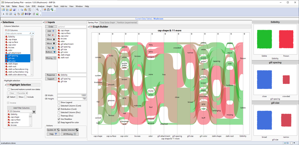
This add-in provides easy to change X-axis for parallel plot found from Graph Builder which creates one more EDA (Exploratory Data Analysis) tool for JMP which is fairly easy to use and interactive.
ESP also provides supporting analyses, supporting graphs, and some settings user can change to make using the tool a bit simpler such as: hide legend, change Graph Builder size, show proportion of selected in support plots and change support plot types.
Settings and menus
User can found different settings, buttons and menus from different location
Buttons
- Order - Add ordering column. Will be added as left-most column to Parallel plot and used as X-axis on time series plot
- Add columns to X-axis of parallel plot
- Delete columns from X-axis of parallel plot
- Move columns up, down, top and bottom
- Launch Missing value exclusion platform for selected columns
- Response - Add column used as response. Will be used as support graph and as right-most column in Parallel Plot
- Support - Add support columns for support plots
- Update with All columns
- Update with only Selected columns (of X-axis)
- Help to open this page
- All Missing will launch missing value exclusion platform for all columns in the data table
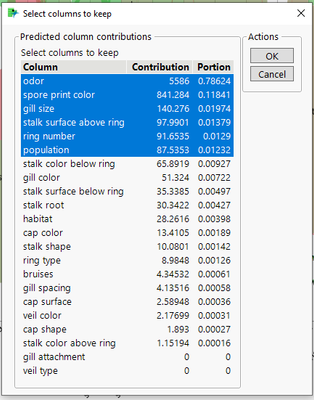
- Auto-Order will use predictor screening with input columns vs response column
- Subset Columns creates subset of all input columns
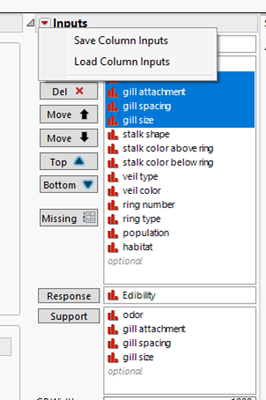
Inputs outline box allows saving current column selections to table variable which can be loaded
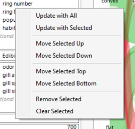
Context menu on column listing allows quick access to some of the buttons
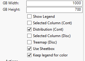
Settings at the bottom allow changing graph builder size and how visualizations are displayed
Tab Pages can be used to launch different quick analyses (Time Series graph builder and Partition)
Auto-Order button will use inputs for Predictor Screening and allow using results from that to modify input list
Very simplified example flow for add-in
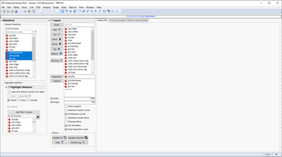
1. Add columns based on your initial guess on which could indicate some correlation or dependencies
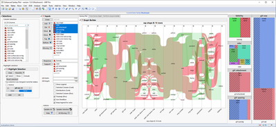
Empty add-in window with some column selections done
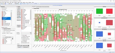
Graphs are created after Update All button is pressed
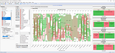
2. Start working on reducing / re-ordering columns with the help of buttons on left or with support graphs
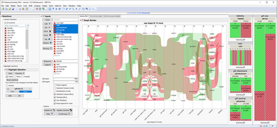
Selected Columns checked for Disc column types
Selected Columns not checked for Disc column types
3. Keep reducing column count until you get satisfactory result. After this you can for example continue analysis in other platforms
Change Notes:
- 2022 - 10 - 06
- Added Auto-Order button (and Predictor Screening Report tab) based on the feedback received in Nordic User Meeting. This button will use Predictor Screening (so it will work with normal JMP) to order and prioritize input columns.
I love it! Unfortunatelly it seems to be generated for JMP Pro users :(
Is there any other similar addinn'S for JMP15 users?
This should function without JMP Pro as it will use Predictor Screening instead of Bootstrap Forest if you don't have JMP Pro.
Quickly unpacking and checking the add-in definitions the minimum version has been defined as JMP16 (I don't remember if there is a reason for this limitation though... but I did develop this on 16 so maybe that is why I left it as 16).
Awesome,very useful
Hi. I want to use this addin to make a Sankey diagram for energy flow of a factor. Is it possible?
To do that, the width on Y-axis should indicate the amount of each flow. May I ask how to adjust the width of each Y-axis factor? An example of the ideal Sankey diagram could be like this: Apple_FY22_NoYOY.width-800.png (800×500)
For something like that I suggest you check out Pictures from the Gallery 8: Innovative Graph Builder Views - (2023-US-30MP-1386) and/orInflow Outflow Parallel Plots - Track Your Budget Flow with JMP Graph Builder
Recommended Articles
- © 2026 JMP Statistical Discovery LLC. All Rights Reserved.
- Terms of Use
- Privacy Statement
- Contact Us
