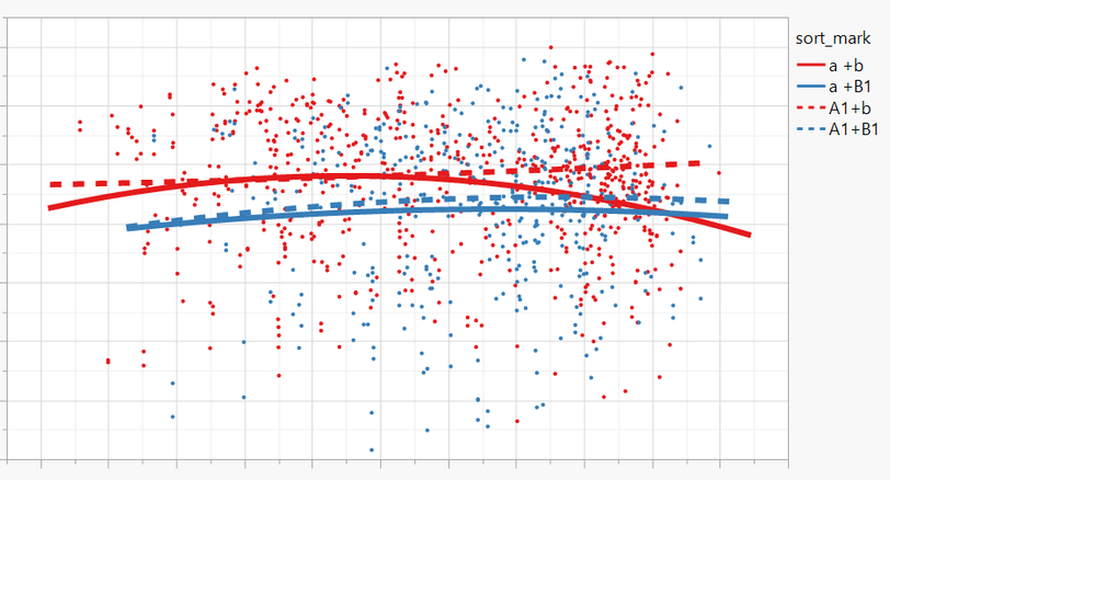
I am trying to show line of fit in graph builder for several sets of data.
The data table have many columns, I want to show the column(i) vs column(1).
Every column can be grouped by A1 & a, also can be grouped by B1 & b, but except column(1).
The follow is the chart about column(2) vs column(1):
I use the follow script to change the type of lines:
Dispatch(
{},
"400",
ScaleBox,
{Legend Model(
8,
Properties( 2, {Line Color( -14948892 ), Line Style( "Dotted" )} ),
Properties( 3, {Line Color( -3636920 ), Line Style( "Dotted" )} )
)}
)
If the date column can be grouped by A1 & a, also can be grouped by B1 , b & bb, but except column(1).
Is there any way to draw the same graph without setting a particular line like :
Properties( 2, {Line Color( -14948892 ), Line Style( "Dotted" )} )