- New to JMP? Let the Data Analysis Director guide you through selecting an analysis task, an analysis goal, and a data type. Available now in the JMP Marketplace!
- See how to install JMP Marketplace extensions to customize and enhance JMP.
- Subscribe to RSS Feed
- Mark Topic as New
- Mark Topic as Read
- Float this Topic for Current User
- Bookmark
- Subscribe
- Mute
- Printer Friendly Page
Discussions
Solve problems, and share tips and tricks with other JMP users.- JMP User Community
- :
- Discussions
- :
- Varying spec limits by data category in variability chart
- Mark as New
- Bookmark
- Subscribe
- Mute
- Subscribe to RSS Feed
- Get Direct Link
- Report Inappropriate Content
Varying spec limits by data category in variability chart
Hi,
I have an application where I use a variability chart in JMP Pro 14 to represent data collected at discrete intervals over some time period. Based on this data collection, the spec limits on the data will also need to be varied. For example:
During "Phase K" of a project there might be M different sample groups each with its own sample size N. During Phase K, there will be some set of limits which we'll want to plot against this.
At some point, the project will enter "Phase K+1" during which we will adjust the spec limits and collect additional data which will need to be compared to the new limits.
Repeat ad-nauseum...
Is there a way to code spec limits to a continuous numeric column which are controlled by a separate column in which the project phase is encoded such that when I plot the data in the Y of a variability chart, the chart will include the appropriate spec limits in the variability chart for each of the sample groups? I'm okay doing something as crude as creating LSL/Target/USL columns directly in the table, but of course that isn't preferred.
By the way, I'm aware that variability charts may not be the "correct" way to represent this data, but it's what's done, so here we are :)
Thanks!
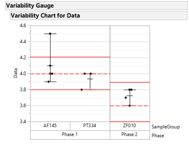
Conceptualized based on the attached jmp table:
- Mark as New
- Bookmark
- Subscribe
- Mute
- Subscribe to RSS Feed
- Get Direct Link
- Report Inappropriate Content
Re: Varying spec limits by data category in variability chart
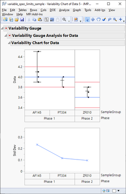
Using graphic script and adding lines between each "group" is one option but it does require some scripting.
I'm not sure if this will work on JMP14
Names Default To Here(1);

dt = Open("$DOWNLOADS/variable_spec_limits_sample.jmp");

var = dt << Variability Chart(Y(:Data), X(:Phase, :SampleGroup));

dt_summary = dt << Summary(
	Group(:Phase),
	Max(:LSL),
	Mean(:Target),
	Min(:USL),
	N Categories(:SampleGroup),
	Freq("None"),
	Weight("None"),
	statistics column name format("column"),
	Link to original data table(0)
);
dt_summary << Delete Columns("N Rows");

// We need access to the framebox
fb = Report(var)[Outline Box("Variability Chart for Data"), Frame Box(1)];

// Using graphic scripts most likely easiest option
xidx = 0;
For(i = 1, i <= N Items(phases), i++,
	curphase = dt_summary[i, "Phase"];
	curlsl = dt_summary[i, "LSL"];
	curusl = dt_summary[i, "USL"];
	curtarget = dt_summary[i, "Target"];
	curcount = dt_summary[i, "SampleGroup"];

	xend = xidx + curcount;

	lslstart = Eval List({xidx, curlsl});
	lslend = Eval List({xend, curlsl});

	uslstart = Eval List({xidx, curusl});
	uslend = Eval List({xend, curusl});

	targetstart = Eval List({xidx, curtarget});
	targetend = Eval List({xend, curtarget});

	xidx = xend;

	Eval(EvalExpr(
			fb << Add Graphics Script(
			Pen Color("Red");
			Pen Size(1);
			Line(Expr(lslstart), Expr(lslend)); // {x1, y1}, {x2, y2}
			Line(Expr(uslstart), Expr(uslend)); // {x1, y1}, {x2, y2}
			Pen Color("Blue");
			Line(Expr(targetstart), Expr(targetend)); // {x1, y1}, {x2, y2}
		);
	));
);


// You might also want to have some sort of scaling to Y-axis
// ((fb << parent) << Prev Sib)[AxisBox(1)] << Min(Min(dt_summary[0, "LSL"])) << Max(Max(dt_summary[0, "USL"]));
And there might not be style option for the line (or rather Pen?) so you might have to change color for it
- Mark as New
- Bookmark
- Subscribe
- Mute
- Subscribe to RSS Feed
- Get Direct Link
- Report Inappropriate Content
Re: Varying spec limits by data category in variability chart
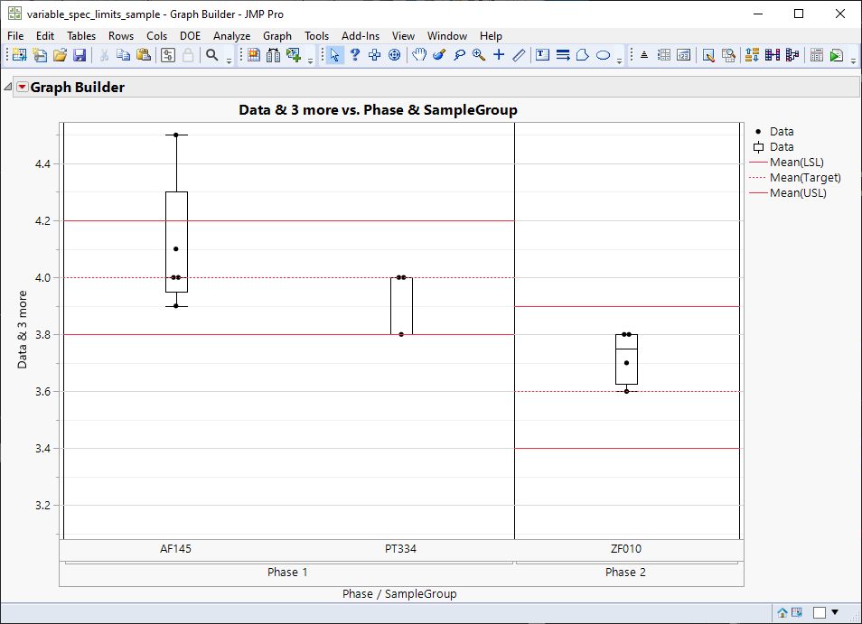
I know you "want" to use variability chart, but graph builder is usually (at least in newer version of JMP) easier for plots like this
Names Default To Here(1);

dt = Open("$DOWNLOADS/variable_spec_limits_sample.jmp");

gb = dt << Graph Builder(
	Size(808, 557),
	Show Control Panel(0),
	Variables(
		X(:Phase),
		X(:SampleGroup, Position(1)),
		Y(:Data),
		Y(:LSL, Position(1)),
		Y(:Target, Position(1)),
		Y(:USL, Position(1))
	),
	Elements(
		Points(X(1), X(2), Y(1), Legend(6)),
		Box Plot(X(1), X(2), Y(1), Legend(7), Outliers(0), Width Proportion(0.1)),
		Bar(X(1), Y(2), Y(3), Y(4), Legend(9), Bar Style("Float"))
	),
	SendToReport(
		Dispatch(
			{},
			"Phase",
			ScaleBox,
			{Label Row(1, Lower Frame(1)), Label Row(
				2,
				{Lower Frame(1), Major Grid Line Color("Black"), Show Major Grid(1)}
			)}
		),
		Dispatch(
			{},
			"Data",
			ScaleBox,
			{Min(3.08101), Max(4.54538984217895), Inc(0.2), Minor Ticks(1),
			Label Row({Show Major Grid(1), Show Minor Grid(1)})}
		),
		Dispatch(
			{},
			"400",
			ScaleBox,
			{Legend Model(
				9,
				Properties(
					0,
					{Line Color(3), Line Width(1)},
					Item ID("Mean(LSL)", 1)
				),
				Properties(
					1,
					{Line Color(3), Line Style("Dotted"), Line Width(1)},
					Item ID("Mean(Target)", 1)
				),
				Properties(
					2,
					{Line Color(3), Line Width(1)},
					Item ID("Mean(USL)", 1)
				)
			)}
		),
		Dispatch(
			{},
			"Graph Builder",
			FrameBox,
			{DispatchSeg(
				Box Plot Seg("Box Plot (Phase 1>>AF145)"),
				{Fill Color("Black"), Fill(0)}
			), DispatchSeg(
				Box Plot Seg("Box Plot (Phase 1>>PT334)"),
				{Fill Color("Black"), Fill(0)}
			), DispatchSeg(
				Box Plot Seg("Box Plot (Phase 2>>ZF010)"),
				{Fill Color("Black"), Fill(0)}
			), DispatchSeg(BarSeg(1), {Set Width Proportion(1)})}
		)
	)
);
Recommended Articles
- © 2026 JMP Statistical Discovery LLC. All Rights Reserved.
- Terms of Use
- Privacy Statement
- Contact Us


