- New to JMP? Join us Sept. 23-24 for the Early User Edition of Discovery Summit, tailor-made for new users. Register now for free!
- Use World Cup data to build models, explore spatial relationships, and create informative visualizations in JMP. Register. July 17, 2 pm US Eastern Time.
- Your voice matters! Tell us how you prefer to receive JMP updates, so we can tailor our communication to your needs. Take short survey.
- Subscribe to RSS Feed
- Mark Topic as New
- Mark Topic as Read
- Float this Topic for Current User
- Bookmark
- Subscribe
- Mute
- Printer Friendly Page
Discussions
Solve problems, and share tips and tricks with other JMP users.- JMP User Community
- :
- Discussions
- :
- Re: Rectangle Graphic

- Mark as New
- Bookmark
- Subscribe
- Mute
- Subscribe to RSS Feed
- Get Direct Link
- Report Inappropriate Content
Rectangle Graphic
Hello everybody,
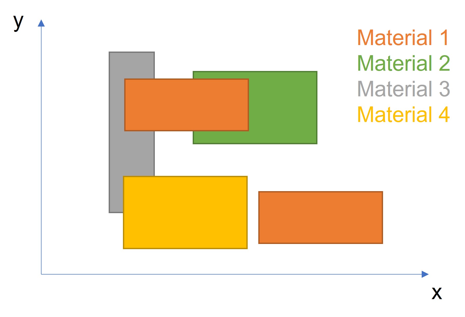
is there an easy way in JMP to generate a graph with different rectangles (different sizes)? See an example attached.
With this graph I would like to give an overview of different materials and their corresponding shapes.
Thanks in advance.
Johannes
Accepted Solutions

- Mark as New
- Bookmark
- Subscribe
- Mute
- Subscribe to RSS Feed
- Get Direct Link
- Report Inappropriate Content
Re: Rectangle Graphic
JMP has a complete set of graphic primitives' that can be used for creating things such as rectangles. The Scripting Index details the functions available and gives examples of their use.


Here is the script from the Rect() function description.
Names Default To Here( 1 );
New Window( "Example",
	Graph Box(
		Pen Color( "Green" );
		Pen Size( 2 );
		Fill Color( "Red" );
		Rect( 15, 75, 65, 55, 1 );
		Rect( 10, 80, 70, 50 );
	)
);

- Mark as New
- Bookmark
- Subscribe
- Mute
- Subscribe to RSS Feed
- Get Direct Link
- Report Inappropriate Content
Re: Rectangle Graphic
Lots of overlap in your data. This code will do it; I set the rectangles to unfilled to show the overlap.
dt = data table("Rectangles");

// Set some constants
xmin = 0;
xmax = 4000;
ymin = 0;
ymax = 1500;
xres = 800;
yres = 500;

color_list  = {"Red", "Blue", "Green", "Orange", "Purple"};
filled_rect = 0;	// set to 1 for filled rectangles

heat_map_win = New Window( "Example Rectangles ",
	rect_gb = Graph Box(
		framesize( xres, yres ),
		xscale(xmin, xmax),
		yscale(ymin, ymax),
		for (i = 1, i <= nrows(dt), i++,
			xleft   = dt:x 1[i];
			xright  = dt:x 3[i];
			ybottom = dt:y 1[i];
			ytop    = dt:y 4[i];
			pcolor  = color_list[dt:material[i]];
			pen color(pcolor);
			fill color(pcolor);
			rect(xleft, ytop, xright, ybottom, filled_rect);
		),
	)
);

- Mark as New
- Bookmark
- Subscribe
- Mute
- Subscribe to RSS Feed
- Get Direct Link
- Report Inappropriate Content
Re: Rectangle Graphic
I would definitely do this with Graph box but you can try to do something with Graph builder also. If I understood the data correctly you have couple of different versions per material. Based on that I did some split/stack/formulas to get table like this:

With this table I then created Graph builder and used smoother with confidence of fit ON.

These two happened by accident and will work only because all rectangles have "line" in x = 0:
Bar chart + line char:

Also using line with fill below:

Datatable attached with tablescript.
Bonus image from same data:

- Mark as New
- Bookmark
- Subscribe
- Mute
- Subscribe to RSS Feed
- Get Direct Link
- Report Inappropriate Content
Re: Rectangle Graphic
What sort of data do you have? You can for example create custom shape files
- Mark as New
- Bookmark
- Subscribe
- Mute
- Subscribe to RSS Feed
- Get Direct Link
- Report Inappropriate Content
Re: Rectangle Graphic
I attached a file with sample data. I do have coordinates for every corner of the rectangles.
- Mark as New
- Bookmark
- Subscribe
- Mute
- Subscribe to RSS Feed
- Get Direct Link
- Report Inappropriate Content
Re: Rectangle Graphic
JMP has a complete set of graphic primitives' that can be used for creating things such as rectangles. The Scripting Index details the functions available and gives examples of their use.
Here is the script from the Rect() function description.
Names Default To Here( 1 );
New Window( "Example",
	Graph Box(
		Pen Color( "Green" );
		Pen Size( 2 );
		Fill Color( "Red" );
		Rect( 15, 75, 65, 55, 1 );
		Rect( 10, 80, 70, 50 );
	)
);
- Mark as New
- Bookmark
- Subscribe
- Mute
- Subscribe to RSS Feed
- Get Direct Link
- Report Inappropriate Content
Re: Rectangle Graphic
Thank you!

- Mark as New
- Bookmark
- Subscribe
- Mute
- Subscribe to RSS Feed
- Get Direct Link
- Report Inappropriate Content
Re: Rectangle Graphic
Also look at the transparency command if you have issues with which one is in front.

- Mark as New
- Bookmark
- Subscribe
- Mute
- Subscribe to RSS Feed
- Get Direct Link
- Report Inappropriate Content
Re: Rectangle Graphic
Lots of overlap in your data. This code will do it; I set the rectangles to unfilled to show the overlap.
dt = data table("Rectangles");

// Set some constants
xmin = 0;
xmax = 4000;
ymin = 0;
ymax = 1500;
xres = 800;
yres = 500;

color_list  = {"Red", "Blue", "Green", "Orange", "Purple"};
filled_rect = 0;	// set to 1 for filled rectangles

heat_map_win = New Window( "Example Rectangles ",
	rect_gb = Graph Box(
		framesize( xres, yres ),
		xscale(xmin, xmax),
		yscale(ymin, ymax),
		for (i = 1, i <= nrows(dt), i++,
			xleft   = dt:x 1[i];
			xright  = dt:x 3[i];
			ybottom = dt:y 1[i];
			ytop    = dt:y 4[i];
			pcolor  = color_list[dt:material[i]];
			pen color(pcolor);
			fill color(pcolor);
			rect(xleft, ytop, xright, ybottom, filled_rect);
		),
	)
);

- Mark as New
- Bookmark
- Subscribe
- Mute
- Subscribe to RSS Feed
- Get Direct Link
- Report Inappropriate Content
Re: Rectangle Graphic
Thanks for the code. Working well for me.
Now I'd like to split the graphs by another key column. E.g. graph 1 will have the rectangles for parameter A, graph 2 will have the rectangles for parameter B, etc.
I'm struggling to use a Where or By clause here.
I would need to have all the graphs displayed vertically and save it as a jpg.
Thank you
- Mark as New
- Bookmark
- Subscribe
- Mute
- Subscribe to RSS Feed
- Get Direct Link
- Report Inappropriate Content
Re: Rectangle Graphic
I would definitely do this with Graph box but you can try to do something with Graph builder also. If I understood the data correctly you have couple of different versions per material. Based on that I did some split/stack/formulas to get table like this:
With this table I then created Graph builder and used smoother with confidence of fit ON.
These two happened by accident and will work only because all rectangles have "line" in x = 0:
Bar chart + line char:
Also using line with fill below:
Datatable attached with tablescript.
Bonus image from same data:
Recommended Articles
- © 2026 JMP Statistical Discovery LLC. All Rights Reserved.
- Terms of Use
- Privacy Statement
- Contact Us