- Learn how to build custom Python data connectors and further customize JMP’s Data Connector Framework with the Python Data Connector Demo, available now in the JMP Marketplace!
- See how to create experiments to support product design and ID useful product features. Register for June 12 webinar, 2pm US Eastern Time.
- Subscribe to RSS Feed
- Mark Topic as New
- Mark Topic as Read
- Float this Topic for Current User
- Bookmark
- Subscribe
- Mute
- Printer Friendly Page
Discussions
Solve problems, and share tips and tricks with other JMP users.- JMP User Community
- :
- Discussions
- :
- Re: Plotting Nonlinear Regression using GraphBuilder and/or Analyze (with script...

- Mark as New
- Bookmark
- Subscribe
- Mute
- Subscribe to RSS Feed
- Get Direct Link
- Report Inappropriate Content
Plotting Nonlinear Regression using GraphBuilder and/or Analyze (with scripts)
This post is similar to this one, and I posted a comment there, but since the post is 2 years old it might not get seen and I'm having trouble adapting the solution(s) to my equation.
I'm doing nonlinear regression using the script below to prepare the data and then using the Analyze option with Normalized Fluorescence as the Y value, and the Model (formula) column as the X value (reversing the axis), and by Well Position, but this only does one at a time. If I use the GraphBuilder, I can't get the Smoother to use the formula . I would like to have all the plots on one graph OR in an absolutely ideal unicorn world, graph 3 well positions at a time (eg. B2-B4) but that seems unrealistic :p
Data Table( "Melt Curve Raw Data" ) << New Column( "Normalized Fluorescence",
formula(
(:Fluorescence - Col Min( :Fluorescence, :Well Position )) / (
Col Max( :Fluorescence, :Well Position )
-Col Min( :Fluorescence, :Well Position ))
)
);

Data Table( "Melt Curve Raw Data" ) << New Column( "Model", Numeric,
"Continuous", Format( "Best", 12 ),
Formula(Parameter({m1 = -60, m2 = 0.2, m3 = -50, m4 = -0.3, m5 = 100000, m6 = 320},
((m1 + m2 * (:Temperature + 273)) + (m3 + m4 * (:Temperature + 273)) * Exp((-m5 / (1.987 *
(:Temperature + 273))) * (1 - (:Temperature + 273) / m6))) /
(1 + Exp((-m5 / (1.987 * (:Temperature + 273))) * (1 - (:Temperature + 273) / m6))))));

- Mark as New
- Bookmark
- Subscribe
- Mute
- Subscribe to RSS Feed
- Get Direct Link
- Report Inappropriate Content
Re: Plotting Nonlinear Regression using GraphBuilder and/or Analyze (with scripts)
I can't tell exactly what you are looking for, by chance does one of these charts show what you are looking for, or can you post a screenshot of the chart that only does one at a time? You said you used Analyze, but I'm not sure which option in that menu you picked.


Graph Builder(
	Size( 671, 507 ),
	Show Control Panel( 0 ),
	Variables(
		X( :Model ),
		Y( :Normalized Fluorescence ),
		Overlay( :Well Position )
	),
	Elements( Smoother( X, Y, Legend( 12 ) ), Points( X, Y, Legend( 13 ) ) ),
	Local Data Filter(
		Add Filter(
			columns( :Well Position ),
			Where( :Well Position == {"B2", "B3", "B4"} ),
			Display( :Well Position, N Items( 15 ), Find( Set Text( "" ) ) )
		)
	)
);

Graph Builder(
	Size( 671, 543 ),
	Show Control Panel( 0 ),
	Variables( X( :Model ), Y( :Normalized Fluorescence ), Wrap( :Well Position ) ),
	Elements( Points( X, Y, Legend( 9 ) ), Smoother( X, Y, Legend( 11 ) ) ),
	Local Data Filter(
		Add Filter(
			columns( :Well Position ),
			Where( :Well Position == {"B2", "B3", "B4"} ),
			Display( :Well Position, N Items( 15 ), Find( Set Text( "" ) ) )
		)
	)
);

Graph Builder(
	Size( 1308, 384 ),
	Show Control Panel( 0 ),
	Variables(
		X( :Model ),
		Y( :Normalized Fluorescence ),
		Group X( :Well Position )
	),
	Elements( Smoother( X, Y, Legend( 12 ) ) ),
	Local Data Filter(
		Add Filter(
			columns( :Well Position ),
			Where( :Well Position == {"B2", "B3", "B4"} ),
			Display( :Well Position, N Items( 15 ), Find( Set Text( "" ) ) )
		)
	)
);- Mark as New
- Bookmark
- Subscribe
- Mute
- Subscribe to RSS Feed
- Get Direct Link
- Report Inappropriate Content
Re: Plotting Nonlinear Regression using GraphBuilder and/or Analyze (with scripts)
Wow those are all awesome. The one that I was originally looking for was the multicolor scatterplot in the top right hand corner, but I'm absolutely blown away by the graphs & script you made.
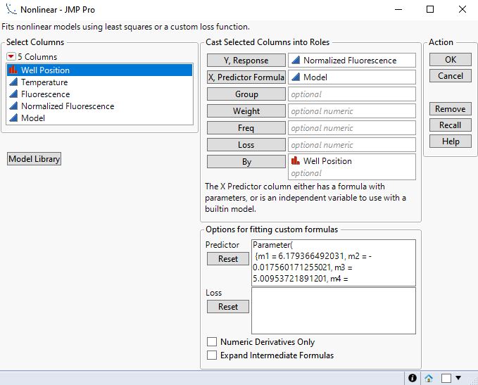
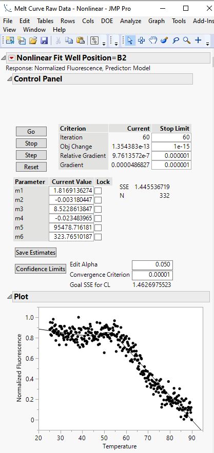
When using the Analyze option, I get the values I need but each graph is separate. I've attached screenshots of the settings I'm currently using along with the results after clicking "go" then clicking "confidence limits".
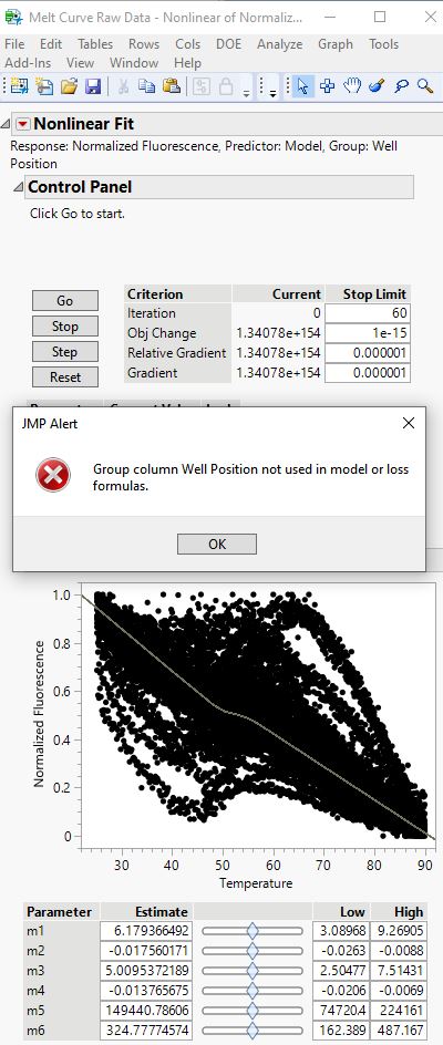
I also attached the error message I get when trying to use "group" instead of "by" for Well Position.


- Mark as New
- Bookmark
- Subscribe
- Mute
- Subscribe to RSS Feed
- Get Direct Link
- Report Inappropriate Content
Re: Plotting Nonlinear Regression using GraphBuilder and/or Analyze (with scripts)
The Nonlinear launch dialog over-simplifies the situation. You need to do more to the custom model to indicate how the Group variable affects the parameters. Your model only includes common parameters. The unique parameters depend on the levels of the Group variable.
Please see this page and the note at the bottom.
Do you have JMP Pro? Have your tried the Functional Data Explorer?
- Mark as New
- Bookmark
- Subscribe
- Mute
- Subscribe to RSS Feed
- Get Direct Link
- Report Inappropriate Content
Re: Plotting Nonlinear Regression using GraphBuilder and/or Analyze (with scripts)
Hi Mark!
Thanks so much for responding. Yes, I have JMP Pro but I have not tried the Functional Data Explorer. I will try reading about it today. Thank you for the suggestion.
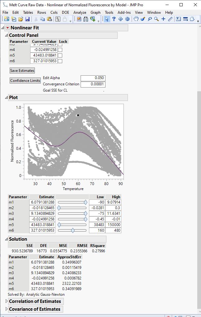
I saw the paragraph you linked to about using the "Expand Into Categories" check box. I added this as a 7th parameter, and in the Analyze page it graphed everything on one plot (great!), but only gave me values for one line. Did I use the Expand Into Categories option incorrectly? Should I have added it to one of my original 6 parameters?
- Mark as New
- Bookmark
- Subscribe
- Mute
- Subscribe to RSS Feed
- Get Direct Link
- Report Inappropriate Content
Re: Plotting Nonlinear Regression using GraphBuilder and/or Analyze (with scripts)
You did not use this feature correctly. The paragraph in Help is correct, but perhaps a bit ambiguous. Here is the correct way, step by step. I am using Big Class to fit a simple exponential model for :weight versus :height with :age as a grouping variable (:weight = A*Exp( B*height ) ).
Add a new data column for the model. Add a formula for the model to the data column. Define the parameters.

Click OK and select the grouping variable.

Repeat this step for the other parameters that are not common to all curves. Build the model. Select the parameters as needed. Here is the grouped exponential model.

Save the formula and launch Nonlinear.

Click OK to begin fitting.

I am afraid, though, that the parameterization in your model will result in high correlation among the estimates. This correlation will be exacerbated by introducing the grouping variable, especially given the number of groups. So an alternative is to use the original model and use the curve ID in the By role. This way will allow you to fit each curve on its own.
On the other hand, if you are not tied to this model, then the FDE is another way. It uses an expansion of basis functions to model the data. These are generic interpolators.

- Mark as New
- Bookmark
- Subscribe
- Mute
- Subscribe to RSS Feed
- Get Direct Link
- Report Inappropriate Content
Re: Plotting Nonlinear Regression using GraphBuilder and/or Analyze (with scripts)
Thank you for clarifying the instructions. It looks like in your example, you had to type out all the different possible ages, is that correct? I'm using 96-well plates, so I usually have ~45 well positions, but can have up to 96. Would I then do 45 parameters for all 6 variables (m1-m6)? I'm thinking I'm seriously misunderstanding something...
You asked in your other comment what I will be doing with this, and it's mostly related to a comparison of change in enthalpy (m5) and melting temperature (m6) for two proteins after different treatments.
- Mark as New
- Bookmark
- Subscribe
- Mute
- Subscribe to RSS Feed
- Get Direct Link
- Report Inappropriate Content
Re: Plotting Nonlinear Regression using GraphBuilder and/or Analyze (with scripts)
You did not misunderstand. The resulting complexity will probably create a practical limit that prevents convergence.
- Mark as New
- Bookmark
- Subscribe
- Mute
- Subscribe to RSS Feed
- Get Direct Link
- Report Inappropriate Content
Re: Plotting Nonlinear Regression using GraphBuilder and/or Analyze (with scripts)
Let me show you how FDE works and what it might be able to do for you. You did not state yet what you ultimately want to do with the fitted curves. For example, how are the conditions in each well determined? Do you want to compare the curves in terms of the condition of each well.
I opened your data table and selected Analyze > Specialized Modeling > Functional Data Explorer. I cast data columns in the following roles:

The initial platform shows the data in an overlay and individual functions (curves). I clicked the red triangle at the top and selected Models > B Splines.

The important information is the mean function, the standard deviation function, and the functional principal components. These FPC capture the uniqueness of each curve relative to the mean function. They provide insight about your curves and their differences. The number of FPCs equals the number of curves, but usually you can ignore most of them. The first three FPCs capture 99.1% of the information in all the curves.
You can think of the FPCs as the archetypes of your curves. That is, they are the essential features that can be combined to produce one of the curves. You can use the FPCs as a response or a factor. In other words, you might ask how do the factor levels that change across the wells determine the shape of the curve? Or how does the shape of a curve predict some other outcome?

JMP arbitrarily displays all the FPCs with at least 1% contribution initially, so there are 5 FPCs in this case. I reduced the number to 3 and saved the functional summaries, which includes the formulas for the 'conditional' response. Now I can do anything I want with the FPCs, they are just data. I can plot them in Graph Builder.

I saved scripts to your original data table and the one with the functional summaries and attached the new data tables below.
Recommended Articles
- © 2026 JMP Statistical Discovery LLC. All Rights Reserved.
- Terms of Use
- Privacy Statement
- Contact Us