- Subscribe to RSS Feed
- Mark Topic as New
- Mark Topic as Read
- Float this Topic for Current User
- Bookmark
- Subscribe
- Mute
- Printer Friendly Page
Discussions
Solve problems, and share tips and tricks with other JMP users.- JMP User Community
- :
- Discussions
- :
- Re: Pie chart - percent of total values
- Mark as New
- Bookmark
- Subscribe
- Mute
- Subscribe to RSS Feed
- Get Direct Link
- Report Inappropriate Content
Pie chart - percent of total values
Hi everybody!
I am having some issues making a pie chart.. I have put in values in the pie: "label by percent of total values". However some of these numbers are put on top of each other. Does anyone know how to move them?
Thank you so much,
Therese
- Mark as New
- Bookmark
- Subscribe
- Mute
- Subscribe to RSS Feed
- Get Direct Link
- Report Inappropriate Content
Re: Pie chart - percent of total values
Which version of JMP are you using and are you using GraphBuilder or Chart to create the pie chart.
- Mark as New
- Bookmark
- Subscribe
- Mute
- Subscribe to RSS Feed
- Get Direct Link
- Report Inappropriate Content
Re: Pie chart - percent of total values
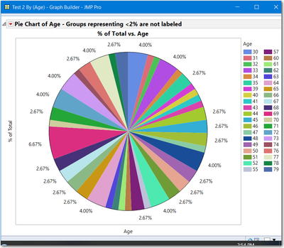
If the labels are overwritten, then you must have some groups with very small percentages. Below is an example using JSL, but you could do the same with point and click. If you have very small percentage groups, I suggest you:
- Create a Summary Table for your groups selecting % of Total as the summary statistic
- Select the column % of Total and from the columns menu select Label
- From Rows > Select > Select Where select the column % of Total and use the criterion > .02 or > 2% or some percent of your choosing.
- Rows > Label
- Clear the table selections
- Now create your pie chart, the table labels will appear only for larger groups
This script looks long, but it is creating the table; creating the Pie Chart with the raw data; then performing the steps described above. Note, the table is created wth random integers, so your pie chart will not be identical to the one displayed above.
Names Default to Here(1);

dt = New Table("Test", add rows(75), New Column("Age", numeric, formula(Random Integer(30,80))));

//create a Pie Chart using Pie chart Labels
gb1 = dt << Graph Builder(
    Show Control Panel(0),
	Size( 495, 440 ),
	Show Control Panel( 0 ),
	Variables( X( :Age ) ),
	Elements( Pie( X, Legend( 6 ), Label( "Label by Percent of Total Values" ) ) )
);
//some labels are overwritten, only fix is to make the framesize larger or
//create custom labels with rotated text

//Alternative, create a summary table of categories, label the rows, do not label the
//rows with very small percentages

dtsum = dt << Summary(
	Group( :Age ),
	Name( "% of Total" ),
	Freq( "None" ),
	Weight( "None" )
);

//Make % of Total the label
dtsum:Name("% of Total") << Set Labelled;

//Label only larger %
dtsum << Select Where(:Name("% of Total") >=.02);
dtsum << Label;
dtsum << clear select;

//Create Pie Chart

gb2 = dtsum <<Graph Builder(
    Show Control Panel(0),
	Variables( X( :Age ), Y( :Name( "% of Total" ) ) ),
	Elements( Pie( X, Y, Legend( 6 ) ) )
);

Report(gb2)[OutlineBox(1)] << Set Title("Pie Chart of Age - Groups representing <2% are not labeled")
- Mark as New
- Bookmark
- Subscribe
- Mute
- Subscribe to RSS Feed
- Get Direct Link
- Report Inappropriate Content
Re: Pie chart - percent of total values
I am using the 14.0 version of JMP.
- Mark as New
- Bookmark
- Subscribe
- Mute
- Subscribe to RSS Feed
- Get Direct Link
- Report Inappropriate Content
Re: Pie chart - percent of total values
There are 3 ways to do this:
- Make the frame size bigger until there is no overlapping text.
- Main Menu > Preferences> Fonts > change text to a smaller font, keep changing until no overlap. For the test data set from the previous post, I had to go down to size 7. You will have to reset the font later to the default.
- Do not use the default labels and write custom labels. Get/compute the center radial line, the write the label using the angle. This will will be tricky, to endsure the lettering is left to right and right side up.
That is why I find the method, I sent previously, the easiest to do.
Recommended Articles
- © 2026 JMP Statistical Discovery LLC. All Rights Reserved.
- Terms of Use
- Privacy Statement
- Contact Us
