Turn on suggestions
Auto-suggest helps you quickly narrow down your search results by suggesting possible matches as you type.
- JMP will suspend normal business operations for our Winter Holiday beginning on Wednesday, Dec. 24, 2025, at 5:00 p.m. ET (2:00 p.m. ET for JMP Accounts Receivable).
Regular business hours will resume at 9:00 a.m. EST on Friday, Jan. 2, 2026. - We’re retiring the File Exchange at the end of this year. The JMP Marketplace is now your destination for add-ins and extensions.
Options
- Subscribe to RSS Feed
- Mark Topic as New
- Mark Topic as Read
- Float this Topic for Current User
- Bookmark
- Subscribe
- Mute
- Printer Friendly Page
Discussions
Solve problems, and share tips and tricks with other JMP users.- JMP User Community
- :
- Discussions
- :
- One Way ANOVA figure for Scientists
- Mark as New
- Bookmark
- Subscribe
- Mute
- Subscribe to RSS Feed
- Get Direct Link
- Report Inappropriate Content
One Way ANOVA figure for Scientists
May 8, 2020 07:22 AM
(1863 views)
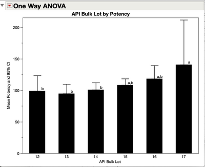
I get asked about this one figure a lot. Almost as many times as I've made it.
A google search for ANOVA images brings up this figure with hundreds of different data sets.
I put together a Blog Post with a Script
for how to make the figure. There are a number of subtle variations out there too.
So... How do you make this figure?
I'm thinking of making launch dialog that includes options for popular variants. If you're interested in contributing or collaborating, let me know in the comments below.
JMP Systems Engineer, Health and Life Sciences (Pharma)
1 REPLY 1
- Mark as New
- Bookmark
- Subscribe
- Mute
- Subscribe to RSS Feed
- Get Direct Link
- Report Inappropriate Content
Re: One Way ANOVA figure for Scientists
If I were still on the team...oh well. That ship sailed. But I'll User Community message you with an idea!
Recommended Articles
- © 2025 JMP Statistical Discovery LLC. All Rights Reserved.
- Terms of Use
- Privacy Statement
- Contact Us


