- New to JMP? Let the Data Analysis Director guide you through selecting an analysis task, an analysis goal, and a data type. Available now in the JMP Marketplace!
- See how to install JMP Marketplace extensions to customize and enhance JMP.
- Subscribe to RSS Feed
- Mark Topic as New
- Mark Topic as Read
- Float this Topic for Current User
- Bookmark
- Subscribe
- Mute
- Printer Friendly Page
Discussions
Solve problems, and share tips and tricks with other JMP users.- JMP User Community
- :
- Discussions
- :
- Re: Looking for good example data for a broken axis graph
- Mark as New
- Bookmark
- Subscribe
- Mute
- Subscribe to RSS Feed
- Get Direct Link
- Report Inappropriate Content
Looking for good example data for a broken axis graph
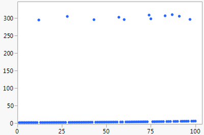
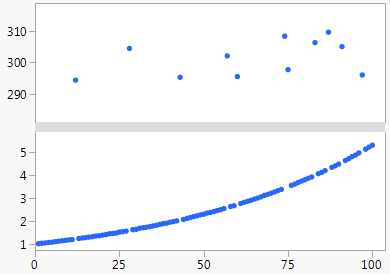
I occasionally get asked about making broken axes in Graph Builder. It's not something I like to do since it requires more conscious thinking to process, but I realize sometimes options are constrained. There's a way to get the effect in Graph Builder and I'm planning to write a blog post about it. Below is my contrived data with a whole axis and a "broken" axis. Does anyone have examples of real data sets that are suitable for a broken axis?

- Mark as New
- Bookmark
- Subscribe
- Mute
- Subscribe to RSS Feed
- Get Direct Link
- Report Inappropriate Content
Re: Looking for good example data for a broken axis graph
I ended up using this contrived data plus an example I found in a journal in my blog post. I'm still interested in examples or discussion on axis breaks in general.
- Mark as New
- Bookmark
- Subscribe
- Mute
- Subscribe to RSS Feed
- Get Direct Link
- Report Inappropriate Content
Re: Looking for good example data for a broken axis graph
Hi xan@jmp,
I was recently searching this topic because I found an example of a "broken-axis" graph and wanted to recreate it without using Microsoft Office products. The paper located at the following link contains a graphical abstract showing IR spectra for modeled and experimental vibration energy for essential oils found in nutmeg (e.g. eugenol). In this case, the authors were attempting to point out different areas of the IR spectrum where certain important peaks were located. These data are usually recorded from 4000 - 20 cm-1 and are plotted with either % transmittance or absorbance on the y-axis. Here, I suppose two graphs would work, but it creates a sense of discontinuity in a continuous spectrum. Generally people use a broken x-axis graph that essentially skips areas of the full IR spectrum where there is no significant absorbance or change in %T. I think this is a similar example to what you've found in your blog post. Thought you'd be interested.
I have been using a combination of Excel and Powerpoint to create my custom graphs. Usually works well, but is time consuming.
Here is the link http://pubs.acs.org/doi/10.1021/acs.jpca.5b07607
~m
- Mark as New
- Bookmark
- Subscribe
- Mute
- Subscribe to RSS Feed
- Get Direct Link
- Report Inappropriate Content
Re: Looking for good example data for a broken axis graph
Thanks! Good to see a real example with a nice explanation.
Recommended Articles
- © 2026 JMP Statistical Discovery LLC. All Rights Reserved.
- Terms of Use
- Privacy Statement
- Contact Us

